Getting visitors to your website is just the first step.
That can be difficult in today’s crowded online environment. But it isn’t enough to maintain a sustainable business. You also have to turn a decent percentage of those visitors into leads and customers.
One of the most effective ways to do this is to guide visitors through your sales funnel step by step.
A lot of businesses aren’t doing this. They set up slick websites, but they don’t use calls to action effectively. Ineffective calls to action make it impossible for people to navigate them successfully.
You’ve probably been to more confusing websites than you care to remember.
And what do you do when you land on those websites?
Not a whole lot. It only takes a few seconds before you’re ready to click the “Back” button in your browser. Savvy marketers like yourself recognize that’s no way to do business.
Keep reading to find out what you can do about it.

Image Credit: johnscotthaydon via Compfight cc
What Is a Call to Action?
You know those confusing websites I just mentioned?
Most are offering decent products and services. That isn’t the reason they’re missing out on customers and sales. They’re missing out because they aren’t taking responsibility for how visitors interact with their websites.
These businesses aren’t using effective calls to action to turn visitors into leads and buyers.
But let’s back up for a minute. What exactly is a “call to action?”
It seems like textbook marketing jargon, but it isn’t as complicated as it sounds.
In the words of a relevant Hubspot article:
A call-to-action (usually abbreviated as CTA) is an image or line of text that prompts your visitors, leads, and customers to take action. It is, quite literally, a “call” to take an “action.”
Depending on your conversion goals, calls to action can represent a range of small commitments (asking visitors to sign up to your email newsletter, demo a product, etc.) to large ones (renew their monthly subscription, recommend you to a friend, etc.)
The key components are 1) a defined step you want your visitors to take, and 2) the opportunity and encouragement to do it.
A lot of businesses are getting this wrong. Their weak (or nonexistent) calls to action cost them leads, customers, and sales.
So let’s talk about how you can get yours right.
The Principles of Calls to Action That Convert
Effective calls to action rely on a combination of copywriting and design principles. Both are important for your conversions because they answer different questions on your visitors’ minds.
As Michael Aagaard pointed out in his excellent Unbounce article:
Button design is a visual cue that helps attract prospects’ attention to the call-to-action. In other words, button design answers the question, ‘Where should I click?’
Button copy, on the other hand, helps prospects make up their minds in the last critical moment and answers the question, ‘Why should I click this button?’
Call to Action Copy
Even if someone is interested in exploring a business relationship with you, he or she will probably need convincing before taking the next step.
A lot of businesses put the burden on their visitors to fill in the gaps about why they should take action. That’s a recipe for low conversions.
Understand and apply the copywriting principles below, and you can stack the deck in your favor. You can give people the last-second reassurance they need to travel deeper into your sales funnel.
1. Tell Visitors Exactly What to Do Next
Ever been to a website and had no clue what to do next?
It happens all the time. There’s either not enough information; too much information or everything’s jumbled together like a maze.
A lot of this confusion stems from failing to give visitors a clear sense of direction—a purpose.
Remember, your visitors might like you, but they aren’t browsing your business website for fun. They’re looking for information and solutions; they’re looking for help.
That’s why every one of your interactions with visitors should have a clear purpose. You’re looking to get people to know, like, and trust you – and eventually do business with you – one step at a time.
Effective calls to action take guesswork out of the equation. Instead of putting the burden on visitors to figure out how to further the relationship, they give them a clear action step of what to do next.
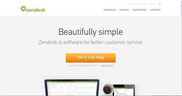
Take a look how Zendesk does it. There’s no question what they want you to do next: try their software for free.
2. Focus on the Benefits Instead of the Commitment
The idea of “submitting” my email address on a business’ web form sounds about as enticing to me as watching paint dry.
There are countless businesses out there urging visitors to “get Started,” “join,” or “sign up.” But most are coming up short because they aren’t answering a fundamental question on every visitor’s mind:
What’s in it for me?
Vague calls to action (like the ones I just described above) are ineffective because they make the commitment seem unappealing and one-sided. No one wants to share their personal information (or agree to even greater commitments) unless they’re crystal clear on what they’re getting in return.
That’s why effective calls to action tend to be benefits-oriented. The focus shifts to what the visitor gains from taking the action instead of the action itself. For instance, a request to “Sign up to our email list” becomes “Get weekly marketing tips.”
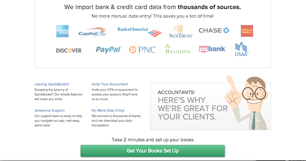
LessAccounting does a great job of this. Instead of focusing on the commitment (paying for accounting software), the call to action focuses on the benefit (getting the visitor’s books set up).
3. Create a Sense of Urgency
With all the distractions online, it’s effortless to put decisions off for later.
But there’s a big problem with that: “later” hardly ever comes. Visitors who were once interested lose focus, and eventually they forget about you altogether.
That happens a lot with people who are on the fence about moving forward. They’re interested in your business, but they might need a little persuading to take action.
Weak calls to action don’t do these people any favors. They put the onus on the visitor to work up enough interest to take action instead of instilling any sense of urgency.
Your conversions will improve if you can encourage people to act now instead of assuming visitors will come back later on their own. Powerful call to action copy incorporates this critical element. It gives people a peg to hang their hats on so they can commit right away.
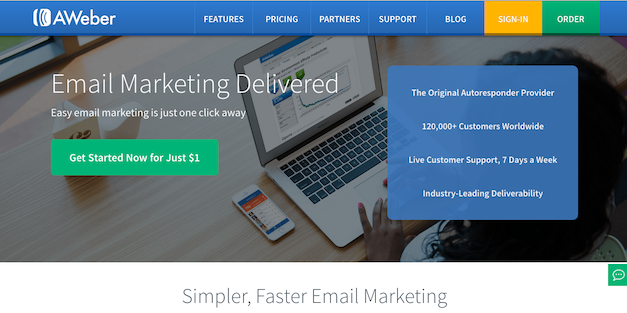
AWeber taps into a sense of urgency by telling visitors to “Get Started Now for Just $1.”
4. Make Action as Effortless as Possible
Visitors might want to find out more about you, but they don’t want to work to do it.
I ran into this problem recently with Yelp. I always thought it was a cool website, and I used it plenty of times to check out new restaurants. When my martial arts instructor asked us to leave a review for his academy, I decided to create an account.
Little did I know! The amount of personal information they asked for—to create a free account—reminded me of filing my taxes. So I decided against it.
The takeaway: you can’t rely on anyone (even if they’re extremely interested in your business) to respond to your calls to action if they’re too time-consuming or intimidating.
Effective calls to action make taking “the next step” as painless as possible. It doesn’t matter if you’re asking for an email address or up selling a product to a loyal customer. Focus on what you can do to make it as painless as possible.
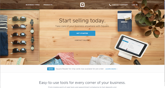
Square does this by supporting their call to action with a compelling headline: “Start selling today.” Visitors can rest easy knowing there won’t be much effort on their end.
Call to Action Design
Excellent copy gives visitors reasons to respond to your calls to action. But it’s useless without a quality design to support it.
Effective call to action design makes it clear where people should take the next step. There’s a much better chance of them following through if they don’t have to hunt around your website aimlessly.
Here are several key principles to make your call to action design more effective.
1. Use a Large Call to Action Button
Featuring a large call to action makes it easier for visitors to see it and follow through with what you want them to do.
You might’ve crafted the perfect call to action copy, but that won’t help if no one can distinguish it from the rest of your content.
That’s why a large call to action—set off from the rest of your content with plenty of white space—will draw more eyes (and clicks). With people’s shortening attention spans, it’s becoming less likely they’ll stick around and pore over your content. A large call to action button grabs their attention right away.
Here’s how clothing store Proper Cloth asks visitors to read customer reviews.
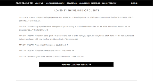
Like a great headline, Prop Cloth’s large call to action button grabs attention and makes it clear what to do next.
2. Make the Call to Action Contrast with Your Other Content
A lot of businesses miss out on customers and sales because their calls to action blend in with the rest of their web content.
This can happen wherever you include your calls to action – in emails, at the end of blog posts, on landing pages, and so on.
A clean, understated design is trendy. But “understated” is the last thing that should come to mind when someone sees your call to action.
One of the easiest ways to make your calls to action pop is to use an accent color that stands out from your business logo and website color scheme.
Take a look at this bright green button from Rackspace.
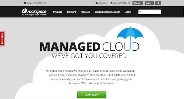
Not sure which color to try? Check out Button Optimizer. It’s a free tool that helps you design call to action buttons for your website.
3. Prominent Placement
Every digital interaction with your visitors is driven by a single underlying goal: turning them into loyal customers.
Getting people to respond to your calls to action moves you closer to that goal. So it’s usually the top priority on your web pages.
Some businesses are using calls to action, but they aren’t giving them the prominent placement they deserve. Then they wonder why no one’s clicking on their call to action button – the one they tucked into the bottom corner of their web page!
Where you place your call to action can make you or break you. That’s why effective calls of action tend to be “above the fold.” Those get more eyes because visitors don’t have to scroll down to find them.
Check out how Netflix does this. Their call to action, “Start your free month,” practically jumps off the screen.

You can also center your calls to action so they’re the only elements in the middle of your web page. That will help set them apart from the rest of your content.
4. Stick to One Call to Action Per Page (Usually)
I’m sure you’ve seen it before. You land on a website, and you’re interested in learning more. But there are too many choices of what to do next. The pressure to decide is overwhelming. It’s easier to hit the back button on your browser.
Sticking to one “next step” per web page clears up the confusion and makes it more likely people will follow through.
It’s also crucial to match the level of commitment you ask for with the visitors’ position in your sales funnel. You might not ask a first-time visitor to purchase a product. But it wouldn’t be crazy to urge them to join your email list.
Some businesses have seen success using two calls to action on a single web page, which gives them a preferred action and a backup option – usually a lesser commitment.
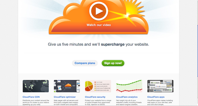
The only way to know whether this will work for you is to test. But if you decide to go that route, make the highest priority call to action larger than the other option. Use a contrasting color to make it stand out.
Take a look how CloudFlare does this below.
Over to You
Constantly chasing down new visitors is exhausting. Especially if you’re only turning a few of them into leads and buyers.
Effective calls to action will help you get more mileage out of your current traffic levels. They can fill your sales funnel with prospects and give you an edge over your competitors.
Although it might seem like a small detail, but it’s an important one. It’s also one a lot of businesses overlook.
But you don’t have to.
Apply the principles above. You’ll connect with visitors, deepen your relationships, and turn more of your interactions into profits.
What tips stood out to you the most? Why? Leave a comment below and let me know!


