Read a lot of business websites for fun?
Me, neither.
With the rare exception, most of us would rather be enjoying our hobbies and spending time with family and friends. If we want to be entertained online, there’s always social media and funny cat videos.
Your business website isn’t there just to entertain or look pretty. It can do those things as well… as long as it’s driving engagement and conversions.
A lot of business owners get so concerned about design, aesthetics, and entertaining visitors they overlook their websites’ main purpose: to sell.
How can businesses get back to the basics?
What does it take to create a high-converting website?
Keep reading to find out.
 Photo Credit: Deathtostock
Breaking down the Persuasion Process
There are tons of tips available about making sales and generating revenue online. Figuring out how to make them work – or even where to start – can seem overwhelming.
Offering a solid product or service is step one. To position it in a way that’s compelling to visitors, you need to walk them through a process that turns them into buyers.
Here’s how to do that in a simple five-part framework:
1. Make a Good First Impression
Would you walk into a store with dingy windows and cluttered merchandise?
Most of us wouldn’t…
But that’s exactly what a lot of online businesses are expecting people to do when they land on their websites. They forget that their website is their virtual storefront, and busy visitors end up leaving before they get the chance to make their offer.
The bar is already high in crowded malls and retail shopping centers. And it’s even higher online, where competitors and other options are a few keystrokes away.
You only get a few seconds to make a good impression. People are busy and distracted online, and most visitors won’t come back if you leave it up to them to figure out what your business is and how it could hep them.
Your website design doesn’t have to be as sleek as Apple’s. But it does need to answer three key questions right away:
- What does your business do?
- Whom does your business help?
- How can your business help?
You’re already familiar with how it feels to be a first-time visitor to a website. You want to know right away whether the content is relevant to you before investing any more of your valuable time. Simple designs – layouts that are easy to read and navigate – keep you around longer than confusing, cluttered messes. The same goes for your target customers.
Websites are also great opportunities to inject your personality and distinguishing features as a brand. But that’s only effective after you’ve established a tidy storefront that answers the key questions on every visitors’ mind.
Take a look how marketing expert Steve Gordon does this:

His website might not win a design award, but it’s simple and professional. In one glance, first-time visitors get all the information they need to decide whether to stick around. They see what his business does (helping clients make high-dollar sales) and how it works (high-trust marketing).
Speaking of sticking around…
2. Turn Attention into Desire
Once you have a visitor’s attention, you have to give them reasons to keep interacting with your website.
A lot of businesses jump straight to the pitch without easing visitors into the process. That might work if you’re selling paperclips or five-dollar t shirts. But for specialized services and high ticket items, you’ll see a lot more success working people through a sales process gradually.
How?
Start by describing your visitors’ frustrations or unique problems. Showing people you understand their situation intimately – before offering your product or service as the solution – is a great way to resonate with them emotionally. It shows you value them as people instead of just “traffic” or “potential customers.”
You don’t have to be a copywriting expert to do this, but studying up on how to craft headlines and website copy for a few hours will help. After you’ve connected with visitors by describing their problems, it’s time to get them imagining just how different their lives would be if those problems were solved.
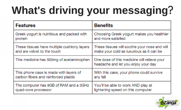
An easy way to do this: break down your product or service into features and “translate” them into tangible benefits. A rubber eraser on a pencil is a feature, for example. “Save time and easily correct mistakes” could be a tangible benefit connected to that particular feature. Connecting with benefits first gets people in an emotional state and makes them receptive to convert. Then you can follow up with the logical appeals of features to really drive conversions.
Here’s a great illustration from ezanga showing how to translate features into valuable benefits:

3. Ask Someone to Act (and Give Them a Reason to Act Now)
Getting someone’s attention and tapping into their desire for a solution to a problem are valuable skills…
But they aren’t much use to you unless you specify what the visitor should do about it.
Have you ever been sucked into a business website, gotten really interested in the content, and left frustrated or confused? It’s probably because they didn’t give you a concrete action to act on your desire.
It helps to design each page of your website with this in mind. What do you want a visitor to do right after engaging with your web page? If you’re selling something small, you might ask for the sale outright. But if you’re selling something expensive, asking for a small commitment first (like a product demo or free consultation) and then asking for more (once you’ve built the relationship) is more likely to convert.
If you can, give visitors a reason to act now. A lot of people engage with websites and are interested in what they’re offering… but they put off making a decision. Life gets in the way, and “later” never comes. Here are just a few ways you can persuade someone to act immediately:
- Bundling multiple products and selling them at a discount
- Increase the value of the offer by adding bonuses
- Make a time-sensitive offer
- Only selling a limited quantity of products
4. Remove the Risk
Even if you get someone excited about what you’re selling online, you’ll miss opportunities unless you ease your visitors’ sense of risk.
Imagine it from their perspective. If they’re on a business website for the first time, there are lots of potential red flags. Most of us have been scammed in the past. The last thing we want to do is end up wasting our time on an inferior (or non-existent) product and not being able to get our money back.
We’re also worried about whether your product or service will do whatever it is you say it can do. Promises sound great. But there’s a lot of hype out there, and it’s natural to start wondering if something might be too good to be true.
That’s why removing the visitor’s sense of risk is such an important part of convincing them to take action. Here are some ideas you could try to tackle different types of risk:
- Generous money-back guarantee
- Low commitments and easy cancellation
- Money-back guarantee
- Simple, no hassle return policy
- Trial periods and demos
The better you can assure people they won’t waste their money or time, the better you’ll convert.
5. A Way to Follow Up (Conversion Funnel)
Even if you’re a master at online persuasion, you won’t convince every interested visitor to pick up your high-ticket products or services right away. Most people will want to sample your less expensive offerings and build a relationship before they’re willing to shell out serious cash.
That’s okay.
Giving people options to continue the relationship is a key piece of building a sustainable business online. Creating a conversion funnel – where visitors become leads and leads become customers through a series of escalating commitments – will keep everyone comfortable and foster valuable relationships.
What are you offering interested visitors who aren’t ready, willing, and able to buy from you right now?
Are you persuading them to sign up to an email list by offering a free incentive in exchange for their permission? It’s one of the most effective ways to follow up with leads and scale your business.
You could also offer free product demos or trials periods. If you’re a service provider, a free consultation or webinar is a great way to demonstrate your credibility and give people a taste of how you could help them.
You don’t have to figure out all of this stuff right away. Refining your conversion funnel is an ongoing process. But at a minimum, collect email addresses of interested visitors. Communicating with people consistently via email (you can use an autoresponder) is a much safer bet than expecting them to remember your website six months or a year from now on their own.
Over to You
Your business website is an investment, not a place to entertain people or blow them away with a cool design.
Those things are great to have… as long as they rest on a foundation that drives conversions. Applying the five-step framework above will help you get the right people’s attention and put your best foot forward. You’ll convince people to do business with you, and you’ll build a pipeline of leads you can nurture over time.
What’s been your biggest challenge in persuading someone online? How do you think it’s different from persuading them in person? Leave a comment below and share your experience!


