Let’s take a step inside the data-driven demand generation marketing team. The biggest concerns on the CMOs radar are that the acquisition costs are too high and not hitting their pipeline or revenue goals. Now looking at the data, we know that not only are they spending a lot on paid and organic traffic, but the quality of the traffic is good, and it’s not converting.
So, of course, the next question would be – what can they do about it? A common answer is to focus on website conversion rate optimization, which involves running online experiments. That’s something you can put a budget around and prioritize but recognize that your executives are going to want to see impact based on pipeline and revenue and probably want to see it fast.
Online Experimentation
Back in 2017, the Harvard business review published an important article digging into the power of online experimentation. In it, they correlated successful business outcomes to a culture of experimentation.
Image Source: The Surprising Power of Online Experiments (Harvard Business Review | Link)
The article cited examples like the one below from Bing, who tested multiple different colors on their site, ran experiments. and realized an incremental $10 million in annual revenue from these experiments.
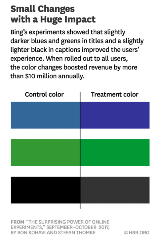
Image Source: The Surprising Power of Online Experiments (Harvard Business Review | Link)
Similarly, Google ran a test with 40 different shades of blue on their site. When they ran those experiments, they achieved $200 million in incremental revenue. Given these results, should we, as demand gen marketers, be running the same experiments?
In our opinion and experience, no, you should not.
You’re not Google or Bing. Leaving aside traffic considerations, you’re trying to influence B2B buyer behavior over customer journeys. And the reality is that groups of buyers that consider enterprise solutions are not going to buy based on the button color or other small cosmetic changes.
This is important because experimentation comes with a cost. Not only do you have people and the technology costs of running online experiments, but also your organizational ability to make decisions. So, focus on the elements that would deliver revenue and influence those B2B buyers when you’re thinking about experimentation.
When we think about the B2B buying journey or the revenue funnel it’s common to conceptualize it as a series of buyer stages. As prospects progress through those stages, they do so through exchanges, in which you’re offering something to that prospect in exchange for something else. The offer could be some content in exchange for their attention, an event, or an opportunity to speak to the sales team in exchange for their contact information. Ultimately those offers are how they learn more about your solution and how it would benefit them.
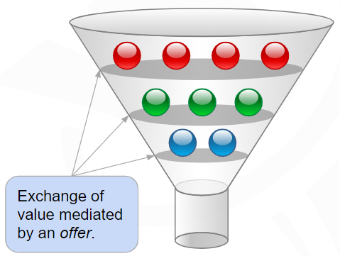
From our experience and the testing that we’ve done, the highest leverage use of experimentation for the demand gen org is to improve the relevance of those offers and the ease of engaging with them throughout the buying journey. Of course, we always want to ensure we measure the impact of those experiments based on the KPIs that matter – pipeline and revenue.
Optimizing Offers
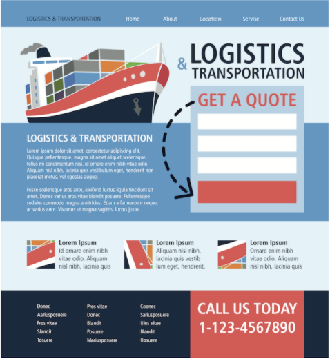
What does it mean to optimize offers? There are three components to an effective offer. One, of course, is the offer itself. That item you’re proposing to exchange with that visitor or prospect for them to understand your solution. The more relevant it is, the more effective your ability to convert them will be.
The second important aspect is how you frame it. Our primary focus here is the headline and Call to Action (CTA). Your headline is important because a visitor will spend five or ten seconds deciding if they want to stay on your site or hit the back button and go somewhere else. So, entice them to continue reading the content on the page.
Finally, the third element of the offer is the exchange and how they provide what you want. Most likely on your site this is a web form, but it doesn’t need to be. It’s increasingly common to see conversational marketing tools (chatbots) that accomplish the same thing by providing that medium of exchange for the offer.
Examples
Let’s look at some examples of how you could optimize your offers.
Landing pages are a great starting point for thinking about your offers. Many of you are probably running traffic to dedicated landing pages and putting an offer in front of the visitors hitting it. But not every visitor is interested in the same offer. In the example below, we recognized when working with a customer that they had three viable offers for those visitors coming through their paid campaigns. And rather than only showing them one, we use data to dynamically personalize the offer itself as well as framing and the page layout to reflect what might be most relevant to that visitor.

When we ran the experiment against the static landing page we saw a 44% improvement in revenue per visitor.
For most of us the most trafficked page on our site is the homepage. And on your homepage the “above the fold” section at the top gets most of the attention. Many of us think about our homepage in the context of welcoming the first time visitor and introducing your solution as in the example below.
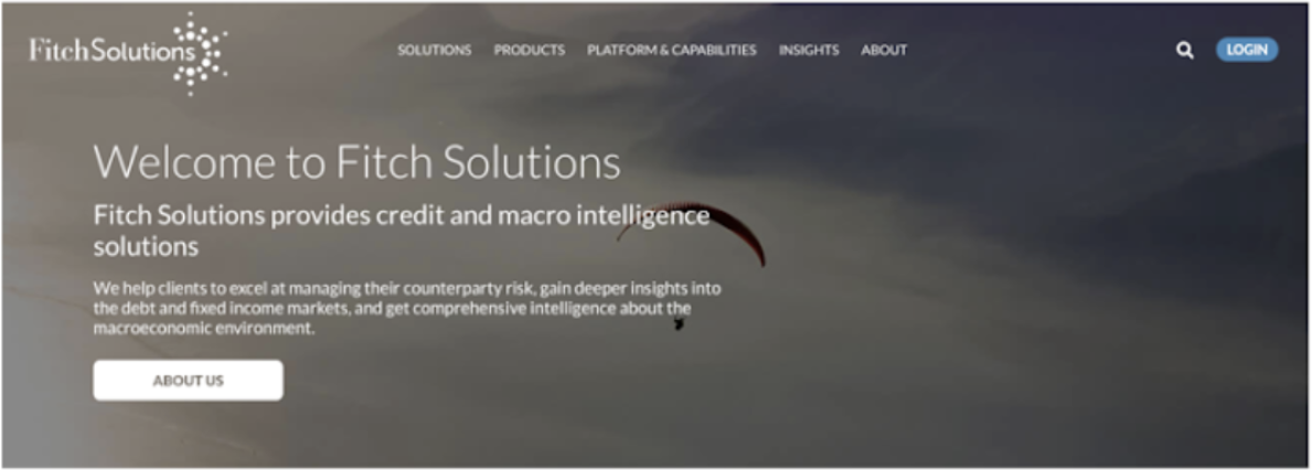
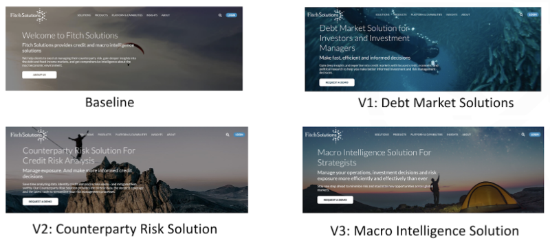
For SaaS and Demand Generation websites it’s common to have a lot of returning traffic. Since return visitors are familiar with your solution, it wouldn’t make sense to show them that same offer. In an experiment, we targeted these return visitors and the solutions they showed interest in and presented them on the homepage. In this case, those offers were buried in the site and require additional navigation. By presenting this offer they would likely be interested in and serving those directly on the homepage, we saw almost 55% improvement in conversions coming through this page.
You can also target well-defined buyer stages. In the following example, we have a customer with a freemium model where visitors on the free plan come to the homepage and see a CTA or a button prompting them to “Upgrade Your Plan”. The baseline experience was to take them to a set of SaaS plan tiers where they could select the one that they would upgrade to.
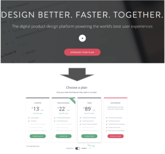
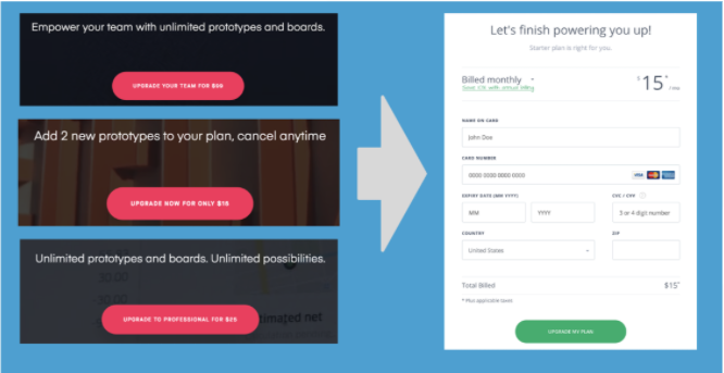
Using this data, we can identify the specific plans most relevant for any individual and offer them directly on the homepage. The framing included the benefits and replaced the CTA with the cost of that specific plan we recommend. Since we recommend a single upgrade plan, we bypassed the plan selection (and the friction it created) and took them directly to the credit card to upgrade. By removing friction and presenting them with a more relevant offer, we saw an almost 70% improvement in revenue per visitor coming through this experience.
The most common mechanism of exchange for the offer is the web form, and as a result, we spent a lot of time optimizing them. It’s important to recognize that there’s a lot of friction for the visitor when they encounter one of these forms.Even if they’re interested in the offer, they face the prospect of handing over their email and other personal information, which often presents a big hurdle. Since it’s common to see drop-offs at this stage, we would like to take those contact forms and reinforce the benefit and the value to the visitor filling them out. In the following example, we tested an updated version of the form page resulting in an 85% improvement in conversions.

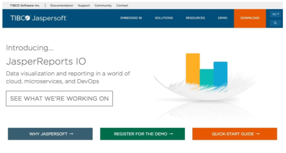
If you have the data, you can get sophisticated with offer personalization. It’s common to see pages like the one below. It is a product page that contains multiple offers for different personas within the organization. Unfortunately, when you try to put them all on a single page, they compete for attention and blend in, making it hard for users to know which one is relevant for them.
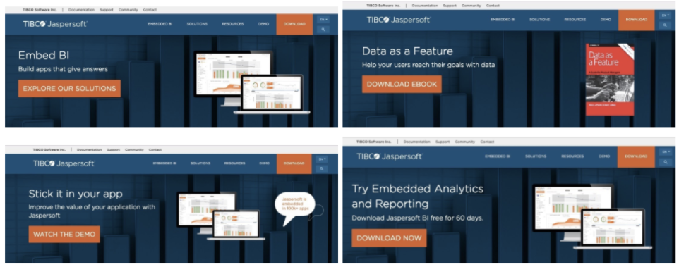
In this case, we target specific personas visiting the page based on data we had in the marketing automation platform and identify the most relevant offer. By testing variations that replace the default experience with a single focused offer, we see an almost 50% improvement in revenue per visitor.
Final Thoughts
It’s possible to waste time, effort, and money optimizing inconsequential elements of your website. For demand generation marketers, the highest leverage things to focus on are the offers – specifically their relevance to the visitor and the ease of engaging with them.
Before you undertake this experimentation it’s important to make sure you have solid revenue insights. What that means is, evaluating your existing offers as well as future experiments based on their pipeline and revenue contribution.
Some of the personalized examples above require some segmentation. Our recommendation is to prioritize segmentation based on the differentiated intent and addressable size of those segments. We often find that marketers are running building audiences that can only address 5-10% of their audience, or ones that don’t have meaningfully different intent from one another. Ultimately those aren’t going to have much value when it comes to optimizing offers.
This is why we start with buyer stages as our starting point for segmentation because it a large set of well-understood segments with differentiated intent – buyers at different stages will naturally gravitate towards different offers. The vast majority of the visitors coming to a demand gen site fit into anonymous, known lead, active opportunity or existing customer.
Finally, when it comes to improving offers, start with common sense ideas. If you start thinking about your buyer stages, some opportunities should become apparent. For example, should a known lead see a lead capture form, or can we repurpose those pixels for something more relevant? Similarly, should existing customers see the “Request a Demo” or “Talk to Sales” CTA? Maybe there’s an opportunity to get them to support resources or event upsell them.
What’s stopping you from generating more revenue by improving offers on your website? If you’re a Demand Gen marketer and need help, feel free to get in touch.

