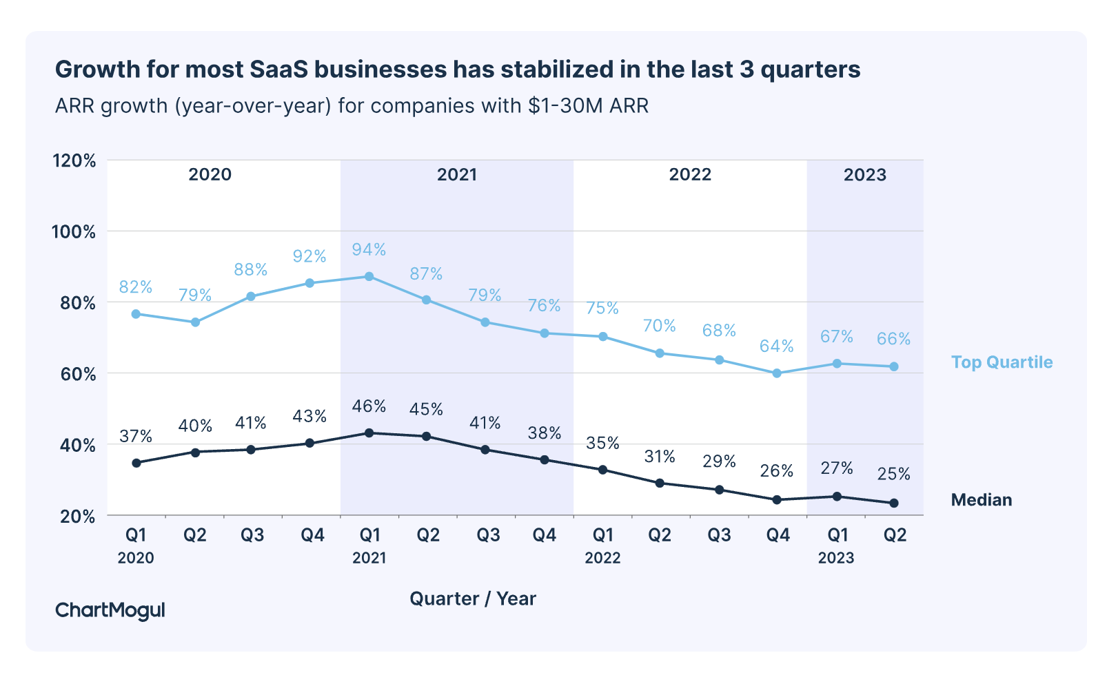
As global unrest and economic uncertainty persist, belts are tightening in most business sectors. While ChartMogul takes the optimistic spin that SaaS growth has “stabilized,” in reality, that translates to the fact that growth in many specific SaaS sectors is stalling or declining.

Optimizing consumer touchpoints is more crucial than ever. High-converting landing pages are strategic assets that transform curious visitors into engaged users and paying customers.
Imagine a visitor landing on your website after clicking on a targeted ad. Their initial impression, shaped by your B2B SaaS landing pages, determines whether they become a lead or bounce away. Technology and consumer trends are changing, so we’ve adapted our best practices for SaaS landing pages in 2024 to reflect changing buyer expectations and new AI tools.
Effective landing pages take time to optimize. They are part of strategic SaaS marketing campaigns that understand the different stages of the sales funnel. If you invest in ads, nailing your PPC landing page best practices is essential!
Just like buyers, landing pages are not one-size-fits-all. This post explores landing pages in the context of the SaaS funnel buyer stages: Awareness, Activation/Purchase, and Expansion/Upsell. But first, let’s look at some basics that every landing page should have, regardless of buyer stage.
Global SaaS Landing Page Best Practices
Regardless of the prospect phase, the best SaaS landing pages share some common attributes. For inspiration, HubSpot offers many examples of best practices for landing pages. Additional tips include:
Regardless of the prospect phase, the best SaaS landing pages share some common attributes. Share on X- Understand the importance of customer journey and intent.
- Use strong visuals and compelling copy throughout the landing page. Be sure your landing pages integrate with the website design to keep the customer journey on-brand.
- Ensure an optimal experience for mobile landing pages to ensure happy mobile users across devices.
- Prioritize page load time for quick access and improved engagement. Slow pages lead to an increased bounce rate.
- A/B testing at all phases helps optimize page elements to improve conversion rates continuously. You can optimize everything on the page with testing, from the CTA button color to your headlines. With multiple pages and stages, A/B testing can get overwhelming. At Funnel Envy, we’re used to dealing with that complexity. Reach out if you have questions.
- Closely track upgrade metrics. Monitor conversions, upgrade paths, and churn rates to understand what resonates with your user base and optimize your expansion landing pages accordingly.
- Measure performance metrics and track key funnel stages.
Sparking Interest: SaaS Landing Pages for the Awareness Stage
The awareness stage represents the first encounter between potential customers and your SaaS product.
At this point, visitors are likely unfamiliar with your brand, and their main focus is understanding how you can solve their pain points. The awareness stage can be the best landing page for lead generation. A common desired conversion is to capture email addresses for email marketing.
Key Strategies for High-Converting Awareness Landing Page
- Hook Them with a Captivating Headline. Use clear, concise language that addresses your target audience’s pain points. Think benefit-driven statements that pique curiosity and promise a solution.
- Showcase Solutions, Not Features. Don’t get bogged down in technical jargon. Instead, focus on your product’s benefits and how it makes users’ lives easier.
- Visuals Tell a Story. Include high-quality images and videos that resonate with your audience and visually represent the value proposition. Think hero images, screenshots, or explainer videos.
- Social Proof Builds Trust. Feature testimonials, case studies, and logos from satisfied customers to establish credibility and build trust with first-time visitors.
- Frictionless Lead Capture. Offer valuable, downloadable content like e-books, white papers, or webinars in exchange for email addresses. Keep form fields minimal and focus on capturing essential information.
- Clear Call to Action (CTA). A clear CTA button is essential. Tell visitors exactly what you want them to do next, whether signing up for a free trial, scheduling a demo, or subscribing to your newsletter. Use strong, action-oriented CTA buttons that stand out visually.
Key Tips for Awareness Landing Pages
- Target Your Messaging. Personalize your landing page content to different audience segments for increased relevance and engagement.
- Mobile-First Design. Ensure your landing page is responsive and optimized for mobile devices, where a significant portion of your traffic will likely originate.
Landing Pages for the Activation/Purchase Stage
Congratulations! You’ve successfully captured attention and ignited interest in your product during the awareness stage. Now comes the crucial activation stage, where you need to transform those intrigued visitors into engaged users and paying customers.
Best Practices for SaaS Landing Pages in 2024 to Generate Sales
Focus on Early Wins
- Highlight Quick Value. Showcase how users can achieve tangible results and solve minor problems within the first few minutes or days of using your product.
- Frictionless Onboarding. Streamline the signup, login, and onboarding process to minimize friction and ensure a smooth user experience.
- Demo the Power. Utilize product demos, explainer and demo videos, and interactive walkthroughs to visually demonstrate your product’s key features and functionalities.
Drive Product Engagement
- Showcase User Achievements. Display progress trackers, badges, or gamification elements to keep users motivated and engaged as they explore the product.
- Offer Personalized Tutorials. Based on user actions and preferences, suggest relevant tutorials, knowledge base articles, or contextual help menus to guide them further.
- Live Chat Support. Offer available chat support to address user questions and concerns in real time, fostering trust and a sense of community.
Nurture User Satisfaction
- Gather Feedback. Implement in-app surveys, feedback forms, or satisfaction ratings to understand user experiences and identify areas for improvement.
- Highlight User Success Stories. Showcase testimonials, case studies, and success stories from existing users to demonstrate your product’s positive impact on real people.
- Personalized Communication. Leverage AI tools to trigger customized email campaigns, in-app notifications, or targeted recommendations, keeping users engaged and interested.
Key Tips for Landing Pages That Drive Sales
- Track Key Metrics. Monitor user behavior, engagement rates, and conversion points to identify areas for optimization and ensure your landing pages are effectively driving activation.
- Leverage Data-Driven Insights. Use the data you gather to personalize your landing pages and tailor your messaging to resonate with each user’s unique needs and journey.
Level Up Growth: Pages for the Expansion/Upsell Stage
Your users are now familiar with your SaaS product and experiencing its value. The expansion/upsell stage presents an exciting opportunity to encourage upgrades, promote premium features, and cultivate long-term customer loyalty.
Key Strategies for High-Converting Expansion Landing Pages
Quantify Achieved Value
- Highlight User Progress. Showcase user dashboards, progress reports, or data visualizations that demonstrate the tangible benefits they’ve achieved with your product.
- Personalize Milestones. Identify critical moments within the user journey and trigger targeted landing pages highlighting relevant premium features that can enhance their progress.
- Social Proof for Premium Users. Feature testimonials and success stories from users who have upgraded to premium plans showcasing the additional value they unlocked.
Introduce Premium Features
- Clearly Communicate Benefits. Don’t just list features; focus on how they solve specific pain points, unlock new capabilities, and accelerate user goals.
- Personalized Feature Recommendations. Based on user data and activity, suggest relevant premium features directly addressing their needs and aspirations.
Motivate Upgrade Action
- Limited-Time Offers. Trigger scarcity and urgency with limited-time discounts, exclusive bundles, or early access opportunities for premium plans.
- Frictionless Upgrade Flow. Make the upgrade process as simple and seamless as possible with clear CTAs, minimal fields, and secure payment options.
- Support. Offer readily available support to address users’ questions or concerns during the upgrade process.
Key Tips for Conversion Stage Pages
- Maintain Trust and Transparency. Communicate the value proposition of each plan and avoid misleading tactics.
- Social Proof Markers. These can do the talking for you. Focus on building long-term customer relationships based on trust and mutual benefit.
By implementing these best practices, you can craft upsell landing pages that effectively showcase the enhanced value of premium plans, motivate users to upgrade, and unlock the full potential of your existing customer base.
Moving Ahead with Best Practices for SaaS Landing Pages 2024
This year, 2024, promises to be challenging for SaaS companies. However, don’t forget that challenge means opportunity for those who keep current and keep moving!
We hope these tips help you implement some best practices for SaaS landing pages in 2024 that are free of jargon, clutter, and distractions.
If you want to know where to start improving, testing, and optimizing your SaaS landing pages, Funnel Envy can help. We have used AI tools long before the ChatGTP era and are experts in new integration and possibilities. You don’t have to do this alone. Reach out today to get started.


