Your landing pages are worth bank vaults of cash. Think about it. You can potentially bring in buckets of money through just landing pages.
Ah, but wait.
(This is where I bring in a unique twist about something that you forgot.)
But, there could be some things getting in the way. Awesome as landing pages are, they don’t work automatically. You, as a marketer, must carefully craft those landing pages in such a way that they capture a customer’s attention, engage the customer’s interest, end result in a conversion.
Within that mix of technique and skill, there is the huge factor of human psychology — the fascinating field of neuroeconomics. In this article, I want to go below the surface of conversion optimization and explain one of these hidden factors of psychology that can completely change the way a landing page looks, feels, functions.
It has to do with memory. And it could bring in gobs of money.
Photo credit: © vladgrin – Fotolia.com
Introduction
This article will explain how memory works, and how to leverage elements of cognition to create powerful, compelling, and conversion-rich landing pages
Here’s the big idea, in rough-sketch form:
- Most conversions come from repeat visitors.
- Those repeat visitors come back because they remember your site.
- Their memories of your site depend on how memorable your site is.
- If you understand how memory works, you will be able to create a more memorable landing page.
You’re not going to remember everything that I write in this article. (If you do, please message me on Twitter. I’d love to meet you.)
But I hope you will remember this central, single, focused, powerful, big idea: Make a memorable landing page, and you’ll have more conversions.
Let me type that in again:
Make a memorable landing page, and you’ll have more conversions.
Where do your conversions come from?
In a study conducted by WebSideStory, researchers learned that repeat visitors are eight times more likely to make a purchase.
Here’s how the data looked in actual conversion rate digits based on a study of B2C ecommerce sites.
- New visitors: 1.55% conversion rate
- Repeat visitors: 12.61% conversion rate
In the study’s focus on B2C computers and electronics, the numbers were even more shocking:
- New visitors: 1.49% conversion rate
- Repeat visitors: 21.12% conversion rate
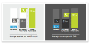
Adobe’s white paper, “The ROI from Marketing to Existing Online Customers” highlighted the statistical disparity between first-time, returning, and repeat visitors and customers. Here are some of the statistics:
Let me be very clear about this point. Statistics, studies, and analytics confirm the following fact:
Conversions come from repeat visitors.
We’re not talking here about repeat customers driving more conversions. We’re talking about first time customers who make a repeat visit.
There’s a critical distinction. Obviously, your existing customers are your best and most valuable customer segment. But often we neglect the importance of returning visitors who might not be customers yet. This — returning visitors — is the group whom we spend our retargeting dollar on, who skew our analytics, and who lower our conversion rates.
But in all our madding pursuit of such creatures, we forget about how powerful memory is.
It’s kind of ironic, actually.
If we could get these visitors to remember our landing pages, then we can better get them to return to our landing pages and make a purchase. The conversion odds are already in our favor.
Here’s an example:
John, a shopper, wants to buy an iPhone case for his iPhone 5. He shops around online and visits 7 websites. He doesn’t bookmark, save, clip, email, or buy. He just looks. The next day, John decides to buy an iPhone 5 case. He conducts a navigational search for the site that was most memorable. He finds the site. He buys the product.
Do you want your site to be memorable like that?
“The E-Commerce Report” from Intershop reported high confidence levels of “online retailers who believe they can influence whether consumers return.” Confidence sites around 73%.
- So, the fact is settled. Revenue comes from the repeat visitors.
- But this is not settled: How do we get those repeat visitors to, well, repeat?
That’s where we dive into the psychology of memory: What and how do people remember?
Understanding the Psychology of Memory
What I’m going to do now is change subjects. We were talking about repeat visitors. Now, we’re going to talk about the psychology of memory in those repeat visitors.
Deepak Chopra said this:
If I buy a cup of coffee, that’s karma. I now have that memory that might give me the potential desire for having cappuccino, and I walk into Starbucks, and there’s karma all over again.
What I’m going to share with you is like that. You want to create memories, that create desires for karma. The customer’s conversion on your landing page is karma:
Here’s how it works:
- Customer remembers your website.
- Customer has a desire for your product.
- Customer returns to your website and buys your product. That’s karma.
Here are several fact-backed features of the human memory:
We don’t lose memories, we simply have trouble retrieving them.
Many scientists believe that the memory can hold everything. Psyblog reports, based on the research of Robert A. Bjork and others, “in fact memory has a limitless capacity.”
Then why do we “forget?” The shortcoming is not our memory itself, but our mind’s retrieval of those memories. The human brain has a limited capacity to retrieve. More accurately, it has a selective retrieval capacity. The brain cannot retrieve everything, because it can’t process everything even if it did retrieve it all.
Three specific types of memories, however, are more easily recalled
- Recent events. You might be able to remember what you ate for lunch. But can you remember what you ate for lunch four weeks ago?
- Similar or relevant events. If you’ve been to Niagara falls, and then visit Victoria Falls in Africa, you may be better able to remember the sensation you experienced at Niagara. “Remember how the mist felt when we walked close to the falls?” Your Niagara memories aren’t things that you process each day, but visiting Angel Falls brought all those memories back.
- Unusual events. The memory does a remarkably good job at recalling events that are out of the ordinary. Chances are, you would remember if you went to Starbucks, ordered a cappuccino, and discovered a cockroach in it. Sorry, that was a little over the top nasty. I love Starbucks, and — full disclosure — I’m writing this article at a Starbucks and on Google Starbucks WiFi. I like Starbucks! My point is — you remember crazy out-of-the-ordinary events like that.
Our recall of memories actually changes the memory itself.
Memories are malleable. They change. Time, experience, and the imperfect practice of recall means that our memories don’t reflect actual events with 100% accuracy.
Recalling memories makes them stronger. And memories can even recall false events, if memory implantation is progressively instilled in a subject’s mind. This is what Harvard psychologist Daniel L. Schacter’s calls the “fourth sin of memory” also known as “misattribution.”
As PsyBlog states, “The process of recall, then, is actually actively constructing the past, or at least the parts of your past that you can remember.”
The recall mechanism is more likely to be prompted by events and experiences that are recent, relevant, or unusual.
To bring this to point to bear on the landing page conversion conversation, we must understand that the more significant the memory of a website or landing page, the less changeable it will become.
Many times, people misattribute the source of a memory.
This is the biggest concern for landing pages. If a customer views five different landing pages as she is researching “shell design iphone 5 cases” then she might easily confuse the features of your product with the name of another website. Her confused memory leads her to the wrong website, where she purchases the wrong product.
The human memory is effective, in part, because it generalizes events, informations, and experiences. But this generalization can lead to loss of a conversion in some cases.
How do you make a memorable landing page?
All this information is great, but how do we bring it together?
- Fact 1: Return visitors are eight times more likely to make a purchase.
- Fact 2: To get these return visitors to return, you have to make them remember.
So, let’s make a memorable landing page now shall we?
I’m going to fire the shotgun of advice. These points of advice are not sequential, but each one will help to create a more memorable landing page.
Create lots of landing pages.
The more landing pages you have, the higher your likelihood of gaining traffic (paid or organic) from returning visitors. Many times, returning visitors will conduct navigational searches to find your brand or product. Other times, they will conduct generic searches or head-term searches coupled with brand name features.
The more landing pages you have, and the better segmented these landing pages are, the more likelihood you have of attracting revisits.
Use pictures of faces.
It’s an indisputable fact that the human mind remembers faces. If you use pictures of faces on your landing page, you can leverage this powerful memory feature to your advantage.
I’m surprised why, in the face of scientific evidence, more landing pages don’t show pictures of people’s faces.
Create a unique design.
The most memorable events in human history are memorable because they are unique. Moses and his commandments, Plato and his caves, Alexander and his empires, and Gutenberg and his printing press — this is the stuff of which history is made and memories are formed.
On a far smaller scale, it works in digital design, too. If you can make your design so outstandingly different, people will remember it.
Short shocking headlines work very well.
You already know that headlines are your biggest landing page weapon. If you can load that weapon with the best shot, and aim it in the best way, you will score more conversions.
One way you do that is with a short, shocking headline. You don’t need to go all salty with your language, but you can 1) state a surprising fact, 2) address the user in a very direct way, 3) or make a surprising claim about your product.
The shorter the headline, the more effective it is. The most effective headlines consist of eight words. Research demonstrates that the human mind can effectively hold and process seven discrete pieces of information. Headlines with fewer words have a stronger memory sticking capacity.
Those types of headlines — punchy, pungent, and profound — make memories.
And memories make people come back.
Use a different brand name from everyone else.
Your company’s name is extremely important. Depending on your percentage of branded search traffic, as much as 70% of your conversions (or more) could come from branded queries. The value of these conversions depends on the memorability of your brand name.
Research has proven that names are harder to remember than any other words. The same is true for company or business names. The more memorable your name, the better chance you have of gaining repeat visitors.
If you’ve already started your company, you’re probably not going to go back and change your name. But if your business is still incubating in your mind, give some careful attention to its name and domain.
The more sensations that are affected, the stronger the memory.
Obviously, you can’t affect someone’s sense of touch or smell with a landing page. Technology hasn’t come quite that far. But you can use creative methods that prompt the involvement of other senses.
The way you do this is by telling the user to feel, smell, touch, or otherwise engage other senses:
- Can you feel the rumble?
- Do you feel the earth moving right now?
- What do the keys feel like on your fingers?
- Smell that?
- Place your hand on your forehead.
- What smells are you experiencing right now?
- Is that shirt comfortable on you?
By asking these questions, you’re turning on the user’s senses that are not otherwise engaged in the landing page experience. The user’s brain signals those other sensory receptors which in turn, reinforces their memories that are correlated with your landing page.
For example, let’s say you have this question on your landing page — “Is that shirt comfortable on you?” Immediately, the user starts thinking about the feeling of the fabric on their shoulders, the pressure of the cut on their arms, and other features about the shirt.
The brain is active during this entire process, creating strengthening pings on the sensory center that is tied to the memory of your landing page.
Examples of Memorable Landing Pages
One of the best ways to learn about memorable landing pages is to look at some unforgettable ones. As you look at them, try to identify some of the memorable elements.
(You can click on each image to enlarge.)
PayPal
- Hero graphics
- Compelling headline
- Pictures of people
- Standout CTA button
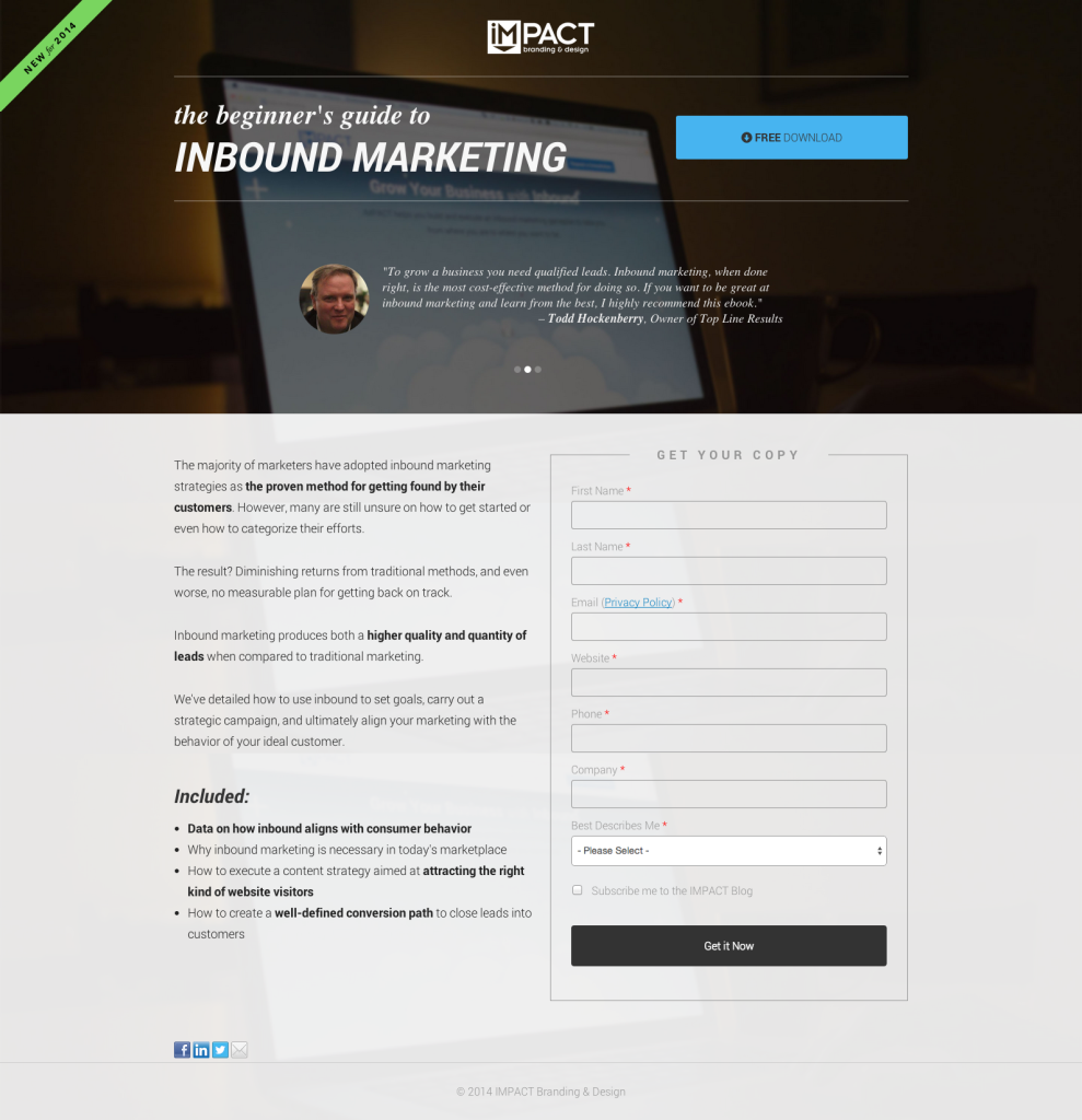
Impact
- Strong graphics
- Above-the-fold testimonials
- Clear value proposition
- Side-by-side value prop and capture form
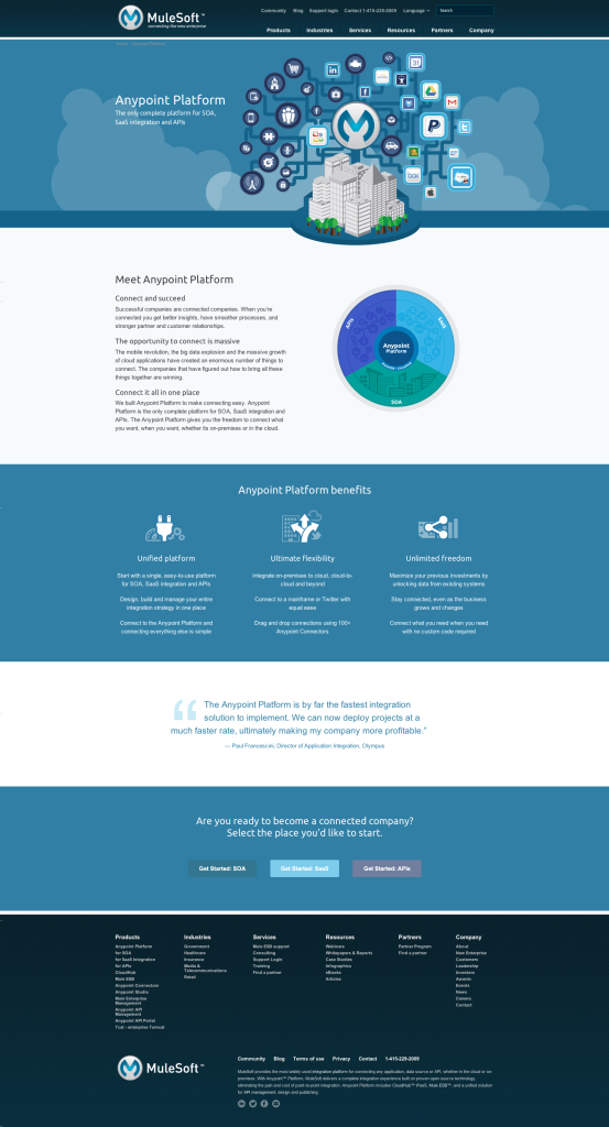
Mulesoft
The busy-looking graphic actually serves to reinforce the “integration” selling point of the product
Clear landing page flow — 1) explanation of product, 2) benefits, 3) testimonials, 4) CTA
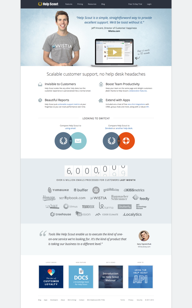
HelpScout
- This guy can smile. No doubt about it. Human faces. They work.
- Cool interactive counter. I’m going to remember that.
Basecamp
- Longform copy
- Frequent CTA exit points
- Lots of information
- Playful graphics
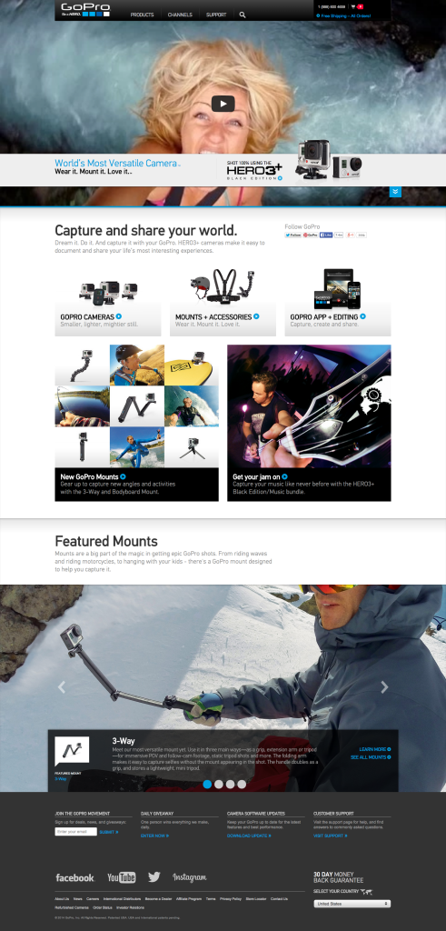
GoPro
- A full-screen, responsive, auto-play action-packed video with people doing insane things like wrestling lions?! Yes, please.
- Tons of pictures. They’re selling a camera.
- That headline: “World’s Most Versatile Camera”
- And that headline, too: “Wear It. Mount It. Love it.”
Conclusion
Make a memorable landing page, and you’ll have more conversions.
That’s it. Just make people remember.
How you make people remember is up to your creativity, outlandish ideas, freakish techniques, and brilliancy. I don’t really care what you do, as long as it’s in good taste.
But when you do come up with some ideas, share your landing page or idea in the comments below, and let’s talk about them.
Make a memorable landing page, and you’ll have more conversions.


