Penny Wise or Pound Foolish? When is the Cost of A SaaS Funnel Audit Worth It?

Imagine pouring hours and dollars into crafting targeted campaigns, nurturing leads, and refining your messaging for your SaaS business. Yet, a nagging doubt lingers: how do you know if website visitors convert optimally? Why exactly is engagement lagging? Evaluating your SaaS marketing conversion rate can feel like peering into a black box. You may be considering a funnel audit, but how do you know when the cost of a funnel audit is justified? Let’s start with the symptoms. What are the warning signs of problems in your funnel? 

5 Signs Your Marketing Funnel is Leaking

A well-optimized marketing funnel should seamlessly guide website visitors toward conversion, but leaks can develop over time. These leaks represent missed growth opportunities, hindering your ability to convert leads into paying customers. Here are 5 signs your marketing funnel might be leaking:

  1. Dwindling Lead Generation. Is the flow of qualified leads into your funnel slowing down? If so, it could indicate a problem at the top of the funnel, such as ineffective content marketing, targeting the wrong audience, or a lack of brand awareness.
  2. High Abandonment Rates. Are website visitors dropping off at crucial points in your funnel, like landing pages or opt-in forms? High abandonment rates suggest friction or confusion within the funnel, preventing users from taking the desired action.
  3. Low Conversion Rates. A low conversion rate is the ultimate indicator of a leaky funnel. Low performance means leads who enter your funnel never convert into paying customers. Analyze conversion rates at each funnel stage to pinpoint where leads are slipping away.
  4. Unengaged Audience. Do your social media posts and email campaigns generate minimal engagement? A lack of engagement suggests that your messaging misaligns your audience’s needs or that you’re not reaching the right people.
  5. Increased Customer Acquisition Cost (CAC). Is acquiring each new customer costing you more and more? This high cost could indicate that your marketing efforts attract unqualified leads or that leaks within the funnel prevent qualified leads from converting.

The more of these issues you experience, the more you need a funnel audit. A comprehensive audit can help identify the specific leaks within your funnel, provide action items to patch them up and optimize your marketing efforts for sustainable growth.

Two Key Challenges with SaaS Funnel Optimization

In our experience, we’ve seen that many B2B marketers, especially in the fast-paced SaaS industry, struggle with two key challenges:

  1. Gauging Funnel Performance: Accurately assessing the health of your marketing funnel requires expertise and specialized tools. Without a clear picture of leaks and bottlenecks in your SaaS sales funnel, it isn’t easy to pinpoint areas for improvement in funnel optimization.
  2. Justifying a Funnel Analysis: Investing in a funnel audit to diagnose problem areas can feel like an unnecessary expense. However, the potential cost of neglecting a sub-optimal conversion funnel can be far greater. How do you know when to pull the trigger?

A shift in perspective is helpful when faced with these challenges. The SaaS model requires an optimized sales funnel as the cornerstone of success. While the upfront cost of a funnel audit might raise initial concerns, the potential return on investment (ROI) of fixing problems in the funnel can outweigh the expense.

Understanding the ROI of a SaaS Funnel Audit

Think of your funnel as the engine of your business. Your funnel should seamlessly guide potential customers (aka qualified leads) through the customer journey toward conversion, ultimately driving revenue and customer acquisition.

However, even the most successful funnels can develop leaks over time. Funnel audits are helpful because a seemingly minor tweak to your landing page copy or a strategic adjustment to your email marketing campaign can significantly increase conversions. 

Funnel leaks represent missed opportunities, bleeding your SaaS business dry in several ways:

Lost Leads and Sales

A broken funnel is like a leaky pipe – qualified leads enter your top-of-funnel stages but never reach the conversion stage, like a free trial or paid subscription. This loss translates to missed sales opportunities and lost potential recurring revenue.

Inefficient Marketing Budget Spend 

Are you pouring money into social media campaigns, organic traffic lead gen, or Google Ads that aren’t resonating with your target audience? An audit can identify marketing budget drains, allowing you to reallocate resources toward more impactful initiatives that improve acquisition costs.

Wasted Resources on Outdated Tactics 

It’s easy to fall into the trap of clinging to tactics that once delivered results. An audit can expose outdated or ineffective strategies, freeing resources to invest in high-performing approaches more suited to your target audience.

By viewing a funnel audit as an investment in identifying and plugging these leaks, you’re investing in the future growth of your business. The potential return on investment (ROI) can significantly outweigh the initial cost, leading to revenue growth and decreased customer churn.

Addressing Specific Cost Concerns

There are some specifics every marketer should ask about when considering a funnel audit. Here’s a breakdown of the costs involved in a funnel audit:

  • Upfront cost. The price of a funnel audit can vary depending on the scope and experience of the auditor. 
  • Implementation Costs. A funnel audit report will naturally include some recommendations. Following the audit recommendations may involve additional costs, such as website tweaks, marketing automation adjustments, or content creation. 

For example, imagine a scenario where your landing page copy is deterring conversions. A good audit will identify this issue, and the cost of revamping the copy pales compared to the ongoing revenue you’re losing due to a sub-optimal landing page.

Think of implementation costs as fine-tuning your sales funnel for peak performance. While there might be an initial investment, the long-term benefits outweigh the short-term expense.

Demonstrating the Value Beyond Cost 

While the cost concerns surrounding a funnel audit are valid, the actual value can extend far beyond the immediate price tag. Here’s a look at some of the intangible benefits that can significantly enhance your marketing efforts:

Gaining a Deeper Understanding of Your Target Audience

One of the most powerful outcomes of a comprehensive audit is a deeper understanding of your target audience. During the audit process, funnel analysis tools and user experience (UX) evaluations shed light on how potential customers interact with your marketing materials and navigate your sales funnel.

This newfound knowledge empowers you to create highly targeted messaging that resonates with your ideal customer’s pain points and desires. A deeper understanding of your customer’s journey helps you create content that fosters trust, leading to higher conversion rates.
Identifying Hidden Opportunities

A fresh perspective on your marketing funnel can be a game-changer. A skilled auditor can identify hidden opportunities you might have missed. An audit could involve uncovering new channels to reach your target audience, optimizing landing pages for significant conversion uplifts, or suggesting adjustments to your sales process that streamline the path to conversion.

For example, the audit might reveal a hidden gem within your customer base. By analyzing data, the audit could uncover upsell or cross-sell opportunities you didn’t previously capitalize on, translating to increased revenue potential without significant acquisition efforts.

Remember, a well-optimized funnel isn’t static. A funnel audit is a springboard for continuous improvement, helping you identify and leverage hidden opportunities to achieve sustainable growth.

What about AI for SaaS Funnel Performance?

We all know that AI tools are quickly changing the funnel optimization landscape. A comprehensive audit can pinpoint areas where AI tools can update your funnel to personalize the customer journey, optimize ad targeting, and automate repetitive tasks.

Moving Ahead: Reframing the Cost of a Saas Funnel Audit

Do you have more questions about the audit process with an experienced provider? 

For a deeper dive, check out our CEO, Arun Sivashankaran’s YouTube Video series. In these short videos, Arun describes FunnelEnvy’s Method for conducting a Full-Funnel CRO Audit, discusses some helpful mindsets when conducting such an audit, and reveals an important keystone habit that can make CRO efforts easier and more effective.

At Funnel Envy, we are a team of growth experts specializing in data-driven funnel optimization for B2B, lead generation, and SaaS companies. We utilize a combination of closed-loop analytics, website experimentation, predictive models, and marketing automation to ensure your funnel is firing on all cylinders.

Contact Funnel Envy today for a free consultation and discover how a funnel audit can propel your business towards sustainable growth and long-term success.

By |2024-05-16T10:08:38-07:00May 27th, 2024|SaaS|0 Comments

Multi-Step Interactive Experiences (Going Beyond the Form)

Transcript

Hi everyone. My name is James Niehaus from FunnelEnvy. And today I want to talk to you about multi-step interactive experiences and going beyond the form. So this is the third video in a series that we focus specifically on a technique we call multi-step interactive experiences. In the first two videos we talked about how to use this on B2B forms to really drive massive improvements in conversion rates. And today I want to talk about how to use the same technique on other parts of your site.
We Will Cover

  • A quick recap on multi-step interactive experiences
  • Why they work
  • How they can work on other parts of your site
  • 5 popular ways to leverage interactive experiences on your site

Full Recap of Multi-Step Interactive Forms

If you have not watched the introduction and multi-step advance use cases videos, watch these in these given links.

Examples of Multi-Step Form Flows

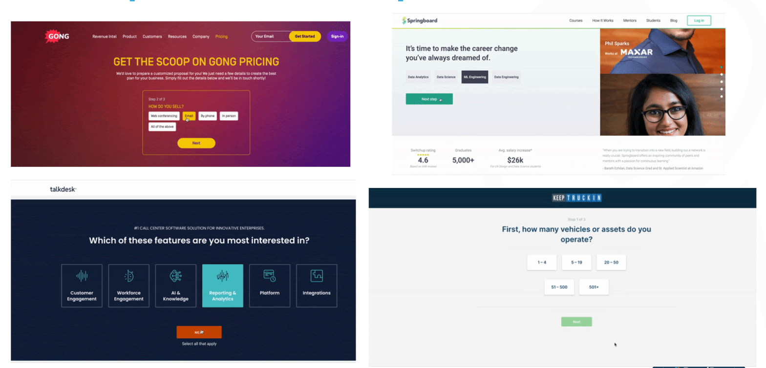
Here are just some examples of past client interactive experiences. So this should be self-explanatory, but as you see here, all we’re doing is taking your typical static B2B form, breaking it up into interactive steps, and leading with intent questions that make it easier for the user to raise their hand, provide you information, commit to the process and convert at higher rates. And we say convert at higher rates, we do mean higher rates. So here are just some examples of recent conversion lifts we’ve seen on client forms just by moving the static forms to multi-step experiences. So as you see here, it’s definitely pretty powerful and effective. And this is also a reason why we kind of then explored using this technique on other parts of the site.

multistep form examples

Some Key Takeaways from previous videos

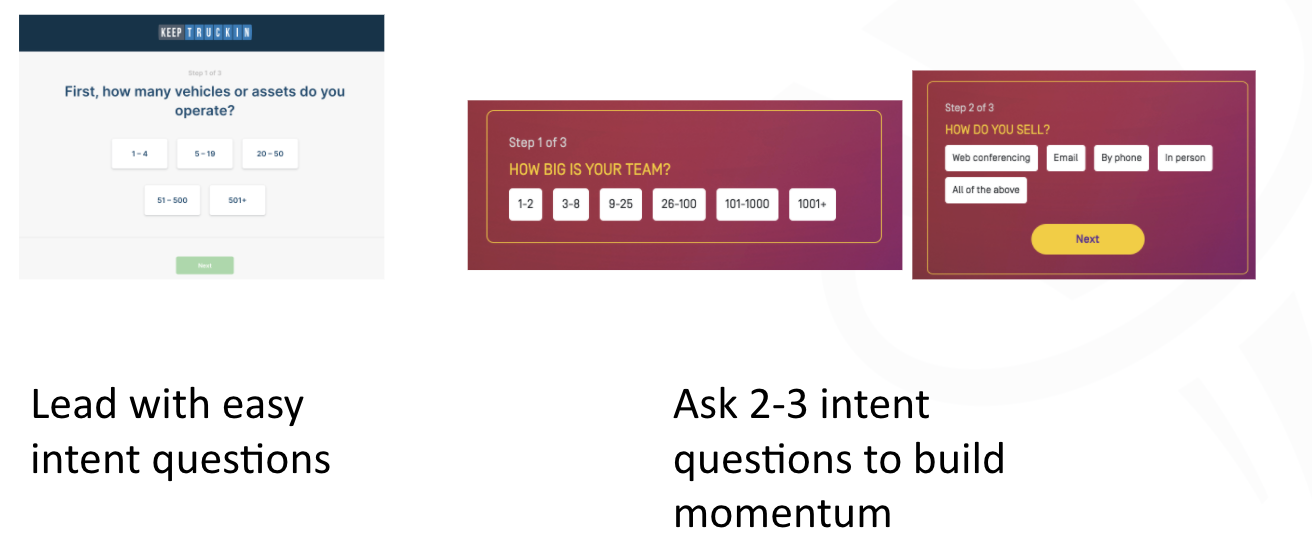
With a multi-step form experience, you usually want to ideally lead with intent questions that’s more about what’s in it for them. What features do they care about? How big is their company? What are they looking to do? What’s their role? But the whole idea here is that asking them easy to answer intent questions, helps guide them down the path towards finding a better outcome or helping you better guide them down to the right solution. So that’s the first takeaway.

The second takeaway is also ideally asking them a couple of those questions first because what you want to do is make it easy for them to get started, continue, and create that momentum and commitment to completing that process. And that’s how we get the higher conversion rates.
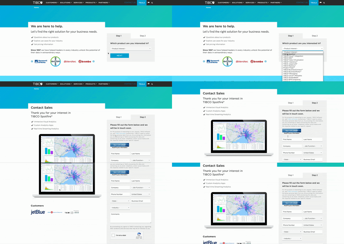
And then the nice part about this technique is that you then layer on additional strategies, and this is where it gets even more powerful. So on the left, you see an example where we actually start personalizing step two and step three of the form experiences based on what they provided as an answer in step one. So this is where it can get a little more targeted and personalized. Or on the right is a good example where you can use their information to then potentially route them to a different funnel or flow. An example there, they’re using company name, based on the email address, to decide whether they should send them to a scheduler as you see there, or to just give them the rest of the regular form. So this is where you can potentially provide custom experiences based on company size or target account or their role or what they’re looking to do. But this allows you to then go from a one size fits all static experience, to providing smarter, routed experiences that align with your personalization and ABM strategies.

More Powerful w/ ABM + Personalization

Personalize the rest of the form by their inputs

Multi-Step Works Beyond Forms

Multi-Step isn’t just for forms. They can work on most parts of your website. I mainly want to focus on five key areas of the site, or techniques.

Step #1 Homepage: funnel them to a multi-step form flow on the entry

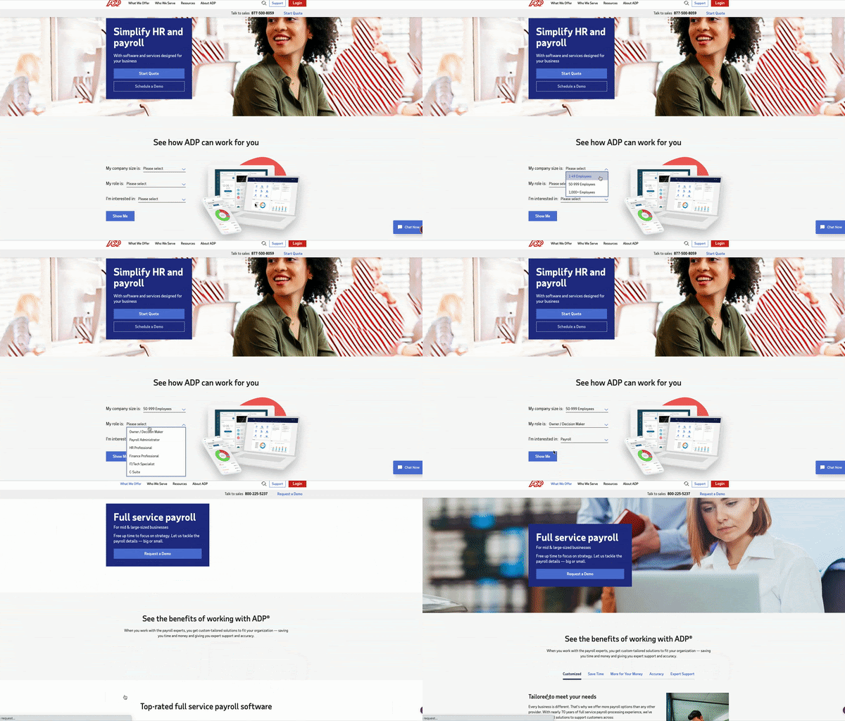
So starting this all off, starting the funnel on the home page. So for most B2B sites, the homepage is typically a static billboard that tries to communicate one message to a broad and diverse set of visitors. So recognizing that you’re probably not going to align exactly to what that user’s intent is, the idea here is that you actually use the homepage real estate to engage the visitor. And in this case, engagement means trying to get them to raise their hand, express intent, and get started with you, and go down a certain conversion funnel right at the homepage. So whether you start interacting then with them, with engaging questions on the left, you see examples there. Or, if they click on a certain action, present out that type of experience. But the whole idea here is that, rather than guess at what their intent is, or how they want to get started, give them some options to make it easy for them to kind of start exploring. And ideally, without even knowing, go start kicking off that conversion funnel from the home page.

Step #2 Homepage: guide and route users to the right content by intent

Use the homepage strategy, and instead of taking them to a form flow, guide and route those users based on their intent, to a better page or a better flow.

So that here is we’re trying to help them by skipping steps and helping them land on the right page so you can cut down on the cycles to get them to where they want to go. So this is more about routing and navigation. But again, the whole benefit of these techniques is that we’re engaging them from the get-go. We’re not forcing them to kind of decide themselves, try to find the right information, and leave it up to chance that they find the right place to go. And this same strategy makes a lot of sense on product pages.

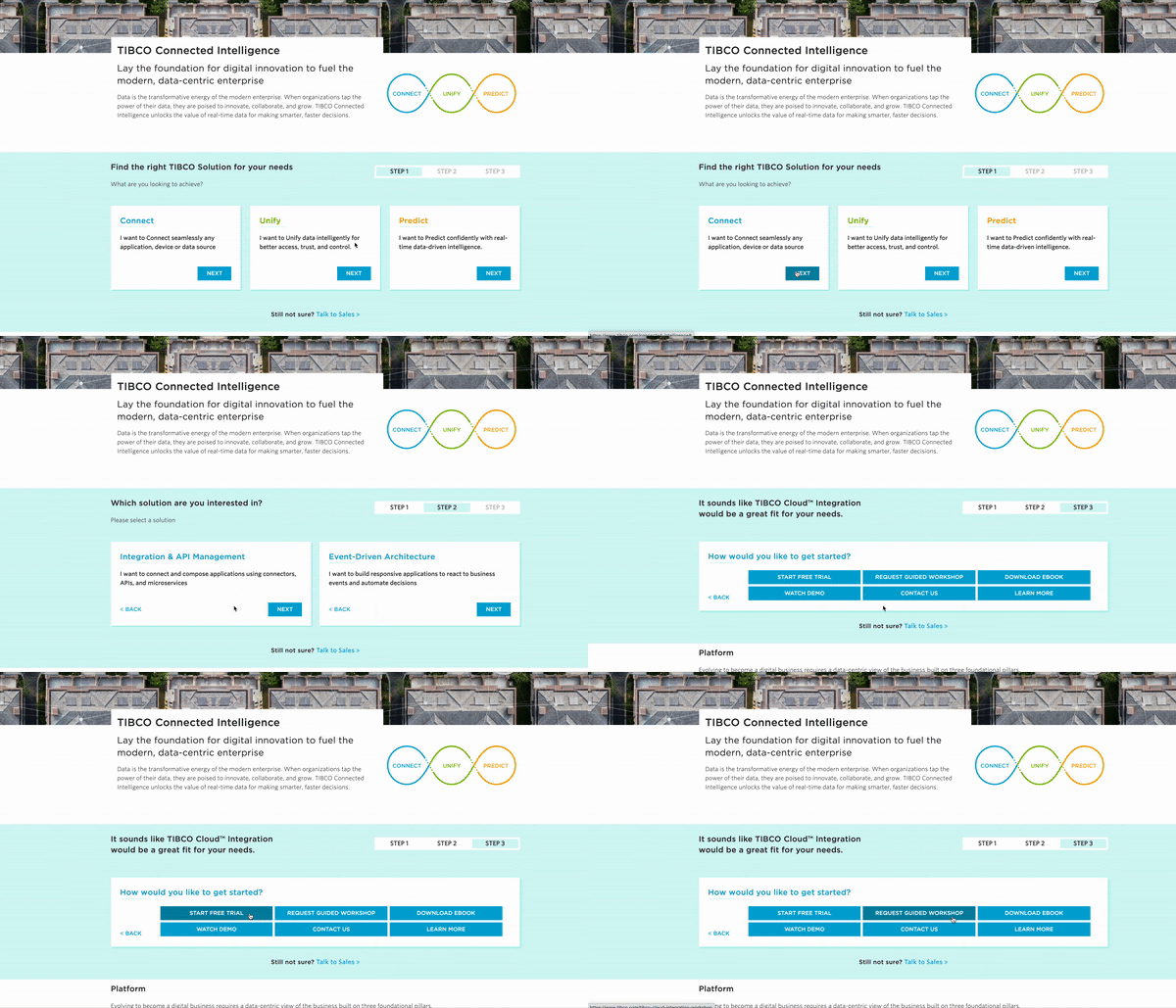
This is an example of one of our clients, where on the left you see their traditional static page. As you see there, it’s your typical solution type page where you provide a lot of content. And give them their choice but through a lot of text and diagrams.

Step #3 Product Page: help them find the right solution

On the right, it’s taking that same content and packaging it up into interactive questions to make it easier for them to kind of, again, find what they’re looking for, raise their hand, express their intent or interest, and you help navigate them to the option that makes the most sense. So we saw some very positive engagement and conversion metrics when we did this technique on product pages like in this example here. But the whole idea here is you’re trying to provide that educated, guided hand that helps them find better what they’re looking for based on what they told you. So in this case you’re being helpful, helping them complete their job better, and in a more timely fashion. And of course, this makes sense on your product and pricing pages. So when you have packages and plans, most B2B sites have your typical good, better, best, here are three or four plans, whether it be based on company size or number of seats needed, or whether it be based on certain features, that’s your typical layout that we’re all used to.

On the product pages, a nice technique is to really use the strategy to help them find the right solution.

Step #4 Plans/Pricing Page: help them find the right package

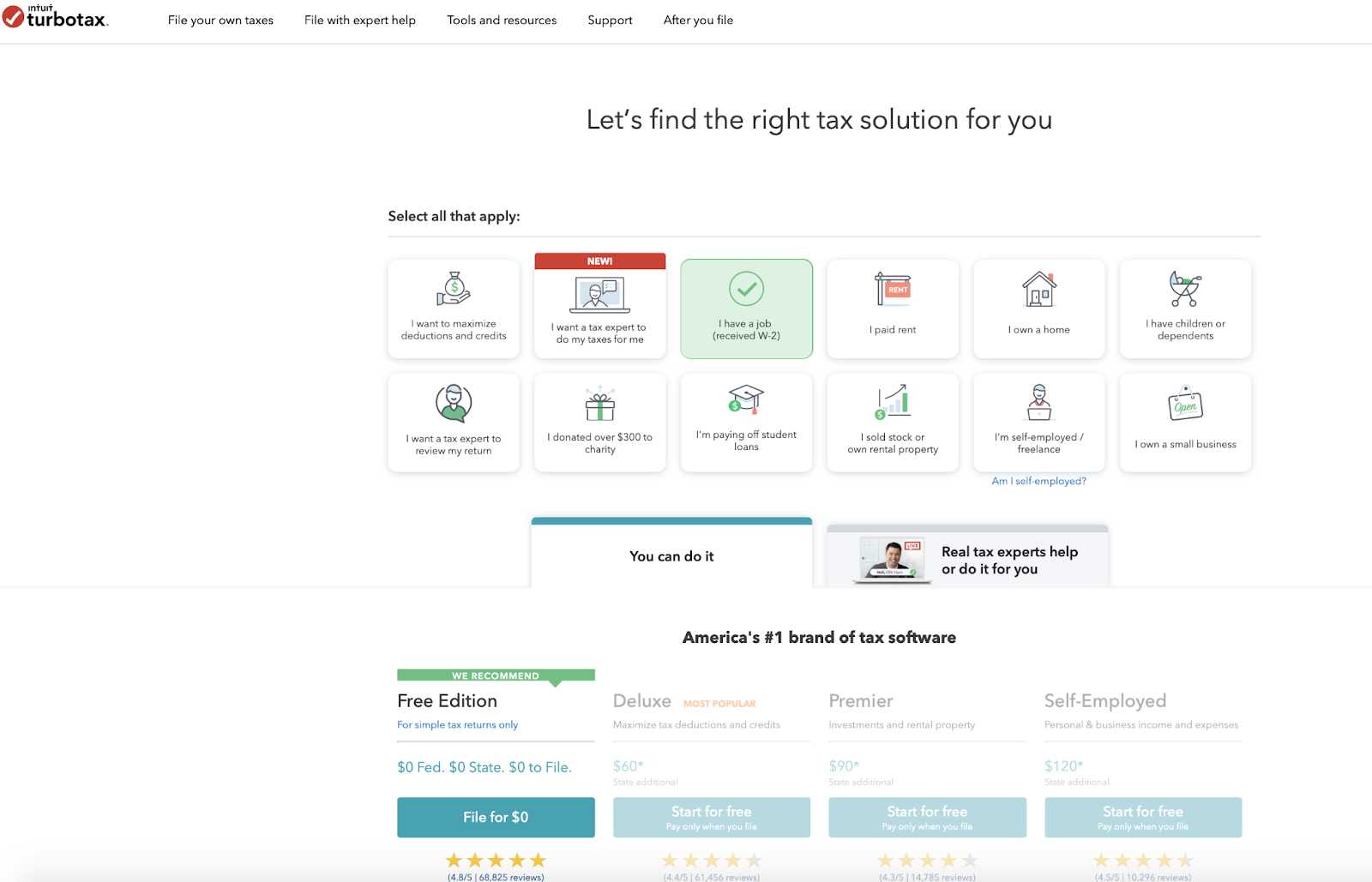
The plans and pricing page is also another great place to use it to help them find the right pricing package or combination.

So we’re not saying you have to move away from that, but in these examples here they still show those tables of plans, but in both examples here they give options where, if you want to specify your interests or what you’re looking to do, or maybe talk through a questionnaire about who you are and what you’re looking for, they can then narrow down the plan packages to fit what you provided them as far as intent or profile. So the whole idea here is that, when you have a little more complex set of packages and pricing plans, rather than have them guess or maybe choose incorrectly, or maybe just waste their time combing through all of this, you give them an easier path of which they just simply specify what is their key intent, profile questions, and use that information to help narrow and guide them down to the right package or pricing plan that works for them.

Again, you know your product more than anyone else. You’ve seen the success of your products and packages on a variety of clients across your industries. This is all about using that intelligence to better guide new visitors, who first come to your site, come to your pricing page, and help them find a solution that fits their needs and best matches their profile. Because you want them to be successful, and this is your chance to guide them down that path in a more direct way. And both sides will win in the end.

Step #5 Quizzes/Calculators: help them get insights

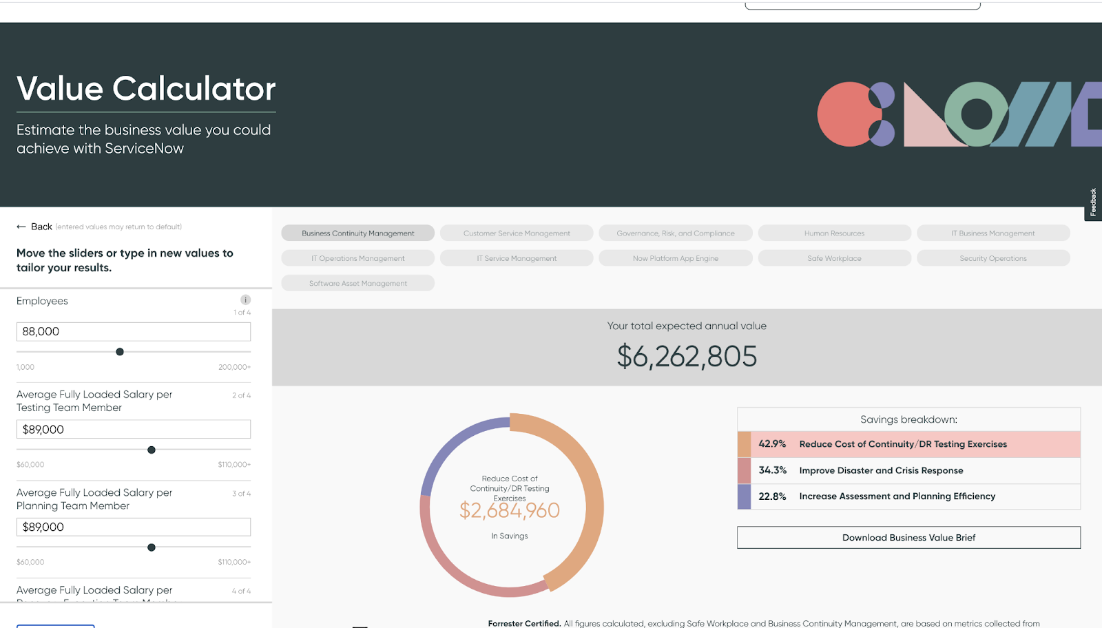
    And lastly, we shouldn’t forget the fact that, for most B2B sites, they do have interactive experiences typically in things like your ROI calculators, your organizational assessments, your company benchmark, and your various quizzes, right? So by all means, these are great options and techniques. We encourage you to keep using them. So in the end we’re just fans of anything that provides that interactivity. We’ve seen, from years and years of testing, that whenever you can give the visitor a chance to interact, raise their hand, you make it easier for them to get started, you reduce the complexity of that visit by allowing them to be guided down the right path. And you actually end up having more control over where they go through their journey, which is what we really want to do. Ideally, if we had a choice, we’d want to guide each visitor on the right journey for them.

    Since we can’t really predict who they are and what they want, we think interactive experience are the best way to meet in the middle and provide them a set of choices that allow them to kind of really narrow down to their best options based on what their profile is and based on what their intent is. So it’s really a win-win for both sides.

    Key Takeaways

    1. Multi-Step experiences, especially on the forms, work great as a great conversion tactic
    2. It works even better when combined with your ABM/Personalization strategies. So this is a great example where your conversion techniques and your strategic techniques should really work well together because they really compliment each other very well.
    3. They really work well in a couple of key places, like your homepage, your product pages, your pricing and packaging pages, as well as your traditional quizzes and calculators.
    4. Here are 5 ways to get started:
      1. Homepage: Start them in a conversion funnel
      2. Homepage: Route them to the right page by intent
      3. Product Pages: Find the right solution(s)
      4. Pricing/Plan: Find the right package
      5. Quizzes/Calculators: Provide custom insights

    So really want to say here, we want to advocate for it, try it out, explore this on your site, you really won’t regret it. This is, again, better experiences for all.

    And then lastly, as I said, if you haven’t had a chance yet, go visit our site. We have a couple of other videos that talk a little more in-depth about the strategy, especially as it relates to forms and personalization, and ABM. So check it out if you haven’t had the chance yet.

    1. Introduction to Multi-step Interactive Forms
    2. Multi-step Interactive Forms (Advanced Use Cases)

    If you have questions, just drop me an email. And if you want to see our own interactive quiz, you can hit our website. And that quiz will actually help you evaluate whether you’re the right fit for working with us. So check it out and hopefully we can talk soon. With that, take care.

    Optimize your Revenue Funnel by Focusing on the Offers

    Let’s take a step inside the data-driven demand generation marketing team. The biggest concerns on the CMOs radar are that the acquisition costs are too high and not hitting their pipeline or revenue goals.  Now looking at the data, we know that not only are they spending a lot on paid and organic traffic, but the quality of the traffic is good, and it’s not converting.

    So, of course, the next question would be – what can they do about it? A common answer is to focus on website conversion rate optimization, which involves running online experiments. That’s something you can put a budget around and prioritize but recognize that your executives are going to want to see impact based on pipeline and revenue and probably want to see it fast.

    Online Experimentation

    Back in 2017, the Harvard business review published an important article digging into the power of online experimentation. In it, they correlated successful business outcomes to a culture of experimentation. 

    harvard business review article title

    Image Source: The Surprising Power of Online Experiments (Harvard Business Review | Link)

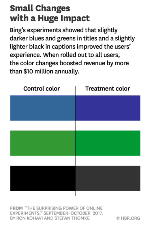
    The article cited examples like the one below from Bing,  who tested multiple different colors on their site, ran experiments. and realized an incremental $10 million in annual revenue from these experiments. 

    small changes with huge image image harvard business review article

    Image Source: The Surprising Power of Online Experiments (Harvard Business Review | Link)

    Similarly, Google ran a test with 40 different shades of blue on their site. When they ran those experiments, they achieved $200 million in incremental revenue. Given these results, should we, as demand gen marketers, be running the same experiments?

    In our opinion and experience, no, you should not.

    You’re not Google or Bing. Leaving aside traffic considerations, you’re trying to influence B2B buyer behavior over customer journeys. And the reality is that groups of buyers that consider enterprise solutions are not going to buy based on the button color or other small cosmetic changes.

    This is important because experimentation comes with a cost. Not only do you have people and the technology costs of running online experiments, but also your organizational ability to make decisions. So, focus on the elements that would deliver revenue and influence those B2B buyers when you’re thinking about experimentation.

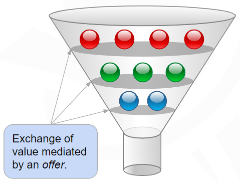
    When we think about the B2B buying journey or the revenue funnel it’s common to conceptualize it as a series of buyer stages. As prospects progress through those stages, they do so through exchanges, in which you’re offering something to that prospect in exchange for something else. The offer could be some content in exchange for their attention, an event, or an opportunity to speak to the sales team in exchange for their contact information. Ultimately those offers are how they learn more about your solution and how it would benefit them. 

    funnelenvy funnel image

    From our experience and the testing that we’ve done, the highest leverage use of experimentation for the demand gen org is to improve the relevance of those offers and the ease of engaging with them throughout the buying journey. Of course, we always want to ensure we measure the impact of those experiments based on the KPIs that matter – pipeline and revenue.

    Optimizing Offers

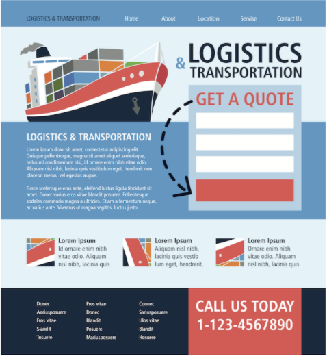
    logistics transportation image of form

    What does it mean to optimize offers? There are three components to an effective offer. One, of course, is the offer itself. That item you’re proposing to exchange with that visitor or prospect for them to understand your solution. The more relevant it is, the more effective your ability to convert them will be.

    The second important aspect is how you frame it. Our primary focus here is the headline and Call to Action (CTA). Your headline is important because a visitor will spend five or ten seconds deciding if they want to stay on your site or hit the back button and go somewhere else. So, entice them to continue reading the content on the page.

    Finally, the third element of the offer is the exchange and how they provide what you want. Most likely on your site this is a web form, but it doesn’t need to be. It’s increasingly common to see conversational marketing tools (chatbots) that accomplish the same thing by providing that medium of exchange for the offer.

    Examples

    Let’s look at some examples of how you could optimize your offers.

    Landing pages are a great starting point for thinking about your offers. Many of you are probably running traffic to dedicated landing pages and putting an offer in front of the visitors hitting it. But not every visitor is interested in the same offer. In the example below, we recognized when working with a customer that they had three viable offers for those visitors coming through their paid campaigns. And rather than only showing them one, we use data to dynamically personalize the offer itself as well as framing and the page layout to reflect what might be most relevant to that visitor.

    landing page offers comparison

    When we ran the experiment against the static landing page we saw a 44% improvement in revenue per visitor. 

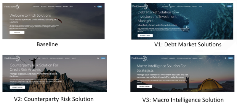
    For most of us the most trafficked page on our site is the homepage. And on your homepage the “above the fold” section at the top gets most of the attention. Many of us think about our homepage in the context of welcoming the first time visitor and introducing your solution as in the example below.

    fitch-solutions-landing-page

    For SaaS and Demand Generation websites it’s common to have a lot of returning traffic. Since return visitors are familiar with your solution, it wouldn’t make sense to show them that same offer. In an experiment, we targeted these return visitors and the solutions they showed interest in and presented them on the homepage. In this case, those offers were buried in the site and require additional navigation. By presenting this offer they would likely be interested in and serving those directly on the homepage, we saw almost 55% improvement in conversions coming through this page.

    fitch-solutions-home-page-offers

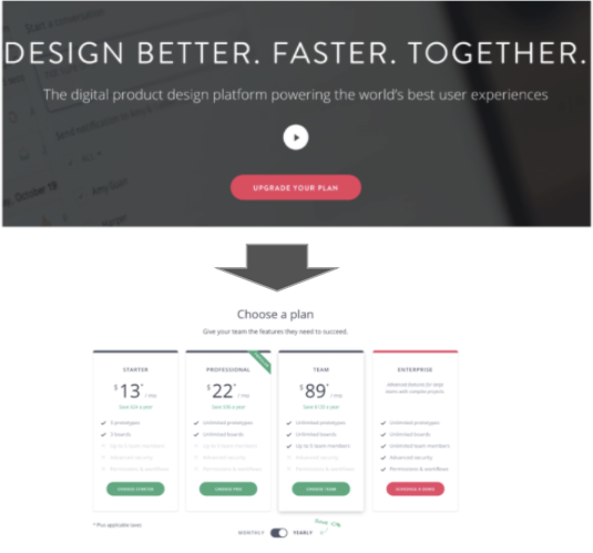
    You can also target well-defined buyer stages. In the following example, we have a customer with a freemium model where visitors on the free plan come to the homepage and see a CTA or a button prompting them to “Upgrade Your Plan”. The baseline experience was to take them to a set of SaaS plan tiers where they could select the one that they would upgrade to. 

    pricing-table-personalization-offer

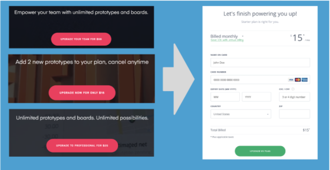
    Using this data, we can identify the specific plans most relevant for any individual and offer them directly on the homepage. The framing included the benefits and replaced the CTA with the cost of that specific plan we recommend. Since we recommend a single upgrade plan, we bypassed the plan selection (and the friction it created) and took them directly to the credit card to upgrade. By removing friction and presenting them with a more relevant offer, we saw an almost 70% improvement in revenue per visitor coming through this experience.

    buyer-stage-changes-to-website

    The most common mechanism of exchange for the offer is the web form, and as a result, we spent a lot of time optimizing them. It’s important to recognize that there’s a lot of friction for the visitor when they encounter one of these forms.Even if they’re interested in the offer, they face the prospect of handing over their email and other personal information, which often presents a big hurdle. Since it’s common to see drop-offs at this stage, we would like to take those contact forms and reinforce the benefit and the value to the visitor filling them out. In the following example, we tested an updated version of the form page resulting in an 85% improvement in conversions.

    form-optimization

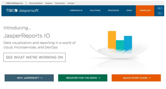
    If you have the data, you can get sophisticated with offer personalization. It’s common to see pages like the one below. It is a product page that contains multiple offers for different personas within the organization. Unfortunately, when you try to put them all on a single page, they compete for attention and blend in, making it hard for users to know which one is relevant for them. 

    TIBCO-homepage-before-personalization

    In this case, we target specific personas visiting the page based on data we had in the marketing automation platform and identify the most relevant offer. By testing variations that replace the default experience with a single focused offer, we see an almost 50% improvement in revenue per visitor.

    TIBCO-homepage-after-personalization

    Final Thoughts

    It’s possible to waste time, effort, and money optimizing inconsequential elements of your website. For demand generation marketers, the highest leverage things to focus on are the offers – specifically their relevance to the visitor and the ease of engaging with them.

    Before you undertake this experimentation it’s important to make sure you have solid revenue insights. What that means is, evaluating your existing offers as well as future experiments based on their pipeline and revenue contribution.

    Some of the personalized examples above require some segmentation. Our recommendation is to prioritize segmentation based on the differentiated intent and addressable size of those segments. We often find that marketers are running building audiences that can only address 5-10% of their audience, or ones that don’t have meaningfully different intent from one another. Ultimately those aren’t going to have much value when it comes to optimizing offers.

    This is why we start with buyer stages as our starting point for segmentation because it a large set of well-understood segments with differentiated intent – buyers at different stages will naturally gravitate towards different offers. The vast majority of the visitors coming to a demand gen site fit into anonymous, known lead, active opportunity or existing customer.

    Finally, when it comes to improving offers, start with common sense ideas. If you start thinking about your buyer stages, some opportunities should become apparent. For example, should a known lead see a lead capture form, or can we repurpose those pixels for something more relevant? Similarly, should existing customers see the “Request a Demo” or “Talk to Sales” CTA? Maybe there’s an opportunity to get them to support resources or event upsell them. 

    What’s stopping you from generating more revenue by improving offers on your website? If you’re a Demand Gen marketer and need help, feel free to get in touch.

    How Hotjar Can Help You Convert More Leads

    Hotjar is a great complement to Google Analytics. Layering qualitative and visual data over the raw numbers gives you another dimension of insights.

    But just like with your Google Analytics data, if you ignore key segments, you do so at your own risk.

    Imagine, for example, that a heat map shows you that only 20 out of every 1,000 of visitors click on your Product Tour CTA. In fact, the scroll map shows you that only 15% of visitors even reach that section of the page.

    You might conclude that the section and CTA don’t matter, and consider removing them.

    Now imagine that all 20 of those visitors are leads – visitors who have identified themselves by signing up for a free trial, downloading a resource, or attending a webinar. Suppose that on average 15 of those 20 leads end up turning into opportunities. The Product Tour just went from wasted space to one of the highest-value interactions on the site!

    Fortunately, it just takes a bit of work to begin segmenting your most valuable visitor data in Hotjar. Let’s look at how to do this with leads.

    Why leads?

    While leads might not be your most important identifiable visitor segment, for most B2B SaaS sites they deserve special attention. In fact, they’re already getting special treatment in your nurture campaigns. (Right?) And hopefully you’re personalizing offers and CTAs for them as well.

    Still, the steps below will work for any segment you can identify. Target accounts, industry of interest, or existing customers can all be given VIP status in Hotjar.

    Setup

    Before you begin, make sure you have two things in place.

    1. Hotjar Plus or Business

    The free plan doesn’t support custom tags and triggers.

    2. A way to identify leads on your website

    Not sure how to do that? This post will walk you through it. And if you’re using Marketo, FunnelEnvy automatically syncs lead status with all your frontend tools – Google Analytics, Drift, Google Optimize, and yes, Hotjar.

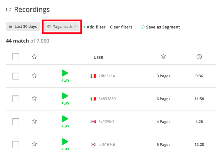
    Tag session recordings

    Watching playback of visitor sessions is a great way to put yourself in your customer’s shoes. It’s also dauntingly time consuming. One day’s worth of recordings could take a month to view.

    So clearly you need to prioritize what you focus on. Watching a half dozen leads interact with your website will yield more insight than watching a hundred anonymous visitors land, scroll, and bounce.

    All you need to do is execute a single line of code when you identify a lead on the site:

    hj('tagRecording', ['leads']);

    Set this up, and you’ll be able to filter recordings later.

    Screenshot of Hotjar recordings filtered for leads

    (See the Hotjar docs for more detail on how this works.)

    Trigger heat maps

    Instead of mixing clicks from anonymous visitors, customers, and leads all into a single heat map, you can create one for leads only.

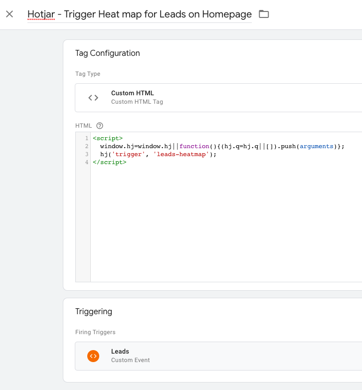
    You’ll need to create a heat map with a JavaScript trigger, then fire the trigger when leads visit the page in question.

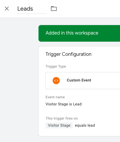
    If you’re using FunnelEnvy for Marketo, it’s as easy as adding a Trigger to Google Tag Manager:

    Screenshot of a Trigger in Google Tag Manager

    (FunnelEnvy for Marketo can push visitor stage to the Data Layer, meaning you can use it to trigger any Tag)

    Then create a Custom HTML Tag to fire the Hotjar code:

    Screenshot of a Custom HTML Tag in Google Tag Manager

    Create a custom poll for leads only

    What page has the highest exit rate? What page do visitors spend the most time on? What are they looking for, and not finding?

    The answer is probably different for leads compared with anonymous visitors. The only way to find out is to ask.

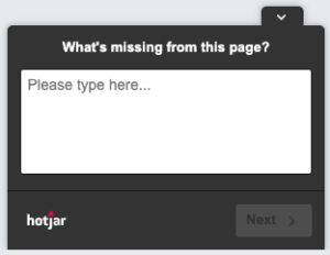
    Lucky for you, you can trigger a custom poll with the same code that triggers custom heat maps.

    So if you’ve added the Google Tag Manager logic shown above, all you have do to is create a poll with a JavaScript trigger. And you’re done!

    Screenshot of a Hotjar poll

    Ask every visitor this question, get a lot of noise. Ask leads only, find out what matters

    Where to start

    There’s a lot you can do to better understand (and more effectively convert) leads on your website. As a first step, just tag and watch some session recordings to see how leads navigate your site.

    This requires a way to identify those leads in the first place. Solve that problem once, though, and you open up deeper insights in Google Analytics, custom playbooks in Drift, and personalization options in Google Optimize.

    If you’re using Marketo, FunnelEnvy solves this for you. No need to bring in the dev team and turn it into a multi-month project. If you’re ready to start giving leads the special treatment they deserve, just get in touch.

    By |2020-08-03T11:54:09-07:00July 13th, 2020|B2B, SaaS, Analytics, Strategy|0 Comments

    Minimum Viable Personalization for Leads

    Your website receives visitors in different stages of the buying process, who have varying needs and priorities. You recognize this, so you’ve installed a personalization platform. Where to begin?

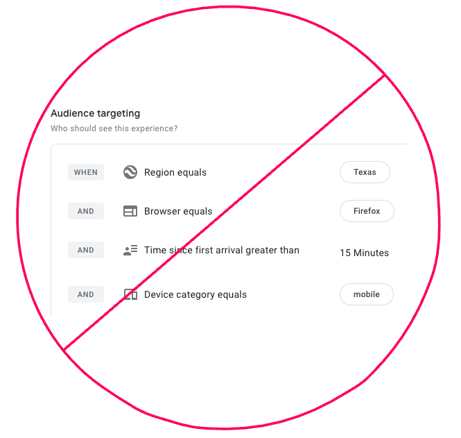
    First, a word on what not to do. Do not get click-and-drag happy with your platform’s audience tool, and end up creating a monstrosity like “Returning visitors from Texas using Firefox on Mobile.”

    Complex audience targeting rules, X'd out

    These audiences are easy to target, but hard to reason about, painful to maintain, and impossible to extract value from.

    Instead, start with leads.

    Why leads? (And what’s a lead?)

    The exact definition will depend on your customer journey, but broadly speaking a lead is any visitor who has identified themself on your website.

    This might include:

    • Free trial users
    • Whitepaper downloaders
    • Webinar attendees

    Put another way, leads are visitors who are neither paying customers nor anonymous.

    As for why you should provide a personalized experience for them, there are three main reasons:

    1. You can. They’ve signed up, so you know something about them.
    2. They’re your second-most-valuable visitor segment. (Customers are #1, but that’s a topic for another day.)
    3. Your current website is probably dominated by top of funnel content that they’ve already seen, and no longer find valuable.

    Given how important this group is, it makes sense to provide an experience that’s relevant to them. But how do you do that without rewriting your whole website?

    Where to personalize

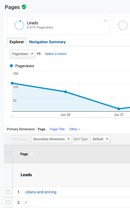
    Meet your leads where they’re already spending time. Finding out the answer to this question is as simple as segmenting your analytics data by leads, then looking at top pages.

    The answer is probably “the Homepage and the Pricing page” but don’t take my word for it. Let the data tell you where to focus, and what kind of reach you can achieve.

    Google Analytics screenshot of top pages visited by Leads

    Once you’ve identified the top pages visited by leads, you can further prioritize by focusing on the elements they see and interact with.

    For example, Hotjar allows you to trigger heat and scroll maps with custom code. That means you can create a “Leads only” heat map of your home page. (If that’s too hard, just keep your focus above the fold.)

    How to personalize

    This step is where the magic happens. What unique questions do leads on your website have? What tasks do they prioritize? What does activation look like?

    To help structure your ideas, look for chances to do three things: Educate, remove friction, and nudge.

    Educate

    Does your homepage hero heading tout your product’s core value proposition? That’s great, but your leads probably know it by now. Can you change it to outline an important differentiator?

    Does the homepage hero CTA still say “Free Trial”? You definitely don’t need that. Does it make sense to link to your knowledge base, or a quick start guide?

    Remove friction

    A simple improvement you can make is to show your free trial leads a more prominent “Log in” or “Visit My Dashboard” button. There’s a good chance that’s what they came to click.

    You can also disable widgets and popups focused on lead generation. Those elements, by definition, can’t provide you with a new lead in this context. All they can do is annoy an existing lead.

    Nudge forward

    What steps does a visitor have to take before obtaining value from your product? Configure an integration, view a dashboard, import contacts?

    When they were new to the site, pushing them toward this would’ve been overwhelming. Now that they’re more familiar with your product, though, they need this guidance.

    Does your chat widget still ask “New here? Got any questions?” Why not start an onboarding-related conversation instead? A simple script along the lines of “Have you imported your contacts yet?” can transform this chatbot from a nuisance to a touch point for upgrades.

    Stuck for ideas? Here are a couple of suggestions for websites we at FunnelEnvy know and love.


    What you can do today

    The first step toward obtaining value from a personalization strategy is convincing yourself that it’s worth the effort. So, start there.

    What is the single highest-traffic page for existing leads? How many visitors does it get each month?

    What’s the single most impactful element on that page? If you’re not sure, start with the hero heading copy and CTA.

    What’s the current experience for leads? Is it relevant at all? Can you think of a message that would easily be 10 times more helpful?

    If so, you’re onto something.

    The good news is that the technical hurdles involved in making this change are solvable in any number of ways.

    Your personalization tool might support targeting based on past visits to the /dashboard page. You might convince a friendly dev to set a cookie for new signups. If you use Marketo, FunnelEnvy lets you target by Smart List.

    So take your newly acquired vision for a better lead experience, share it with the team. You’ll be hard pressed to find someone willing to fight to keep redundant CTAs on the page. I doubt anyone will argue that converting leads to sales is a wasted effort.

    Starting personalization with a well-defined, high value, high reach, and observably different audience segment will make the difference between real ROI and a cringe-inducing vanity metrics report. So let’s go nurture some leads!

    By |2020-07-10T09:40:07-07:00July 2nd, 2020|Analytics, SaaS, B2B|0 Comments

    Personalizing the Revenue Journey with Segment Data

    Accelerate your customers journey to revenue with FunnelEnvy, now powered with Segment.

    Segment helps their customers instrument, store and unify data about their visitors and the actions they take all the way to revenue. Now with the FunnelEnvy Segment integration you can deliver personalized, 1:1 website experiences and optimize for revenue using all of that rich customer data that you’re already collecting in Segment.

    What does this mean? Segment customers will be able to run more effective campaigns using better data with less custom code required.

    Check out our integration on Segment

    (more…)

    The Reason Your B2B Website is No Longer Effective

    The 1907 Quakers from the University of Pennsylvania were the juggernauts of college football. Heading into a home field matchup with the Carlisle Indians they had not only won, but dominated their previous seven games by a combined score of 189-10.

    Their October home game on Franklin field against Carlisle wasn’t expected to be much different. Although the Indians were also undefeated, they were a group of unheralded, undersized players that the 22,800 fans in attendance didn’t give much of a chance against their mighty Quakers.

    So what happened? Carlisle demolished Penn 26-6. The most notable play of the game was fullback Pete Hauer’s 40 yard perfect spiral pass that sports historians would later call one of the “three or four signal moments in the evolution of football” and “the sporting equivalent of the Wright brothers taking off at Kitty Hawk.”

    These historians attribute Carlisle’s stunning upset that Saturday to Carlisle coach Pop Warner’s exploitation of a rule change that was adopted a couple of years earlier. In order to curb the surging violence in football schools adopted a number of rules changes, most notably legalizing the forward pass.

    Warner decisively capitalized on this rule change, confusing the Quakers with long passes and new formations. Penn was playing by the old rules, and caught completely unprepared for the new era of football that they had the misfortune of writing into history that day.

    (more…)

    By |2018-10-20T21:47:07-07:00March 7th, 2018|B2B, Uncategorized, The Funnel, Strategy, SaaS|0 Comments

    How to Develop (and Optimize) a Profitable SaaS Pricing Strategy

    When you’re running a SaaS business, it’s easy to feel overwhelmed.

    There are mountains of critical issues to deal with. Everything from improving the software and delivering a high quality customer experience, to reducing churn and making payroll every month.

    Unfortunately, sometimes these demands drive SaaS businesses to overlook a crucial factor for their success: price.

    Drawn out conversations and research is the last thing most people want to do after months (or years) spent developing the software and bringing it to market.

    The temptation to just go with a price that feels right—to just “ship it” and see how it goes—is strong. It’s easy to tell yourself you’ll worry about this stuff later—once your business gets off the ground.

    But overlooking price in the beginning can set you up for an uphill battle. Here’s how:

    (more…)

    By |2015-07-24T13:08:39-07:00June 4th, 2015|SaaS|0 Comments

    SaaS Churn Rate: Why It Matters (and What to Do about It)

    Ever feel like you can’t keep up?

    Practically everyone has felt like this one time or another. SaaS business owners have it especially tough.

    Sometimes it feels like you’re on an endless treadmill. You’re running as hard as you can just to replace customers who slip through the cracks. And you can’t dare let up no matter how exhausted you are. Otherwise your business starts shrinking instead of growing like you need it to.

    Getting ahead seems out of the question when you’re working as hard as you can just to stay even with all the people who are leaving.

    Your SaaS churn rate, the percentage of customers (or recurring revenue) that leave your business over a specified duration, is a vital sign of your business. It’s one of the best metrics you can use to value your company and assess your performance.

    Here’s why it matters—and how to keep your business healthy and profitable.

    (more…)

    By |2015-05-27T16:07:34-07:00May 28th, 2015|SaaS|0 Comments
    Go to Top