Beyond Aesthetics: How to Design High-Converting Forms That Capture the Right Leads (Without Losing Data)

In the ultra-competitive SaaS digital marketing and B2B lead generation world, strategic social media and content marketing to generate leads is only the first step. Contact forms must do the heavy lifting and capture info from a healthy share of website traffic. 

Every form submission counts. Some of the most common questions we hear are about how to design high-converting forms. Many businesses struggle with lead generation forms plagued by low completion rates, unqualified leads, and data errors.

This struggle begs the question: how can you design user-friendly and effective forms that capture valuable leads with clean data?

The answer lies in a strategic approach that goes beyond aesthetics. Here are some best practices and tips for how to optimize your B2B forms for conversions and ensure accurate data capture:

The UX Advantage: Why Beautiful Forms Convert Better 

First impressions matter, so your web design is critical. Remember that your visitors usually encounter forms within the context of your website design, so the forms should integrate seamlessly into the website experience.

Beyond that, poorly designed contact forms can create user experience (UX) friction, leading to frustration and form abandonment. Below, we look at how prioritizing UX can significantly improve conversion rates.

How to Design High-converting Forms

  • Streamlined Design. Keep it simple! Building trust with top-of-funnel visitors takes time. Limiting the number of capture form fields to only the most essential information feels less invasive and helps optimize your conversion rate.
    For example, asking for a phone number may be a turn-off for some prospects. Consider an a/b test to see if there is a difference in conversion rates with and without the cell phone input field. Utilize clear labels and intuitive layouts to guide users through the process effortlessly.
  • Social proof. Include brief social proof, like testimonials. Downloadable case studies that go deeper with social proof can help increase form conversion rate and move prospects down the funnel.
  • Engaging Visuals. Incorporate visuals like icons, progress bars, or subtle animations to make your form more visually appealing. Remember, white space is your friend – avoid cluttering the design. Consider implementing a/b testing to determine which visual elements are most effective.
How to Design High-Converting Forms

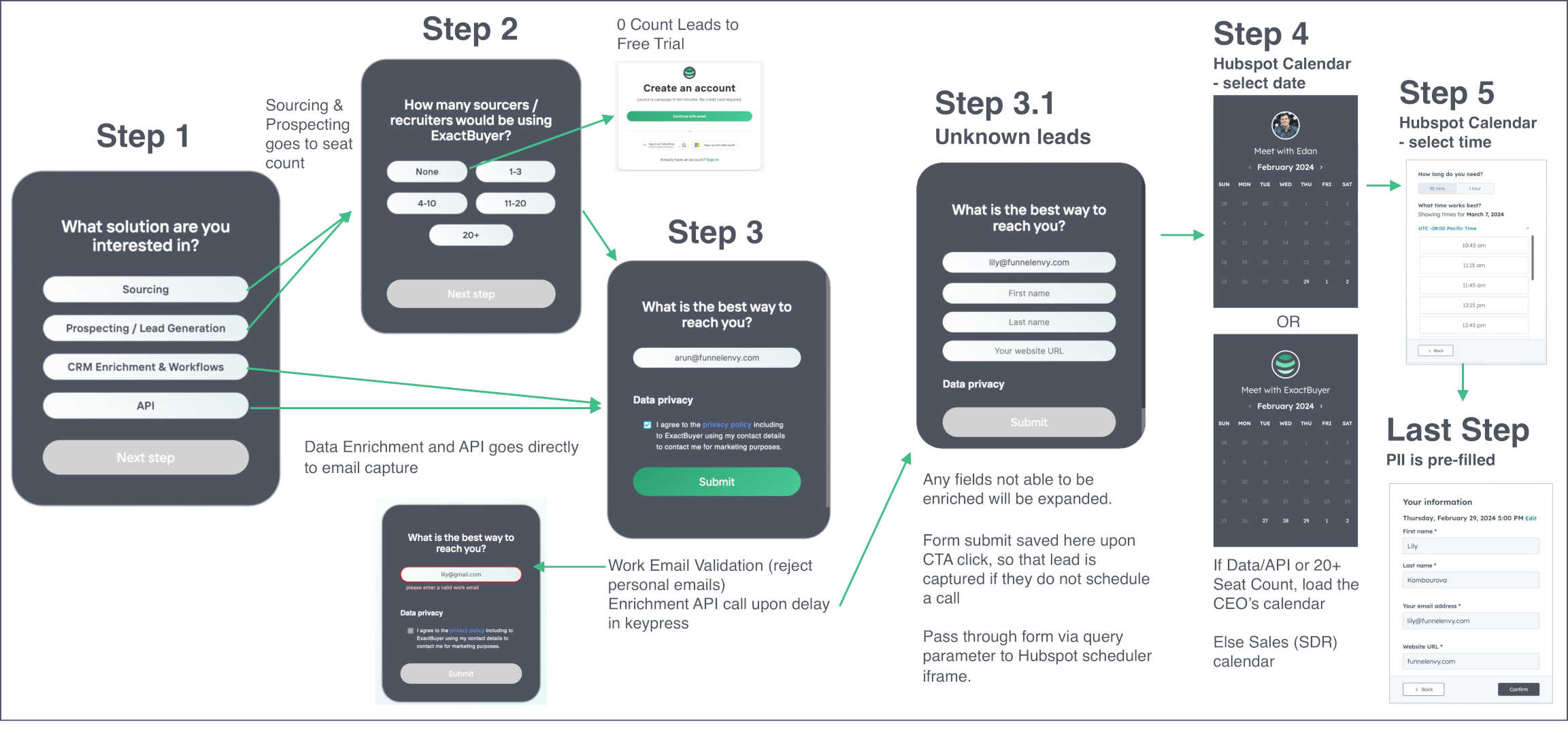
Source: Funnel Envy / ExactBuyer Case Study

Sometimes its helpful to see an example in action. Check out our Case Study for ExactBuyer, a a data enrichment and sales enablement SaaS.  By partnering with FunnelEnvy to implement a Reform custom lead capture form, ExactBuyer was able to roll out a multi-step form workflow that included routing, qualification, enrichment and integration with Hubpsot. 

The new form experience increased conversions from high quality prospects while simultaneously filtering out spam and low quality leads.

A/B Testing: The Power of Data-Driven Decisions

In today’s digital marketing landscape, data is king. A/B testing allows you to collect data from different versions of your forms and see which performs better. It can be anything from testing different headlines and layouts to experimenting with the number of form fields.

At Funnel Envy, we use AI to power up traditional A/B testing. In general, here’s how A/B testing can benefit your B2B lead gen forms:

  • Identify Conversion Killers. Test different elements of your form to pinpoint what’s hindering conversions. Is it the length? The wording of a specific question? A/B testing helps you isolate these factors and make informed decisions.
  • Optimize for Different Audiences. Consider segmenting your audience and testing variations targeted to specific user groups for a more personalized experience and potentially higher conversion rates.
  • Continuous Improvement. A/B testing is an ongoing process. By consistently testing and refining your forms, you can ensure they stay optimized for maximum performance.
  • Mobile-Responsive Design. Optimize your lead capture forms for all mobile devices. With the rise of mobile browsing, a responsive design is no longer a luxury; it’s a necessity for high conversion.

Beyond Design: Conversion-Focused Features for High-Quality Leads

Aesthetics are important, but a truly high-converting lead gen form goes beyond just looking good. Here’s where built-in conversion optimization tools can make a real difference:

  • Conditional Logic. Personalize the form experience by dynamically showing or hiding fields based on user selections, increasing user engagement and reducing irrelevant data collection.
  • Progress Indicators. Clear progress bars or step indicators let users know where they are in the form completion process, building trust and motivating users.
  • Clear Error Messages. Eliminate frustration with helpful and specific error messages that guide users toward correcting their input.

Capturing the Right Data: FunnelEnvy’s Approach to Form Design and Optimization

At FunnelEnvy, we understand that effective lead capture is about quality, not just quantity. Here’s how we collaborate with you to optimize your lead generation forms:

  • Targeted Questions. We work with you to identify the information most valuable for qualifying leads. This process ensures your contact forms capture the right data, allowing you to focus on nurturing leads with a higher conversion potential.
  • Compelling Value Proposition. Why should users fill out your form? Craft a clear and concise value proposition that entices users to complete the form by highlighting the benefits they’ll receive (e.g., free trial, white paper download).
  • Data Validation and Enrichment. Prevent errors and incomplete data with built-in data validation tools. Consider data enrichment options to enhance your lead profiles with valuable insights.
  • Seamless Integration: Keeping Your Data Flowing Smoothly. A well-designed form is only half the battle. Ensure smooth data flow by seamlessly integrating your forms with your existing marketing ecosystem. This flow allows you to automatically route leads captured by your contact form into your CRM, marketing automation platform, or email marketing software.

The Benefits of High-Converting Forms 

By investing in form optimization, you unlock a multitude of benefits:

  • Increased Conversion Rates. High-converting forms capture more qualified leads, pushing your sales and marketing teams closer to their goals.
  • Improved User Experience. A streamlined, user-friendly form experience builds trust and fosters positive brand perception.
  • Enhanced Lead Quality. Capturing the right data allows you to segment your leads effectively and personalize your marketing efforts for better engagement.
  • Accurate Data Capture. Minimize data loss and errors with validation tools, leading to cleaner lead profiles and more efficient marketing campaigns.

Advanced Techniques: Taking Your Forms to the Next Level

Once you’ve mastered the basics of form optimization, you can explore more advanced techniques to further enhance your lead capture efforts. Here are a few examples:

  • Multi-Step Forms: Break down lengthy forms into smaller, more manageable steps, which can improve user experience and reduce abandonment rates. We have created a deep-dive video series on how multi-step forms can help solve the problems of low-converting forms and poor lead quality. Check it out here!
  • Progressive Profiling. Gradually collect more information about leads over time through interactions and website behavior. This information allows you to build a more comprehensive profile without overwhelming users upfront.
  • Hidden Form Fields. Some form fields can be pre-populated with information from user behavior or previous interactions. Doing this allows you to personalize the experience and reduces the need for manual input.

Moving Ahead: The ROI of Investing in High-Converting Forms

Optimizing your B2B lead gen forms is an investment that pays off in the long run. Focusing on user experience, capturing the right data, and implementing data-driven strategies can significantly improve your lead-generation efforts.

Remember, high-converting forms generate more qualified leads, improve brand perception, and drive sales growth. Don’t underestimate the power of a well-designed form in your B2B marketing strategy.

Refrain from settling for mediocre results. A well-designed and optimized form can be a game-changer for your B2B lead generation strategy. We utilize a data-driven approach to crafting high-converting forms that capture the right leads with clean data every time.

Let’s talk! Consider partnering with FunnelEnvy to unlock the full potential of your lead gen efforts.

By |2024-06-10T15:09:29-07:00June 10th, 2024|Landing Pages|0 Comments

Fire Up Demand Gen and Sales: Best Practices for SaaS Landing Pages 2024

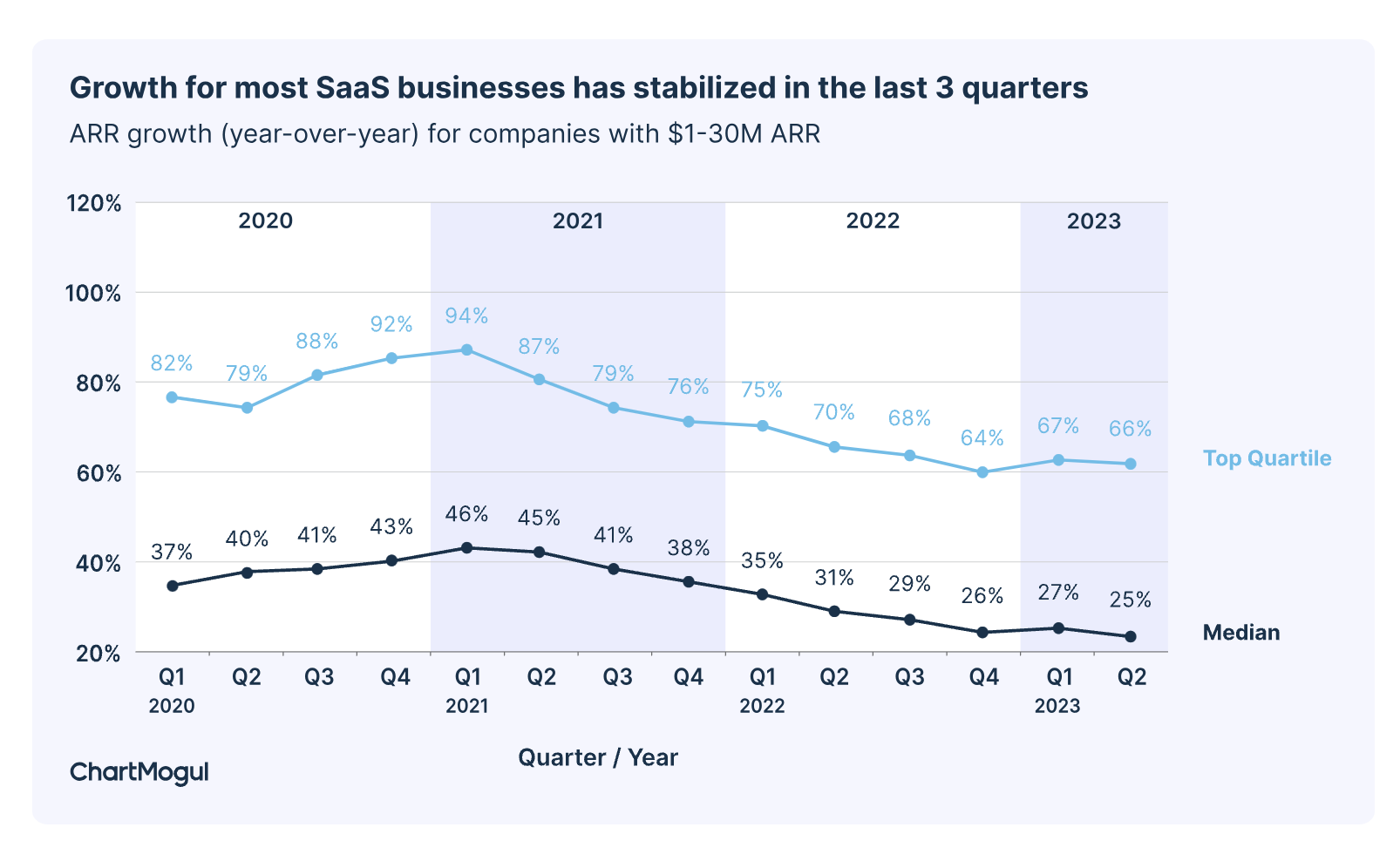
As global unrest and economic uncertainty persist, belts are tightening in most business sectors. While ChartMogul takes the optimistic spin that SaaS growth has “stabilized,” in reality, that translates to the fact that growth in many specific SaaS sectors is stalling or declining.

Best Practices for SaaS Landing Pages 2024

Source: ChartMogul

Optimizing consumer touchpoints is more crucial than ever. High-converting landing pages are strategic assets that transform curious visitors into engaged users and paying customers. 

Imagine a visitor landing on your website after clicking on a targeted ad. Their initial impression, shaped by your B2B SaaS landing pages, determines whether they become a lead or bounce away. Technology and consumer trends are changing, so we’ve adapted our best practices for SaaS landing pages in 2024 to reflect changing buyer expectations and new AI tools. 

Effective landing pages take time to optimize. They are part of strategic SaaS marketing campaigns that understand the different stages of the sales funnel. If you invest in ads, nailing your PPC landing page best practices is essential!

Just like buyers, landing pages are not one-size-fits-all. This post explores landing pages in the context of the SaaS funnel buyer stages: Awareness, Activation/Purchase, and Expansion/Upsell. But first, let’s look at some basics that every landing page should have, regardless of buyer stage. 

Global SaaS Landing Page Best Practices

Regardless of the prospect phase, the best SaaS landing pages share some common attributes. For inspiration, HubSpot offers many examples of best practices for landing pages. Additional tips include:

Regardless of the prospect phase, the best SaaS landing pages share some common attributes. Share on X
  1. Understand the importance of customer journey and intent.
  2. Use strong visuals and compelling copy throughout the landing page. Be sure your landing pages integrate with the website design to keep the customer journey on-brand.
  3. Ensure an optimal experience for mobile landing pages to ensure happy mobile users across devices.
  4. Prioritize page load time for quick access and improved engagement. Slow pages lead to an increased bounce rate.
  5. A/B testing at all phases helps optimize page elements to improve conversion rates continuously. You can optimize everything on the page with testing, from the CTA button color to your headlines. With multiple pages and stages, A/B testing can get overwhelming. At Funnel Envy, we’re used to dealing with that complexity. Reach out if you have questions.
  6. Closely track upgrade metrics. Monitor conversions, upgrade paths, and churn rates to understand what resonates with your user base and optimize your expansion landing pages accordingly.
  7. Measure performance metrics and track key funnel stages.

Sparking Interest: SaaS Landing Pages for the Awareness Stage

The awareness stage represents the first encounter between potential customers and your SaaS product.

At this point, visitors are likely unfamiliar with your brand, and their main focus is understanding how you can solve their pain points. The awareness stage can be the best landing page for lead generation. A common desired conversion is to capture email addresses for email marketing.

Key Strategies for High-Converting Awareness Landing Page

  • Hook Them with a Captivating Headline. Use clear, concise language that addresses your target audience’s pain points. Think benefit-driven statements that pique curiosity and promise a solution.
  • Showcase Solutions, Not Features. Don’t get bogged down in technical jargon. Instead, focus on your product’s benefits and how it makes users’ lives easier.
  • Visuals Tell a Story. Include high-quality images and videos that resonate with your audience and visually represent the value proposition. Think hero images, screenshots, or explainer videos.
  • Social Proof Builds Trust. Feature testimonials, case studies, and logos from satisfied customers to establish credibility and build trust with first-time visitors.
  • Frictionless Lead Capture. Offer valuable, downloadable content like e-books, white papers, or webinars in exchange for email addresses. Keep form fields minimal and focus on capturing essential information.
  • Clear Call to Action (CTA). A clear CTA button is essential. Tell visitors exactly what you want them to do next, whether signing up for a free trial, scheduling a demo, or subscribing to your newsletter. Use strong, action-oriented CTA buttons that stand out visually.

Key Tips for Awareness Landing Pages

  • Target Your Messaging. Personalize your landing page content to different audience segments for increased relevance and engagement.
  • Mobile-First Design. Ensure your landing page is responsive and optimized for mobile devices, where a significant portion of your traffic will likely originate.

Landing Pages for the Activation/Purchase Stage

Congratulations! You’ve successfully captured attention and ignited interest in your product during the awareness stage. Now comes the crucial activation stage, where you need to transform those intrigued visitors into engaged users and paying customers.

Best Practices for SaaS Landing Pages in 2024 to Generate Sales

Focus on Early Wins

  • Highlight Quick Value. Showcase how users can achieve tangible results and solve minor problems within the first few minutes or days of using your product.
  • Frictionless Onboarding. Streamline the signup, login, and onboarding process to minimize friction and ensure a smooth user experience.
  • Demo the Power. Utilize product demos, explainer and demo videos, and interactive walkthroughs to visually demonstrate your product’s key features and functionalities.

Drive Product Engagement

  • Showcase User Achievements. Display progress trackers, badges, or gamification elements to keep users motivated and engaged as they explore the product.
  • Offer Personalized Tutorials. Based on user actions and preferences, suggest relevant tutorials, knowledge base articles, or contextual help menus to guide them further.
  • Live Chat Support. Offer available chat support to address user questions and concerns in real time, fostering trust and a sense of community.

Nurture User Satisfaction

  • Gather Feedback. Implement in-app surveys, feedback forms, or satisfaction ratings to understand user experiences and identify areas for improvement.
  • Highlight User Success Stories. Showcase testimonials, case studies, and success stories from existing users to demonstrate your product’s positive impact on real people.
  • Personalized Communication. Leverage AI tools to trigger customized email campaigns, in-app notifications, or targeted recommendations, keeping users engaged and interested.

Key Tips for Landing Pages That Drive Sales

  • Track Key Metrics. Monitor user behavior, engagement rates, and conversion points to identify areas for optimization and ensure your landing pages are effectively driving activation.
  • Leverage Data-Driven Insights. Use the data you gather to personalize your landing pages and tailor your messaging to resonate with each user’s unique needs and journey.

Level Up Growth: Pages for the Expansion/Upsell Stage

Your users are now familiar with your SaaS product and experiencing its value. The expansion/upsell stage presents an exciting opportunity to encourage upgrades, promote premium features, and cultivate long-term customer loyalty.

Key Strategies for High-Converting Expansion Landing Pages

Quantify Achieved Value

  • Highlight User Progress. Showcase user dashboards, progress reports, or data visualizations that demonstrate the tangible benefits they’ve achieved with your product.
  • Personalize Milestones. Identify critical moments within the user journey and trigger targeted landing pages highlighting relevant premium features that can enhance their progress.
  • Social Proof for Premium Users. Feature testimonials and success stories from users who have upgraded to premium plans showcasing the additional value they unlocked.

Introduce Premium Features

  • Clearly Communicate Benefits. Don’t just list features; focus on how they solve specific pain points, unlock new capabilities, and accelerate user goals.
  • Personalized Feature Recommendations. Based on user data and activity, suggest relevant premium features directly addressing their needs and aspirations.

Motivate Upgrade Action

  • Limited-Time Offers. Trigger scarcity and urgency with limited-time discounts, exclusive bundles, or early access opportunities for premium plans.
  • Frictionless Upgrade Flow. Make the upgrade process as simple and seamless as possible with clear CTAs, minimal fields, and secure payment options.
  • Support. Offer readily available support to address users’ questions or concerns during the upgrade process.

Key Tips for Conversion Stage Pages

  • Maintain Trust and Transparency. Communicate the value proposition of each plan and avoid misleading tactics. 
  • Social Proof Markers. These can do the talking for you. Focus on building long-term customer relationships based on trust and mutual benefit.

By implementing these best practices, you can craft upsell landing pages that effectively showcase the enhanced value of premium plans, motivate users to upgrade, and unlock the full potential of your existing customer base. 

Moving Ahead with Best Practices for SaaS Landing Pages 2024

This year, 2024, promises to be challenging for SaaS companies. However, don’t forget that challenge means opportunity for those who keep current and keep moving! 

We hope these tips help you implement some best practices for SaaS landing pages in 2024 that are free of jargon, clutter, and distractions.

If you want to know where to start improving, testing, and optimizing your SaaS landing pages, Funnel Envy can help. We have used AI tools long before the ChatGTP era and are experts in new integration and possibilities. You don’t have to do this alone. Reach out today to get started.

By |2024-02-08T04:12:44-08:00February 19th, 2024|Landing Pages|0 Comments

Two Keys to Unlock B2B Landing Page Performance – Customer Journey and Intent

Who hasn’t had the experience of being chased out of a showroom by a pushy salesperson? Those experiences are tiresome because they don’t respect where we are in our customer journey. 

We see this mirrored in B2B landing page performance with annoying popups and premature calls to action (CTAs) that don’t offer prospects what they need when we need it. 

For digital marketing, integrating customer journey and intent into landing page design is essential for its success. You can reverse engineer a path to higher engagement and conversion rates by mapping out the customer journey and intent across all stages.

What Is Intent in the B2B Customer Journey?

The customer journey is like a timeline of their experience with your brand, from initial awareness to the final decision to purchase. At each journey stage, prospects have a specific intent for their goals. 

Intent refers to what the customer wants to achieve at each journey stage – and this also speaks to their underlying motivation. 

Remember that customer intent is almost always very different based on price. For example, in high ticket sales, customers rarely intend to purchase the first time they engage with a brand. 

Prospects may value their time more than shopping around for small, low-risk purchases. In this instance, the landing page may look like a traditional sales page, hosting the entire funnel content from awareness to consideration to a “buy now” button. 

Understanding intent can help businesses create targeted, intentional marketing strategies that align with the customer’s journey phase. This awareness is essential to creating an excellent customer experience. From the customer’s perspective, the wrong offers at the wrong time are confusing or irrelevant at best and annoying at worst.

Why B2B Landing Page Performance is More Important Than Ever

Recent research shows that most post-pandemic B2B buyers prefer a self-service customer journey over “booking a call” to speak to a salesperson or company representative. 

Gartner predicts that by 2025, 80% of B2B sales interactions will occur in digital channels, making landing pages more crucial to lead gen and conversion than ever. 

It’s also excellent news for companies that fully embrace digital marketing. Landing pages allow for a precision-tailored approach to marketing. Optimizing landing pages can result in more effective lead generation, higher conversion rates, and better customer retention.

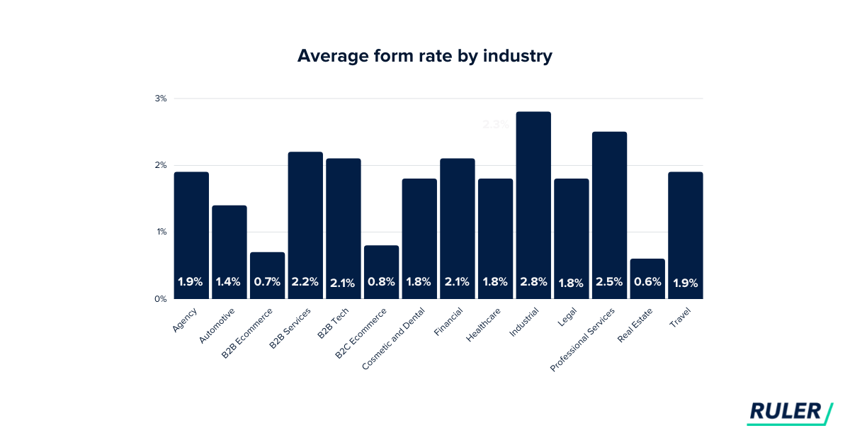
Successful conversion rates for landing page forms vary across industries but tend to hover around 2 to 3%.

B2B Landing Page Performance with Customer Journey and Intent

Source: Ruler Analytics

When you consider landing page content for each stage of the journey, a good starting place is to ask what kinds of questions your prospects have at each phase.  That question can help you tailor content that anticipates their needs.

Optimizing CTAs for B2B Landing Page Performance

What makes a landing page a landing page? It’s the Call to Action (CTA). The most important predictor of landing page success is how well the content and the CTA align with the customer journey. 

For example, a prospect at the awareness stage of a high-ticket purchase will likely not click “buy now” but may respond to a CTA for an educational webinar. A typical conversion CTA is a free trial requiring credit card information with lower-cost products and services.

Now, let’s look at some landing page tips for each step of the customer journey. 

B2B Landing Page Tips for the Customer Journey Awareness Phase

In the awareness stage, the customer is just getting to know the brand. Common questions include “What solutions or options can address my business problem? Who provides these solutions?”

Their intent likely includes narrowing their options. Here are some key considerations to increase B2B landing page performance in this phase:

  • Content: Landing page content at the awareness stage should seek to move prospects further into the consideration funnel. For lower-cost purchases with minimal risk, like a SaaS subscription, the funnel is relatively short, so the landing page includes consideration information and a “sign up now” button.  

For higher ticket items, you can use “top of funnel” (TOFU) content like blog posts, whitepapers, and industry reports to cover the most common questions and challenges your prospects face to drive organic traffic to your landing page. 

  • SEO Optimization: Conduct keyword research to understand what your target audience is searching for and optimize your landing page content to increase visibility in search engine results.
  • Retargeting: Only some visitors will convert on the first visit. Showing targeted ads to visitors who didn’t initially convert keeps your brand top-of-mind and provides multiple touchpoints along the customer journey. With dynamic retargeting, these ads can showcase products or services they viewed, reminding them of their interest and your value proposition.

B2B Landing Page Tips for the Customer Journey Consideration Phase

In the consideration stage, you now have something precious and rare – your prospect’s attention. Gary Vaynerchuk goes so far as to say that attention is the number one asset in the business world today.

In this stage, simply providing more information about your product is not enough to engage and nurture leads. The CX during this phase builds trust. Trust is essential because people rarely buy from companies they don’t trust.

So, how do you keep the audience’s attention and build trust with B2B prospects? Here are some ideas.

  • Personalized messaging and experiences. Consumers now expect personalized experiences across all their customer journeys. Let your prospects know you understand where they are in their customer journey by providing appropriate content. For example, 

consumers looking for in-depth information will be annoyed by constant “buy now” pop-ups or repeated offers for the same lead magnet they just downloaded.

  • Personalize the viewer experience. Implement dynamic content on your landing pages, meaning integrate that content changes based on visitor demographics, industry, or behavior on your site. 
  • AI for landing pages. As you might expect, AI tools are taking landing page personalization options to the next level. At Funnel Envy, we leverage AI and manage the added complexity of multiple landing pages to help our clients optimize results.  
  • Lead magnets. Customer preference for self-service info is good news for lead magnets if done correctly. Instead of making “book a call today” the only option for moving ahead, offer valuable resources like webinars or downloads appropriate for the consideration phase in exchange for contact information. 

B2B Landing Page Tips for the Customer Journey Conversion Phase

By this time, your prospect has gotten to know and trust you. Landing pages for sales are both an art and a science. Here are some tips:

  • Testimonials and Case Studies: Provide social proof through testimonials, reviews, and case studies. Real-world success stories can significantly influence decision-making.
  • Live Demos or Consultations: Now is the time for in-person contact for high-ticket items. Offer live demonstrations or free consultations to prospects who have shown a high level of engagement. This direct interaction can be the final nudge they need to convert.

AI for Continuous B2B Landing Page Improvement 

Continuous improvement in B2B landing page performance is a crucial goal. With AI, A/B testing is evolving rapidly. AI can now manage dozens of split tests of landing page elements, such as headlines, images, and CTAs, and even automate optimization based on the results. 

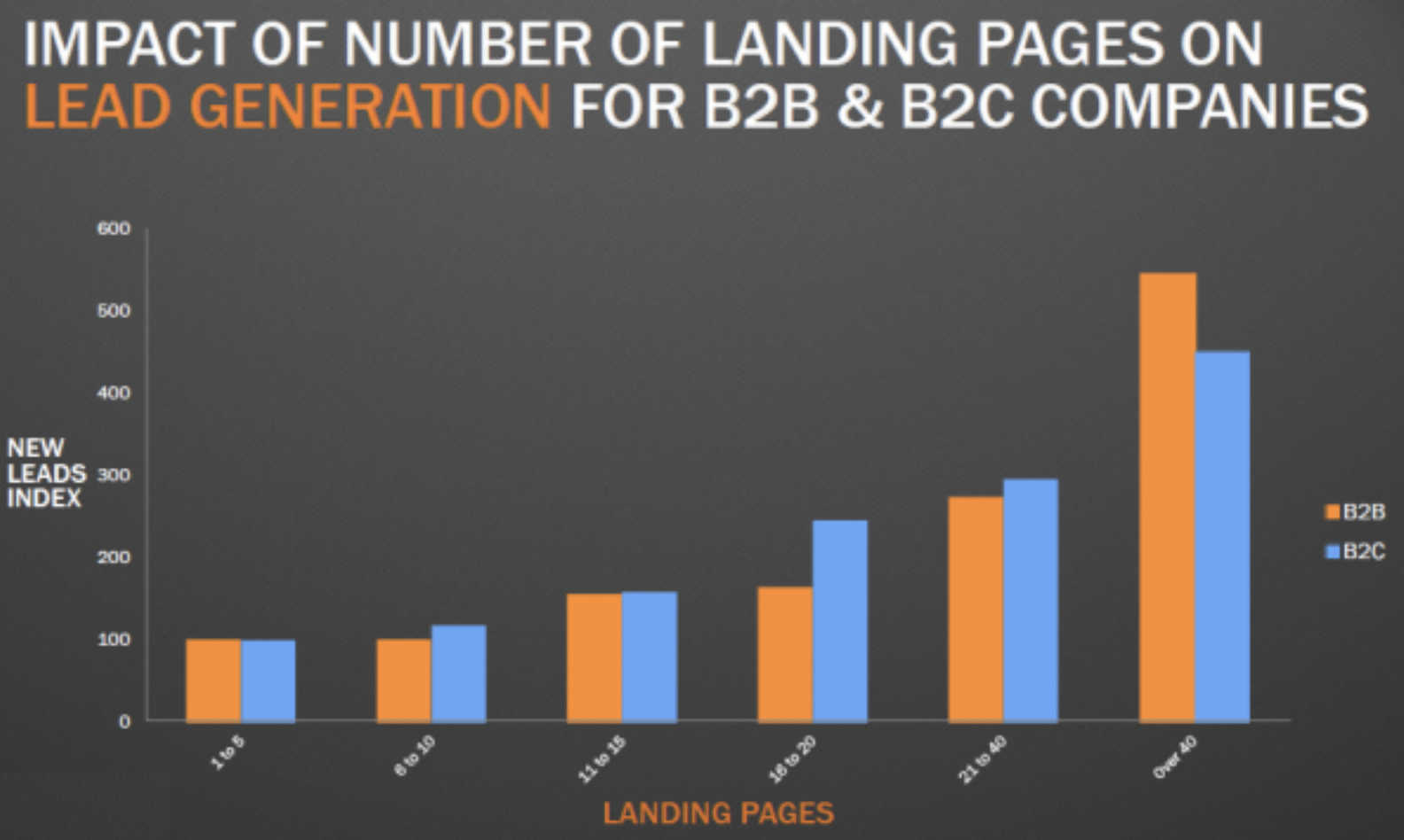
This development has significant implications for improving lead gen because studies show that the more landing pages companies run, the better. The study revealed that 31 to 40 landing pages generate five times more leads than 1 to 5 landing pages, and over 40 pages generate 12x the leads. 

Moving Ahead

Optimizing even five to ten landing pages can be a lot to manage in-house. From testing to reporting, Funnel Envy can help you with the complexity of scaling your landing page strategy. We specialize in optimizing B2B landing pages to drive conversion and boost sales.

We understand the complexities and have the tools and expertise to help you take your landing page performance to the next level. Reach out today to get started.

[/fusion_text][/fusion_builder_column][/fusion_builder_row][/fusion_builder_container]

By |2023-11-16T08:44:13-08:00November 27th, 2023|Landing Pages|0 Comments

3 Keys to Optimizing Software Services Landing Pages

B2B SaaS companies compete in crowded industry sectors, selling intangible services that often address complex problems. Landing pages play a crucial competitive role in attracting interested leads and converting them to the next step in the sales funnel. 

And it turns out that less is not more regarding landing pages, especially for B2B. HubSpot reports that companies with 40 or more landing pages see a 55% increase in leads.

Optimizing Software Services Landing Pages

Source: Hubspot

Your landing pages are a significant stop for your buyers’ journey. From design to testing, optimizing a landing page can be costly. That’s why even though there are dozens of variables to test, we suggest you start with optimizing three main areas that function as performance levers for landing pages. Landing pages with video testimonials, excellent sales copy, and a friction-free user experience will put you ahead of the game.

Landing pages with video testimonials, excellent sales copy, and a friction-free user experience will put you ahead of the game. Share on X

Video Testimonials to Optimize SaaS Landing Pages

Video testimonials on your landing page are a powerful way to build trust and credibility with potential customers. People are more likely to trust the experiences and opinions of actual clients and customers than any marketing jargon. 

Get Specific With Your Testimonials

To make the most impact, create specific testimonials. Ask for statements about how your solution solved a particular problem for the customer. Interview formats work well because the viewer can see themselves in the dynamic as long as you ask the kinds of questions that your ideal client would ask. This approach also builds trust by positioning your brand in the context of authentic conversations.

Production Value Still Matters in B2B Videos

We are in an era where casual video is the norm, and in many cases, that’s acceptable. For testimonials, though, you want to take some extra time to make the recording as polished as possible. Most SaaS companies will benefit from videos that have decent production value. 

Smartphone cameras are fairly good; just be sure you use a tripod, have good lighting, clear audio, and a well-framed shot. You want the viewer to focus on the speakers, not be distracted by issues with the video itself. 

You can save time and money by batching your production and creating shorter videos from longer interview footage when creating multiple videos for testing. 

Straightforward Copy

While online marketing has been around since the 1990s, sales pages predate the internet with direct copy marketers from the 1950s and even earlier. Today’s B2B prospects are busier and more skeptical than ever. While testing will help you identify what’s resonating with your audience, here are some tips for landing page copy that converts:

  • Build your copy around a single conversion goal: While giving people choices may seem like a good idea, research shows that the more options you offer people, the more they delay the decision. With landing pages, this translates into a higher bounce rate.
  • Lead with benefits: Describe your services’ benefits before presenting a laundry list of features.
  • Be specific: Focus on specific pain points and how your solution helps them achieve their goals.
  • Be succinct: While longer landing pages perform better in some cases, longer doesn’t mean rambling with filler copy. Wandering copy causes busy people to lose interest and click away. Grammarly is your friend not only for correctness but for flagging wordiness. Prospects who can easily follow the structure of the content flow stay on the page longer.
  • Personalize the experience: Don’t show the same offer repeatedly to a returning visitor that you deliver to a first-time visitor. 

Unfortunately, even the perfect landing page copy can’t fix bounce rates from poor user experience. Let’s look at how to improve your visitor’s experience on the landing page. 

User Experience Keys for B2B Landing Pages

B2B prospects are busy. Most expect an almost seamless user experience from the sites they visit. From a page design perspective, the book “Don’t Make Me Think” by Steve Krug is an excellent resource for improving user experience and conversions. 

In addition, check the tech behind the page performance by testing for the following:

Compatibility Across Devices

People use various devices and operating systems to browse the internet. They expect a uniform experience across all devices. The same viewer may start looking at your landing page on their laptop, then leave the office and pull it up on their phone while waiting for a friend at a coffee shop. 

Ensuring that your SaaS landing page is compatible with various devices and browsers is crucial for conversions. A responsive design that automatically adjusts the page layout to fit different screen sizes and devices ensures a seamless user experience across devices.

Loading Speed and Performance

Slow-loading pages are deadly to your landing page results. Engaging visual design is essential, yet it should never come at the cost of loading speed and performance. Studies have shown that even a one-second delay in loading time can significantly impact bounce rates. 

If your landing page takes too long to load, potential customers might abandon it before seeing your offerings.

Optimize your landing page by compressing images, leveraging browser caching, and using efficient coding practices. Prioritize performance to ensure your prospects have a smooth and satisfying experience, regardless of their internet connection or device.

Moving Ahead with SaaS B2B Landing Page Strategies

At the core, landing pages are an opportunity to build trust and credibility with potential customers. Delivering an excellent user experience and clear value proposition will go a long way in converting visitors into loyal users.

If you think dozens of well-crafted, longer landing pages will lead to more leads, you’re not wrong – but there is a catch. The caveat is that the more complex your outreach, the more essential testing is to be sure you are making the right choices. 

And testing is where our expert team at FunnelEnvy can assist. We work with clients in many industries, from consumer healthcare to industrial equipment. We provide customized assistance to our clients with all elements of their landing page design, from technical aspects like page speed and caching to form fields and CTA design.

Are you interested in finding out more? Just click here to complete a short quiz that we’ve created to help us learn more about your needs and how we may be able to help.

By |2023-08-09T00:31:45-07:00August 21st, 2023|Landing Pages|0 Comments

The 4 Most Important Landing Page Elements

We’ve devoted several posts on this blog to discussions of landing pages and their importance within the broader context of your digital marketing. It’s no exaggeration to say that a landing page can make or break your funnel. Even if other elements are well-optimized and you have a great offer that adds value for prospects, a bad landing page can significantly constrain your results.

Too often, we think about landing pages in the abstract. They’re mentioned in passing as if every marketer should know how to construct a landing page by instinct. 

Unfortunately, real-world funnels aren’t that simple. Like any complex system, a landing page is only as good as its parts. The specific things you put on a landing page can vary based on the offer, your industry, and the people you want to attract. However, we’ve found that every landing page needs the below four elements in one form or another. Remember to view these tips in the context of your specific funnel and target audience.

Concise, Usable Forms

During many B2B funnel transactions, you will need to collect data from the user to take them further down the funnel. These efforts can be limited or stifled by forms that are difficult to use or unclear to the audience. Ideally, users shouldn’t need to think about forms; they should blend seamlessly into the broader landing page experience.

What exactly makes a good form? HubSpot has created a helpful list of tips, including:

  • Single-column design: According to design research, it’s easier for the eye to follow and progress through one column of text and fields. It can also feel overwhelming to be presented with two columns full of text and form fields.
  • Go from easy to hard: Putting a few simple questions at the front of a longer form will help reinforce the feeling of progress. Doing this makes visitors less likely to bounce while filling out your form, since they’ll feel they’ve already made tangible steps to finishing.
  • Validate entries immediately: If someone provides an invalid response to a form field – like an email address with no domain – make sure the form alerts them directly. They should not need to wait until they try to submit the form to notice and then work backward through it to identify the error. 

Succinct Copy

We’ve all met someone who loves nothing more than talking about themselves. Every topic concerns what’s happening in the person’s life with little care for those around them.

No one wants to hear you wax poetic on a landing page: they simply want to know how your offer is relevant to them and what they stand to gain. Share on X

The digital marketing equivalent of this is a landing page with tons of elaborate sentences and flowery phrasing about the greatness of a product or service. No one wants to hear you wax poetic on a landing page: they simply want to know how your offer is relevant to them and what they stand to gain. 

That’s not to say long-form landing pages don’t work. Many B2B and B2C marketers have found success with longer, narrative-style landing pages, especially when selling a relatively new product or dealing with an audience that needs plenty of information before making a business decision.

But there’s a clear distinction between a long-form landing page and a page with too much text. Long-term testing will help you pinpoint an exact balance, but in the short term, you can reach out to trusted clients or colleagues to get quick feedback about your landing page copy. You can also use helpful online tools like the Hemingway App to see if you can make your writing more straightforward.

Social Proof

The power of social proof is well-documented and based on a simple psychological principle: people place a lot of weight on the words and experiences of others like them. Seeing that another person had a positive experience can go a long way toward convincing a prospect that your offering is right for them.

Like other parts of a landing page, the specific way you present social proof depends on the nature of the funnel and your audience. Some might like to see a talking-head-style video of a client like them speaking firsthand about how great their experience was. Others may want to look at hard data, like an ROI experienced by your previous clients.

Two quick tips for social proof: don’t go overboard. Many people are suspicious of things they see on pages designed to get them to buy or commit to something. Even if it’s true, an over-the-top client testimonial may appear inauthentic. Second, remember to offer external validation of the people you include on your testimonial page. A social profile or company website link can help visitors believe in what you’re showing.

A Multimedia Element

In 2023, “multimedia” can be defined in several ways. It could be a video, chart, graphic, animation, or even a lovely photograph depending on the specific nature of your offering and the people visiting the page. Multimedia is essential as a way to break up text on your page. It’s also valuable for visitors who may be using a mobile device or tablet and can’t spend a lot of time reading and processing text on a page.

Videos are popular for a landing page because they are easy to produce – all you need is a phone – and engaging for visitors on any device. According to marketing expert Neil Patel, it’s helpful to incorporate the video in the design of the rest of your page and track the video’s analytics closely to see how often it’s being viewed and for how long.

Final Thoughts on Key Landing Page Elements

It’s easy to conceptualize theories about landing pages and discuss ideas about what may or may not work. But for marketers who want to maximize their results, the only way to know what will lead to success is by trying and measuring different options to see which resonates most with your audience.

And remember: changes to your landing page elements or overarching strategy shouldn’t be static items you address whenever you get the time. It’s important to stay committed to frequent assessments of the success of your entire funnel, including landing page elements. By including concise copy, highly usable forms, social proof, and multimedia, you’ll be well on your way to constructing a successful funnel that drives your desired business results.

Looking for a hand with these four items or any other parts of building a landing page? Our team of specialists can help. We have many years of history assisting clients in different industries with their landing page needs. Whether you want a partner who can work with you to build a plan from the ground up or you’d simply like another set of eyes on the various components of your landing page, FunnelEnvy is ready to assist. Click here to fill out a short quiz to learn more about how we can help.

By |2023-04-05T19:53:14-07:00April 17th, 2023|Landing Pages|0 Comments

3 Trends in Multi-Step Forms for B2B Funnels in 2023

Forms used in digital marketing have come a long way since the earliest days of simple radio buttons, one-line form fields, and dropdown options. Today’s users expect the forms they engage with to be as frictionless as possible, but they also want to know exactly how much of an investment of time they’ll need to make – and what kind of return that investment can bring.

In this modern environment, multi-step forms have emerged as a way for marketers to make forms more easily digestible for users. In turn, this increases the conversion rates typically seen on multi-step forms. According to some stats, multi-step forms can convert 300% more than forms with a single step.

Knowing the value of multi-step forms in today’s B2B marketing, it’s essential to construct them well and keep them updated as trends and best practices change. As the new year progresses, we’ll track multi-step form trends. 

Artificial Intelligence and Forms

There’s a lot of discussion in the media about artificial intelligence and what it will mean for the future of business. ChatGPT, a sophisticated text-based AI platform created by the prominent research firm OpenAI, has dominated headlines and social media posts thanks to its accuracy and authentic-sounding tone.

AI tools are exciting to discuss but are still far from being a core element of any B2B marketing campaign or funnel. One of the most common deployments of AI in multi-step forms comes with chatbots, which can be helpful tools for certain prospects but aren’t a panacea for all sales needs.    

Specifically, AI tools like chatbots can help when a visitor has a straightforward question about an element of a form but aren’t as valuable for complex inquiries. Throw in the technical complexity and high-dollar amount often associated with B2B purchases, and you can see why many prospects may not want AI heavily involved in their transactions. Despite this, we anticipate AI tools becoming more and more helpful for their predictive capabilities in the early parts of forms when users may need a straightforward clarification or additional detail.

Increase in Social Proof

Since the earliest days of business, social proof – or validation of a product or service from other buyers – has always been a valuable marketing source, especially for companies selling complex and high-dollar solutions. In the economic conditions of 2023, where budgets are likely tight due to pressure on supply chains and other global factors, B2B buyers may want even more social proof before committing to a specific vendor.

In 2023, we expect the changes to multi-step forms in this category to be more related to the specific nature of the social proof provided. For example, we’re already seeing more videos used as social proof throughout marketing funnels. Some studies show that two out of three people would be more willing to purchase after watching a testimonial video showing how a product or service helped someone else like them.      

Another important social proof indicator for 2023 will be the participation in industry groups and organizations. These associations and trade organizations are increasingly effective in certain industries – like healthcare and medical technology – and should continue to grow in importance throughout the year. If your form can remind visitors of your participation in well-respected associations or industry forums, it may increase your conversion rate and improve your overall marketing results.

Progress Indicators & Dynamic Forms

For many years, studies by major research organizations have shown the value of using progress bars, indicators, or icons somewhere on your form. These elements show people where they are in a multi-step form and how much they have left before completion. Research indicates that these elements extend the attention span of users and may make them more likely to finish the form.

Throughout the rest of the year, we expect these elements to become even more prominent throughout B2B forms. Look for leading marketers to deploy these elements in slick, user-friendly ways that don’t detract from the experience. For example, you might incorporate additional information about a form behind a hover icon near the progress bar.

Along the same lines, we’re also projecting an increase in the importance of dynamic forms. Everyone has had the experience of filling out a long form with multiple unnecessary questions that may or may not even apply to their situation. Dynamic forms that adjust based on user-provided information are a valuable solution to this problem. If your forms aren’t adaptable based on specific details that people provide, you may be adding friction to the process and making it less likely that people will complete the form.

Going forward this year, we expect dynamic forms to become even more popular and wide-reaching in their applications. One of the more popular dynamic form use cases involves providing extra content to give prospects even more details about a specific solution. Combining these ideas with technology like automated follow-up tools can create a powerful push to get prospects through your funnel.  

One last note on this point – remember that there’s a fine line between helpful form add-ons and excess clutter that distracts a user from completing the form. With multi-step forms that already require a larger investment of time and energy, it’s crucial to be mindful of clutter or wasted elements. Finding the correct balance requires testing and input from real prospects and customers.

Remember that there’s a fine line between helpful form add-ons and excess clutter that distracts a user from completing the form. Share on X

Incorporating Multi-Step Form Trends Into Your Funnel

As is always the case when we discuss trends, developments, or best practices in a particular area, we aren’t suggesting that you rush to incorporate these three ideas into your campaigns as quickly as possible. Not all of these ideas may be right for your multi-step forms, or you may already have some in current funnels.

Instead, it’s critical to identify which concepts make the most sense for your forms and then thoughtfully plan a strategy for adding them to your campaigns. Multi-step forms may not be the sleekest or most exciting elements of your marketing funnels, but they can be vital to the success of your campaigns. A minor tweak to a multi-step form can cause a significant improvement in its conversion rate, leading to massive results in your business.

If you’re looking to apply one or more of these ideas to your multi-step forms but aren’t exactly sure how getting help from an experienced advisor can be valuable. Our team at FunnelEnvy has many years of experience helping clients plan, develop, and optimize multi-step forms that move prospects along their funnel. Whether you want to improve a mid-campaign form that helps existing prospects or you want to optimize your lead capture form, we can help you incorporate all the elements your form needs to be user-friendly, concise, and persuasive to all prospects who use it.

Fill out this brief form to get more details about our pricing structure and learn more about how we can help your organization.

By |2022-12-29T00:26:25-08:00January 9th, 2023|Landing Pages|0 Comments

Optimizing Your B2B Landing Page Flow

You already know landing pages matter. The key to a successful landing page is giving page visitors what they want while also having them take desired actions that move them through your funnel. And while the design of your landing pages, their forms, and visuals are critical, how you set up these landing pages in the context of the rest of your marketing is just as important.

What happens before and after a user visits your landing page? How do these fit with the other elements in your funnel and your brand? These are important questions regarding improving B2B landing page effectiveness, but they’re often not as closely considered as traditional issues like fonts, colors, and form fields.

Below are some of our best tips and considerations for optimizing your funnel’s landing page flow.

Ensure the Landing Page is Applicable to All Lead Sources

One of the things we know for sure is that people use the internet on different kinds of devices. Not only are they using different kinds of hardware, page visitors all come from unique sources. It doesn’t matter whether someone comes from a social media ad, an email newsletter, or any other potential source: their experience with your landing page should be consistent. 

That doesn’t mean you shouldn’t be creating unique landing pages for each campaign you and your team come up with, or that you don’t need to worry about the different sources for leads to the same landing page. It just means that all the different versions you create need to offer consistency no matter how someone accesses the site. This is especially true when it comes to funnels related to consuming information or learning – by some measures, over 70% of web traffic comes from mobile devices. It’s important for those users to have the same thorough access to your landing page as someone on a desktop.

Don’t Neglect Your Post-conversion Thank You Page

It can seem like a relatively subtle detail, but the page that site visitors see after converting can make a big difference in both how they perceive your brand and what they do after taking the desired landing page action.

There are several different strategies to consider when it comes to a thank you page. We see plenty of marketers making the mistake of sticking with the default text. Failing to address these valuable areas where many visitors look for additional information about your business and its other components is a wasted opportunity.

The page that site visitors see after converting can make a big difference in both how they perceive your brand and what they do after taking the desired landing page action. Share on X

A few common strategies used for thank you pages:

  • Play a short video thanking the user and talking about other areas of the company – ideally ones related to the landing page’s funnel.
  • Link to another relevant area on your site. This link could be something like a mission or vision statement, a case study section, or anything else that might entice your visitors.
  • Add a link to a blog post or other popular new content that you’ve recently published. You could also share news in this section, but keep it relevant, so you don’t appear to brag. 

Remember to iterate on and test each design option you consider for your thank you page to see which one works best. Finally, don’t overload your page with so much content that people get bogged down or overwhelmed. 

If your landing page’s funnel is information-heavy and you feel it’s important to include a lot more details on your thank you page, save it for the part of your landing page flow we bring up in the next section. 

Create (or Improve) Your Follow-up Sequence

When we talk about a follow-up sequence, it doesn’t mean a confirmation email you send to a user who converts. It’s a longer set of multiple emails that is meant to do more than just reiterate that they’ll get what they were told they’d receive on the original landing page.

A follow-up sequence should provide extra context that helps nurture a prospect closer to becoming a client by giving them the kind of information that also assists them in achieving their goals.

For example: let’s say you’re a healthcare software company with a landing page funnel to book demonstration appointments. After someone books an appointment on your landing page, you could send them a technical description of the specific tool (or element of the tool) that they’ll be seeing at the upcoming demonstration.

This is also a good place to incorporate social proof in your funnel. Include quotes, reviews, or case studies with data and numbers that show evidence of business improvement and tangible results achieved by your past clients. 

Finally, after enough time has passed – and the user has completed any demonstration, appointment or other time-based objective – you can include an email in the sequence that asks for feedback. Speaking of which…

Solicit Feedback (and Use It!)

You don’t have to ask every user who converts their thoughts on the entire process, but it is important to actively ask for feedback from visitors to your landing page funnel. It could mean including a button that links to a quick web survey, or you might simply decide to follow up with a personal email or call. But one of the best ways to improve the flow around any landing page is to see what real people think about it. If you start hearing something repeated often in your feedback, it may be a sign to implement it into working versions of the landing page or funnel.

Again, it’s essential to keep your requests concise – your prospects likely have a lot of other things going on. Focus on one or two key areas of the page that you might be uncertain about or have been underperforming relative to other parts of the funnel. Remember to be gracious and thankful for any feedback a prospect is voluntarily willing to provide.

Final Thoughts on Optimizing Landing Page Flow

Landing pages are a common and vital part of any funnel. But if the parts of your funnel around your landing page aren’t working well, it will likely hold back your performance and constrain the number of leads you bring in from the funnel.

While you should always strive to improve your landing pages and the things included, it’s equally important to ensure page visitors have a good experience before, during, and after they are on the landing page. That means spending some time considering elements outside of the page itself – the emails you send to users who convert, the information you present on the confirmation page, and the way you incorporate their feedback in both individual sales relationships and improvements made to the broader business.

Looking to get expert insights into your landing pages and the elements around them? The team at FunnelEnvy can help you, whether you’re looking to plug a leaking funnel, pick up the performance of a landing page, or simply ensure that your marketing continues to perform at a sufficient level. Click here to take a short quiz that will help us learn more about how we can get you closer to your business goals.

By |2022-10-06T05:04:35-07:00October 17th, 2022|Landing Pages|0 Comments

Top B2B Marketing Landing Page Trends

A landing page is the critical element of a funnel upon which its broader results hinge. You could have slick visuals and top-notch marketing automation software – if an error or obstacle on your landing page prevents visitors from converting, it will constrain your results and limit the effectiveness of your digital marketing.

Even if your landing page has been working well and capturing a healthy number of people, it can always be optimized so that you can convert even more visitors. The bigger question is, how do you take steps to optimize your landing page?

There’s no one-size-fits-all answer. Everyone’s offering and their funnel will be slightly different. However, even in the dynamic world of B2B, where there is a strong focus on customization, our team has seen certain trends emerge across several industries.

Just remember, trends in landing page design operate the same way as trends in any other industry – fashion, art, music, etc. That means you don’t need to take this blog post as a comprehensive guide to all the elements you must include on a landing page. Think of it the way you might think about trends in clothing: you wouldn’t rush out and replace your entire wardrobe with only the items trending at this year’s top fashion shows.

Instead, you would look at what kind of clothes are trending, think about your signature style, and decide how you might incorporate a few popular pieces into what you already wear. The same goes for your landing page – instead of completely overhauling a page to keep up with the latest trends, decide which of them make sense and edit your pages accordingly.

Live Messaging and Chatbots

If you’ve been on any recently-updated landing page in the last year or two, you probably noticed a recurring pattern: a chat window pops up, often on the bottom-right side of your screen, prompting you to ask a question about a product or service, or perhaps giving you details of the company’s latest sale or launch.

The rise of support via messenger and chatbot platforms on company websites has been meteoric. According to Fortune, the global chatbot industry expects to grow at a rapid clip of 22.5% between 2020 and 2027. That significant growth rate didn’t happen by accident. It’s the result of customers in many industries preferring to get their questions answered immediately via chat instead of sitting on hold or waiting around for an email inquiry to get answered. Over 40% of customers prefer getting answers from chat immediately, compared to 32% who prefer the phone and 23% who prefer email.

You don’t need to build a sophisticated AI-based chat platform from scratch. Plenty of simple chat platforms allow you to use either a real person or a basic bot to message people who have questions about your offering. Check out tools like HubSpot, Drift, Intercom, and Twilio as a starting point in your search for live messenger and chatbot solutions.

Inclusive Design

According to Adobe, inclusive design is a style that “considers the full range of human diversity with respect to ability, language, culture, gender, age, and other forms of human difference.” In other words, it’s a design that allows the broadest range of people to view and use your landing page content, even if they use adaptive technology or have some type of disability.

A great place to start regarding inclusive design is the web content accessibility guidelines (WCAG), created by the World Wide Web Consortium (W3C). Government bodies, universities, and other organizations leading the way in accessible digital content use these guidelines.

A few simple elements that you can incorporate right away to improve accessibility:

  • Add captions to all video content, whether live or pre-recorded
  • Allow users to pause and play audio and video content
  • Allow users to resize text by at least 200% without assistive technology 
  • Don’t include any images or visual elements that flash more than three times

Progress Indicators and Icons

Another common element on today’s landing pages is some type of indicator to let users know how they are progressing on a form. Percentage bars or icons representing the number of form pages completed and remaining are a great addition to almost any landing page. By some metrics, you can increase your website’s conversion rate by 30% just by adding a progress bar to your landing page. 

Ideally, you want to keep your landing page to no more than four separate pages or sub-forms. If you need to collect more information than this, think about adjusting your funnel or trying to gather extra data after the conversion event has taken place. For example, if your landing page is to book appointments, there may be some kinds of information that you can collect on your first sales call instead of on the page form. Keeping your form as short as possible and letting people know how many more sub-forms they have to complete is a great way to improve landing page conversion.

Minimalist Design

Check out this landing page from Squarespace:

Landing page trends

Notice the simplicity: it has the company’s logo, the main form, and an option that allows visitors who aren’t ready to buy to return to the home page. This type of minimalist design is everywhere on modern landing pages, from those related to the most complex B2B software to those offering the most basic B2C commodity.

If you’re going for the minimalist approach, strike a good balance between design and functionality. Don’t sacrifice important information that prospects need to know simply to include as much space as possible. However, it can be helpful to re-evaluate your landing pages with a close eye to determine if there are elements that you may be able to remove.

A final tip for the minimalist or “blank space” approach: use colors that make the main elements of your page stand out. A white background typically means using brighter colors on elements like links, buttons, and headers. Be sure to pick a color scheme that works well together and doesn’t clash or cause any readability issues for visitors.

Final Thoughts On Landing Page Trends

Remember: you don’t need to adopt any of these trends on your existing landing pages, particularly if your funnel already works well at converting visitors. However, when looking to improve your landing page’s conversion rate, it can be helpful to look at current trends in landing page design as a starting point to determine what positive changes you could make.

Our expert team at FunnelEnvy can help by evaluating your landing page and identifying a few key areas you can improve. With only minor tweaks to your page, it’s possible to increase your conversion rate by a significant percentage that expands your marketing funnel and provides real gains to your organization’s bottom line.
Click here to complete a short quiz and find out more about how FunnelEnvy may be able to assist with optimizing your funnel’s landing page to incorporate some of the latest trends and designs for better results.

By |2022-09-21T04:41:22-07:00October 3rd, 2022|Landing Pages|0 Comments

The 3 Most Common Landing Page Design Mistakes

We all come across landing pages in day-to-day web browsing. From consumer purchases to complex business decisions that affect large organizations, landing pages are often the foundation for commerce on the internet. A landing page might have many different parts or components from a technical perspective, but a good page has a singular goal: getting a page visitor to take an action, whether that’s to sign up for a newsletter, set an appointment, or purchase a product.

When it comes to complex components like landing pages, successful execution can seem overwhelming. With so many different options and factors to think about, how can you give yourself and your team a process that results in the consistent creation of productive landing pages?

At FunnelEnvy, we sometimes find it easier to advise clients and prospects on what not to do when building out their landing pages. When you know what you should be staying away from, it’s easier to direct the project into success. 

Below are three landing page design mistakes we see most frequently, why they matter, and how you can correct them, so they don’t cause leaks in your funnel that cut into your company’s growth.

Overloading the Page with Copy

When working on creating a landing page, it can be tempting to include every single benefit of your company’s offering, information about past users, quantitative statistics about how your product or service has helped, and so on. Resist the initial urge to be exhaustive on a landing page. In today’s era of browsing on mobile devices and shorter attention spans, it’s almost always better to convey information with the fewest words.

Some marketers – particularly those in complex B2B fields that involve a lot of technical jargon – may push back on this idea, believing that they have to include as much detail as possible to speak to an educated buyer. Depending on which stage of your funnel the landing page is placed, this approach could still work – so long as the content you include is well-formatted and scannable. Make sure to use headers no matter how long or short your page is, and if you include a significant amount of text, it might be wise to include a basic navigation menu that allows visitors to jump from section to section.

Finally, remember that text shouldn’t be the exclusive medium you use to communicate on your landing page. Putting aside the difficulty of reading long-form text on the small screen of a phone or tablet, many people just prefer getting information from videos no matter what device they use. In a survey by HubSpot, over 50% of consumers of all ages reported wanting more video content from businesses they support. 

Giving Users Too Many Choices

Along the same lines as including too much content, giving users too many choices is another fatal landing page error. Again, the tendency here for inexperienced marketers is to try to squeeze as many conversion events as possible out of each prospect or page visitor. And while there’s nothing wrong with striving for efficiency, giving people multiple paths to take often means they decide to walk none of them.

Yet too often, marketers can’t resist adding that small email signup box on the sidebar, or linking page visitors to a similar offer they might like since they were interested in the original one. It may seem harmless to you since you’re focused intently on crafting the best possible landing page. But to your prospect, your landing page is just one (probably small) element in a day likely full of complicated tasks and responsibilities. Several visitors will leave if it’s too difficult to figure out the right path on your landing page. By some statistics, landing pages with multiple offers get 266% fewer leads than pages with a single offer.

while there’s nothing wrong with striving for efficiency, giving people multiple paths to take often means they decide to walk none of them. Share on X

Keep things simple for your page visitors by limiting your landing page to one offer. If you feel strongly about including a plug for your newsletter or another offer relevant to your current funnel, save it for the confirmation or “thank you” page after the visitor has already converted on your main offer.

Poor Load Time (or Other Technical Issues)

One of the major advantages of keeping your landing page minimal regarding content and conversion offers is that it also keeps the page light from a technical perspective. You could have the best offer in your industry with compelling landing page copy and slick, captivating visuals that make visitors want to know more about your product or service. It won’t matter if the technical side of your landing page falls.

According to Google, an increase in page load time from one second to three seconds can increase the page’s bounce rate by almost one-third. In their rush to build a creative, aesthetically-pleasing landing page that will also convert, many marketers forget to consider the technical side of building a successful landing page.

A few common reasons your landing page might be slow loading include: 

  • Too many plugins. Many great marketing automation tools can enhance your web experience for visitors and provide you with a better understanding of their behavior through data. Unfortunately, having too many plugins can also cause your landing page to drag when people try to load it.
  • Images not optimized. Even if you size your images properly, they could be in the wrong format or not compressed the right way. There’s no need to work on manual image optimization. Plenty of helpful plugins and online tools can automatically take your images and compress them to load quickly on the web.
  • Caching problems. Page caching allows small files to be stored on a user’s computer the first time they access a site to increase load speed, but it also helps a page load more quickly on subsequent visits. This fast loading is important if you expect it might take a few visits for an average conversion, which is often the case with complex B2B offerings.

Broken or wasteful code and outdated plugins can also cause issues with how a site loads.

The Last Word on Landing Page Design

As marketers, we are all about efficiency. The goal of any campaign or initiative is to generate the most significant number of leads and sales with the smallest possible investment of time and money. But there are some aspects of marketing where streamlined simplicity should be the name of the game.

That’s the case when it comes to landing pages. By avoiding the common issues mentioned in this post – too much text, too many different offers, and slow page load time – you can bring your audience some simplicity. Doing so will guide them down a path to purchasing something that will ultimately help make their life easier, making them more productive or allowing their organization to remove critical roadblocks affecting progress towards important initiatives.

Looking for some expert help with your landing pages? Click here to fill out a short quiz to determine whether or not our team is a good fit for your needs.

By |2022-07-14T05:05:38-07:00July 25th, 2022|Landing Pages|0 Comments
Go to Top