Optimizing Conversational Marketing: A Data-Driven Deep Dive

Transcription

Hey everyone. I’m Arun from FunnelEnvy. I’m sure all of you are aware of conversational marketing and probably many of you have deployed chatbots on your own sites for lead capture and conversion. Now, I’ve been digging into some of the data around them myself and I wanted to share some more that I learned along the way along with some hypotheses on how you might be able to improve conversational marketing performance on your own funnel. So let’s get started. I wanted to establish some shared context first. Now, web chat on B2B and demand generation sites used to be used primarily for customer support, but increasingly whether it’s because of actual results or FOMO, you see the chat widgets all over the place as part of the revenue funnel.

chatbot

Let’s start with some shared context. Webchat on b2b & demand gen sites used to primarily be for customer support. Increasingly, whether it’s because of actual results or FOMO you see the chat widgets all over as part of the revenue funnel. Conversational marketing presents an alternative to the website funnel & forms to engage visitors in what is supposed to be a more human, interactive medium.

Does conversational marketing actually work?

The Google featured snippet here tells us that it’s the fastest and most effective way to guide prospects through the sales funnel and that it provides an authentic experience and real value for your customers. This is despite the fact that 99% of the time it’s a bot on the other side (and everyone knows it). 

Let’s start with the first customer, who uses Drift on their site. 

Customer Engagement with Drift

First up we’ve got a customer who uses Drift on their site. Now, we’re going to be looking at the engagement and conversion metrics based on the number of new visitors coming to the site over a certain time period and using the metrics that each platform sends to Google Analytics. Now, as you can see here, this site isn’t doing too well when it comes to chatbot engagement, less than half a percent of visitors are actually engaging with the Drift bot, but it’s doing even worse when you look at the email and phone number capture rates, less than a 10th of a percent. When you compare that to the form baseline, contact us form in this case, it’s certainly outperforming the chat experience.

Conversion with Qualified. 

When we look at another customer who happens to have Qualified, we see pretty similar results. In this case, again, we’re seeing a small fraction of visitors engage with the chatbot and of those that do, we see a pretty small percentage actually proceed to book a meeting or give their email address. Again, when we look at the form conversion rates, in this case, it’s a request a demo form, it significantly outperforms the qualified chatbot.

But of course, I’ve just been showing you top of the funnel numbers and this is demand generation. So it would be a mistake to only focus on the top of the funnel leads. So in the third example, let’s fit a customer that is Intercom and take a few steps further down the funnel. Now, the top of the phone numbers looks pretty similar. The baseline contacts us form outperforms the chatbot for lead conversion. However, in this case, we segment it by known leads and try to evaluate the effect of engagement with Intercom on the conversion to pipeline or opportunity. And what’s interesting here is we get about 10% of the 4,600 or so known leads engage with Intercom.

down funnel with intercom

So a small number of engaging with Intercom, but those that do convert to pipeline at a much higher rate than the leads that did not have any Intercom interaction. So what can we observe from all of this? Well, despite the fact that Drift used to tell us that forms are dead, from this data here, they clearly are. In the data that we looked at, the top of the funnel engagement with chat is relatively low on an absolute basis and the forms on the site, static web forms outperform chat for lead conversion. But both from the example that I showed you as well as conversations that I’ve had with other marketers, chatbots can have a significant impact lower in the funnel on lower-funnel leads and accounts and their conversion to the pipeline.

Observations

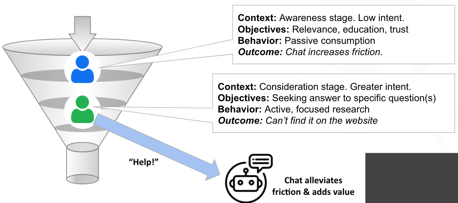
So how do we think about this? Well, like everything on your site experience is all about the friction for the visitor and the value that you’re providing. It’s important to recognize that conversational marketing and chat are a form of interruption marketing. The question you need to ask yourself, of course, is, is that interruption adding or removing friction from the buyer’s journey? So some ways to think about that in the context of your visitors are, what is the context of buying stage and intent of that visitor? What are they actually trying to accomplish in that session on your site? How does that impact and affect their behavior? And finally, what value will interrupt that experience with chat have on their experience and their objectives?

So we can make this a little bit more concrete by considering visitors at various stages of your funnel or buyer journey. Starting with that top-of-the-funnel visitor, they’re typically in an awareness stage with relatively low commercial intent. Now in this stage, visitors are first trying to figure out if what you are selling on your site is even relevant to them and then maybe educating themselves and seeing if they can trust you for a future commercial decision. Now, this type of behavior is characterized by passive content consumption, and introducing or interrupting that experience with chat is likely to increase their friction in that experience.

And let’s contrast that with a lower-funnel visitor that is in the consideration or decision stage that has greater commercial intent. Typically, they’re seeking answers to very specific questions on your site. And unlike passive consumption, they’re actively trying to answer that question, and then they’re doing some focused research. And if they can’t find it on your site, that introduces friction. So in this case, reaching out to chat can actually add value by alleviating that friction of not being able to find the answer to the question on your site and connect them either with a bot or with a salesperson.

Conversations shouldn’t be limited to chatbots

So how do we think about this to improve our conversational experiences? Well, first off, when we think about the top of the funnel, recognize that the concepts of conversational marketing don’t have to be limited to chatbots. They become synonymous with chatbots, but conversations are how we as humans engage with other humans and the traditional static website form which asks for all sorts of personal information upfront is daunting. And that’s why we see a lot of conversion drop-off. But we can adapt that form to be more conversational in nature, more interactive. And when we do that through our multi-step forms at FunnelEnvy and we’ve tested these, we average about 53% improvement in lead conversion.

Strategic Interruptions

This obviously is the added benefit of keeping the visitor on the site experience on the page and presenting less of an interruption than the chatbot. If you’re going to try this yourselves, we recommend leading with some easy-to-answer questions to establish both intent and conversion momentum. Typically two to three questions, initially not asking for personal information, making them very relevant to the visitor and also setting proper expectations along the way, both in terms of the steps that they have to go through and the outcome when they fill out that form.

Strategic Interruptions

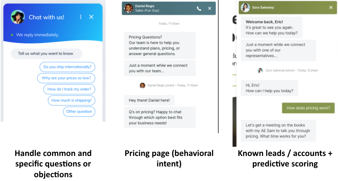
Now, when you do choose to interrupt with chat, do it strategically, don’t settle for the standard out-of-the-box transcripts that you get, welcome to our site, do you have any questions? You can be very effective with the chat by understanding and answering and handling common or, and specific questions or objections from that visitor. If you can identify visitors with specific intent and a common example is if they’re on the pricing page lingering there, they usually have a specific question and are close to making a decision. You can very effectively intercept them, interrupt them with chat and answer those questions, or even connect them to a sales person to get them over the line.

Of course, they don’t have to be on a specific page. You can use data to identify known leads, target accounts, even use real-time predictive scoring to identify those high-value, high intent visitors and answer their questions and get them in front of a salesperson faster. One thing to think about might be to reduce the interruption by have them opt into that chat experience through an online and onsite CTA.

Key Takeaways

First off, know your own numbers. I presented some examples from what I observed, but certainly, you should know your own chat and conversational marketing engagement and conversion rates, not just at the top of the funnel, but all the way through by buyer stage and to opportunity and revenue.

Secondly, recognize that forms aren’t dead. And you can apply those same interactive conversational marketing principles outside of your chatbot and to your onsite experience. When you do choose to interrupt, do it strategically, check, and be very effective to handle common questions and intercept those high-value, lower-funnel leads and accounts.

And finally, recognize that not everyone is going to engage with chat even further down the funnel. So there are ways to use the investment in chat to improve your onsite experience. You can do that by studying your chat transcripts, understanding the common questions, objections that your visitors have, and testing different site experiences to better meet those.

If you’re going to go to the trouble of targeting lower funnel visitors with chat, you can also use that to personalize the site experience and change your offers and content to better meet the expectations and needs of your lower funnel visitors. So with that, I want to thank you for listening today.

How To Improve Your Site Experience In A User-Centric World (And Still Generate Leads)

The algorithmic world of web optimization is rapidly moving towards a user-centric paradigm. To keep up, brands will need to prioritize their site experience like never before. 

In this post, we’re going to cover why site experience is key to your success and give you some actionable tips you can use to improve your site experience today. 

Let’s get into it!

Your site experience is key to generating leads

Website experience, or UX, encompasses everything your users encounter when they visit your website. It’s the visuals, the ease with which they can uncover information, and the process they go through to make a purchase. 

In a world that is becoming more user-centric, focusing on user privacy and moving away from keyword-based SEO, lead generation is going to become increasingly entangled with the performance of your website. The better your site experience, the more leads you’ll generate. And, with that in mind, here are our top ways to improve your site experience…

5 ways to improve your site experience

1. A great site experience starts with pages that load quickly

The first thing that anyone is going to notice when they visit your website is how quickly it loads. Or, ideally, they won’t notice this at all.

The goal for any website should be for any page on your site to load in less than three seconds on an average WiFi download speed. If your website takes longer than this to load, you have some work to do. When it comes to mobile, things need to be even faster. Less than two seconds is ideal for reducing your bounce rate. 

One of the first things you should do to reduce a web page’s load time is to compress all of the images on your website. There are free resources online (like TinyPNG) that will quickly compress images for you. 

Plus, white space is also important. Not only is it important to a pleasing design, but blank space loads faster than content-filled space. 

And, finally, ensure that the most important and visible elements of your webpage load first. Typically, buttons and navigation bars should appear first, then your text, then images and media. 

2. Simple and efficient registration and sign-up forms are crucial

Another crucial component of a great site experience is simple registration and sign-up forms. These are the forms on your website that visitors use to sign up for your newsletter, subscribe to your service, and register an account on your website. 

If these forms aren’t easy to use, then visitors aren’t going to use them. When you ask your visitors to complete a task, you aren’t just asking for their attention span, but also their mental effort. Seamlessness is key. 

A simple form process uses as few fields as possible, doesn’t needlessly violate the person’s privacy, and keeps everything on one page if possible. The more information a visitor has to give and the more pages that have to load for them to give, the more likely they are to bounce.

3. Have clear CTAs –– and not too many of them!

Everyone working in the marketing industry knows that CTAs dramatically increase engagement. Direct CTAs, such as “Order this product today!” as well as indirect CTAs like colorful buttons both count. They give a webpage purpose, guide visitors down a path, and most importantly, close sales!

Despite the overt marketing at work here, visitors like CTAs. They’re on your website because they are curious about your business. CTAs make their journey simple. Click here for this information, go here to buy this, and subscribe in these three steps. 

On the other hand, you can overdo your CTAs. Try to keep it to just one CTA per page, and don’t have every CTA be aimed at landing a sale. Maybe have a CTA to your newsletter on your blog instead of a CTA for a product you sell. Or, work on personalized CTAs (or smart CTAs) tailored to different audiences and their specific needs. 

And use clever design and logical flow when placing your CTAs. You don’t need a big red arrow telling visitors to look at your CTA if you place the CTA where they’re already looking. 

4. Follow conventions creatively over creatively ignoring them

A common pitfall that businesses run into is the idea that everything they do needs to be unique to them. So they overcompensate when doing something simple (like crafting a great site experience) and try to stand out by breaking convention.

This more often than not will scare visitors off. Design conventions exist for a reason –– because they work! And because conventions are popular practice, they’re what users expect when they visit your website. 

Moving the navigation bar to the bottom of the screen adjusting all of your text to the right, and having images of your product flash around the screen will help you stand out –– but probably not in the way that you hope for. 

Instead of trying to be quirky, stick to tried-and-true web design conventions. Then, put your personality into them! Follow traditional functional practices while adding unique and personalized aesthetics to your website. 

A pleasing color scheme and clever animation in an otherwise standard website will take you much farther than an obtuse (albeit original) site experience.

5. Save your writing for the blog

Our last tip is pretty simple. Save your writing for your blog! Articles and content marketing perform great there, but they’re not going to perform as well on your landing pages. 

Instead, try to replace text content on your home and landing pages with graphics, blurbs, and bullet-point lists. Video content performs particularly well on landing pages (not so much on your home page). Use text in short sentences to give clarity, flow, and concise information. For everything else, stick to visuals!

Eager to keep learning about how to improve your site experience?

The tips listed above are just a few of the ways that you can improve your site experience. To become a lead generating pro, you can check out the rest of the posts on the FunnelEnvy blog.

And if you’re ready to take your marketing and site performance to the next level, reach out to the FunnelEnvy team for expert advice, guidance, and optimization. 

By |2021-06-04T00:02:20-07:00June 2nd, 2021|Uncategorized, Experimentation, B2B, Strategy, Analytics, Conversion Rate Optimization|Comments Off on How To Improve Your Site Experience In A User-Centric World (And Still Generate Leads)

Revenue attribution: Everything You Need to Know to Ramp Up Your Marketing ROI

Revenue is a top priority for any business, no matter how big, no matter how small. It’s fundamental: without money coming in, you’ll have nothing to cover overheads or invest back into the company. 

We all know that a hard-working sales team is key for bringing in new business and increasing revenue. But revenue is increasingly a priority for marketing teams too. 

Many marketers turn to ROI (return on investment) to determine the profitability of a promotional campaign. In fact, more than 40% of marketers claim their main priority in 2021 is to “better measure the ROI of [their] demand generation initiatives”. 

It makes sense: effective marketing should achieve a healthy return on investment (ROI) and generate new revenue. A portion of this can then be invested back into marketing campaigns to keep bringing in more money, and so on. It’s a cycle of profitability that can help businesses grow and grow. 

And revenue attribution can help you create more effective, successful marketing campaigns. But what does it mean and involve? 

In this article, we’ll explore everything you need to know about revenue attribution and how it relates to improving marketing ROI. 

What is revenue attribution? 

Revenue attribution (also known as marketing attribution) is a reporting process that involves matching revenue brought in, to a specific marketing output. 

For example, you might utilize revenue attribution techniques to monitor the impact that a particular piece of thought leadership content made on sales within two months of its publication. Or you may prefer to track the effect that a new series of videos made on revenue over a shorter or longer period. 

Businesses have more channels — and more opportunities — to reach consumers than ever with targeted marketing campaigns. But it’s unbelievably competitive and marketing teams must take advantage of real creativity to make an impact, especially in the most crowded sectors or niches. 

Employing revenue attribution techniques empowers marketers to hone in on their most effective work and understand how they can keep refining their techniques over time. 

Why is revenue attribution important and how can it help?

Revenue attribution is crucial for marketing teams who want to gain a clear insight into their strategies’ value and learn how they affect customer engagement. Fortunately, there’s a wealth of data available online to help marketers build an accurate overview of campaign performance and ROI. 

Identifying how specific campaigns and strategies have been received by audiences (target and/or general) enables you to make more informed, calculated decisions on future campaigns. 

You’ll have a tighter grasp on what works, what doesn’t, and what elements should be combined to cultivate the most impactful marketing campaigns. You’ll be able to capture more leads, close more sales, and improve ROI thanks to continued analysis. 

Another key benefit is that revenue attribution helps businesses (particularly those in their infancy or experiencing financial challenges) get more out of their marketing spends while still streamlining their budget. 

Essentially, it can make your money go further. You’re not throwing ideas at the wall to see what sticks — you’re basing your decisions on provable facts. 

You can jettison those marketing techniques and campaigns that fail to bring in satisfactory ROI. All resources usually dedicated to those will be put to better use on more effective options instead. 

How can you use a revenue attribution model to measure and ramp up your marketing ROI?

We understand what revenue attribution is and why it matters. But how do you put a revenue attribution model to work and start improving your marketing ROI?

While it can appear complicated for newcomers, and more than a little daunting, it will seem far simpler when we take a deeper look. In this section, we’ll cover how to use this model to both track and measure ROI — and improve it. 

What types of revenue and marketing attribution models are available?

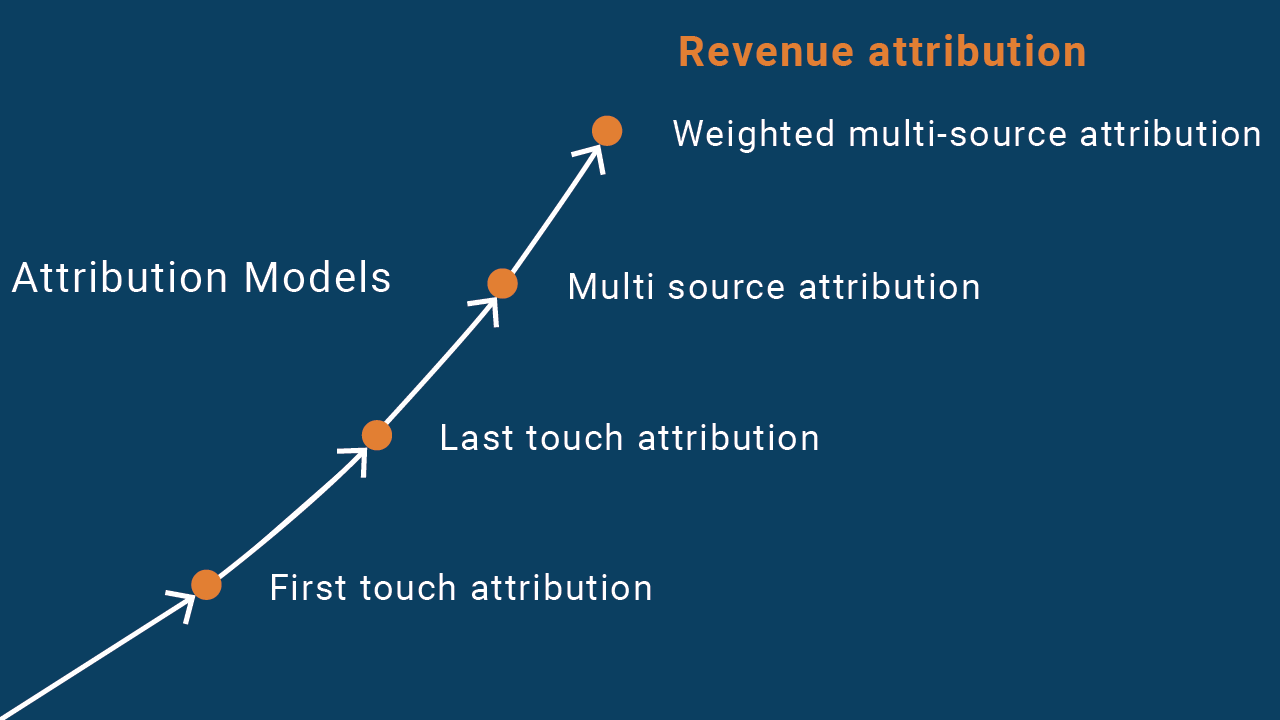
First-touch attribution 

The first-touch (or first-click) attribution is one of two single-source models (along with last-touch attribution, below). 

In this model, the first channel with which a converted user engages receives all credit for generating revenue. This could be an in-depth whitepaper, a blog post, a video, or any other piece of marketing content that captures the lead’s interest enough to drive a conversion. 

For example, around half of marketers describe webinars as the top-of-the-funnel format generating the most high-quality leads. 

While a spectacular piece of content can be enough to push users towards a sale, the first-touch model may have a blindspot — a failure to take other interactions following this first one into consideration.

As a result, you may not have an accurate insight into how effective other channels are in swaying users’ decisions. 

Last-touch attribution 

Last-touch (or last-click) attribution is regarded as another easy model. Why? Because it involves looking at the final touchpoint before the sale is completed, which is usually simple to find.

The last touch could be something as straightforward as a well-researched sales call or a webinar that whets the lead’s appetite and inspires them to commit to a purchase. 

However, the last-touch attribution model may overlook previous interactions with a user. These could include a visit to your website or hearing an ad for your business on a podcast. And, again, this could cause you to overlook the value of other channels 

Multi-source attribution

As you can probably assume, the multi-source (or multi-touch) attribution model focuses on all channels that lead to a conversion. Multiple touchpoints will be attributed instead of just one. 

Still, while the multi-source attribution model is more of a holistic approach to measuring marketing success, there’s a crucial factor to consider: it doesn’t provide an accurate reflection of a specific touchpoint’s actual contribution to a conversion. It could lead to a false representation of certain channels’ role in the customer journey. 

Six multi-source attribution models are available:

  • Linear: This is the easier model to implement, providing all touchpoints with the same weight, though it can be hard to determine which were most important (as mentioned above). 
  • Time decay: Touchpoints will be separated by bigger and bigger gaps in long sales cycles. With the time decay model, you’ll apply greater credit to those in the later stages than those in the earlier period. They might not have been as valuable to the eventual outcome, and in particularly long sales cycles, the buyer might have totally forgotten about their initial interactions with your business anyway. 
  • U-shaped: A U-shaped revenue attribution model applies the credit to two main touchpoints, with fixed percentages. These are the initial touchpoint and the last, as well as any between those points. The first and last touchpoint receive 40% of the credit each. The 20% remaining is split between those touchpoints taking place in between. 
  • W-shaped: A W-shaped model is similar to the one above, but it adds an extra touchpoint: when a prospect is converted into a lead. So, this covers the first touchpoint, the last touchpoint, and the occurrence falling somewhere between them. These receive 30% of the credit each, while the remaining 10% is shared among other touchpoints that may be detected between them. 
  • Full path: The majority of the credit is assigned to the key steps in the customer journey and the rest goes to those touchpoints between. Unlike the other models explored so far, this includes follow-up chats between the customer and the sales team. 
  • Custom: Teams can come up with their own weighting shares according to the channels used, customer behaviors, etc. For example, you may decide that a user who subscribed to your newsletter should have more weight than someone who clicked on an ad. 

Weighted multi-source attribution 

Weighted multi-source attribution involves accounting for every interaction during the sales cycle and assigning weight to the most important touchpoints. This model can lead to the most reliable views of a customer’s journey. 

However, it’s one of the most challenging to put into effect, as weight must be applied to a potentially large number of touchpoints. 

Why is it so important for marketing and sales teams to work in partnership?

Traditionally, businesses tend to keep sales and marketing activities separate. They consider marketing teams’ role to create leads and sales teams’ to transform them into paying customers. That’s simple enough to understand — but it could be a big mistake. 

Why? 

Because overhauling and refining your marketing to achieve an increase in leads won’t guarantee a rise in high-quality leads. 

Yes, marketing teams can drive clicks and interest, but a large proportion of leads could be of a lower quality than expected. 

The aim should be to bring in leads more likely to evolve into conversions, based on carefully targeted marketing with specific demographics in mind. 

By uniting your marketing and sales teams, you can start to develop a clearer understanding of which marketing efforts bring in the most valuable leads and, ultimately, conversions. Those that consistently generate the weakest leads and harm ROI should be replaced. 

What are the key benefits of using these revenue and marketing attribution models?

Here are five key benefits of using revenue and marketing attribution models:

  • Improved ROI
    Effective revenue attribution provides businesses with an accurate insight into how much return they gain on their marketing investments. Over time, you can start to cultivate a better awareness of those techniques and strategies that engage your target audience best.

    And you’ll keep reaching the right people with the most appealing messaging. This will increase the number of conversions you can expect to achieve and, eventually, the ROI you earn.

  • Save money on ineffective marketing
    Attribution models reveal the most important touchpoints throughout sales cycles and show how marketing money is best invested. Fewer funds will be wasted on dead-end marketing.

    That may free up money to channel into better marketing or other areas of your business, including sales or post-purchase support.

  • Hone your audience targeting
    Audience targeting is one of the top methods through which advertisers increase demand. And studying attribution data reveals which types of content, messaging, and channels engage your ideal customers best.

    Marketing teams can keep sharpening their material to consistently engage your target demographic(s) and minimize the risk of missteps.

  • Learn how to make products or services better
    Marketers can get a better understanding of target customers through attribution data analysis.

    Over time, this can open your eyes to ways in which you can improve products or services to suit your audience better. For example, the response to a blog post covering specific software features could inspire future releases.

The power of Revenue Funnel Optimization 

Hopefully, you’re now in a place where you can see the key benefits of revenue and marketing attribution to your business. But, one of the most important aspects of attribution strategy is acting on attribution insights. And, that’s where we come in…

We’ve designed our Revenue Funnel Optimization strategy so you can get the most out of your revenue insights. 

FunnelEnvy enables you to generate revenue insights by updating analytics to measure the complete end-to-end customer journey. You can pinpoint the most valuable funnels, offers, and other factors that drive revenue. 

Revenue funnels comprise strategy sets focused on maximizing your website’s revenue generation through targeting the most effective offers to the priority buyer segments in your top conversion funnels. 

Funnels can also be personalized by the user’s stage in the customer journey to maximize revenue further. You also can run campaigns and experiments on your most important funnels. Use direct response best practices to optimize offers, messaging, and more. 

With Revenue Funnel Optimization, your decisions are driven by data and genuine insights into the buyer journey. 

You’ll make stronger choices for your marketing and sales teams — and your business as a whole — by studying the facts. 

Many companies are already achieving success with Revenue Funnel Optimization, with up to 250% growth in revenue and a 10x increase in Marketing Qualified Leads (MQLs)

Want to try Revenue Funnel Optimization? Start using FunnelEnvy and drive real revenue growth for your business! 

By |2021-06-04T00:02:29-07:00June 2nd, 2021|B2B, Strategy, The Funnel, Digital Marketing, Conversion Rate Optimization, Uncategorized|Comments Off on Revenue attribution: Everything You Need to Know to Ramp Up Your Marketing ROI

Website Analytics & Attribution in the Privacy Era

If you’re wondering how the new privacy landscape will affect your ability to track visitors and customers you’re not alone. In this conversation, we dig deep into the governmental, technology, and other considerations that marketers need to be aware of. Hopefully, we’ll clear up some confusion and misconceptions along the way!


By |2021-06-01T09:51:21-07:00May 27th, 2021|Analytics, Uncategorized, Testing, B2B|0 Comments

Multi-Step Interactive Experiences (Going Beyond the Form)

Transcript

Hi everyone. My name is James Niehaus from FunnelEnvy. And today I want to talk to you about multi-step interactive experiences and going beyond the form. So this is the third video in a series that we focus specifically on a technique we call multi-step interactive experiences. In the first two videos we talked about how to use this on B2B forms to really drive massive improvements in conversion rates. And today I want to talk about how to use the same technique on other parts of your site.

We Will Cover

  • A quick recap on multi-step interactive experiences
  • Why they work
  • How they can work on other parts of your site
  • 5 popular ways to leverage interactive experiences on your site

Full Recap of Multi-Step Interactive Forms

If you have not watched the introduction and multi-step advance use cases videos, watch these in these given links.
Examples of Multi-Step Form Flows

Here are just some examples of past client interactive experiences. So this should be self-explanatory, but as you see here, all we’re doing is taking your typical static B2B form, breaking it up into interactive steps, and leading with intent questions that make it easier for the user to raise their hand, provide you information, commit to the process and convert at higher rates. And we say convert at higher rates, we do mean higher rates. So here are just some examples of recent conversion lifts we’ve seen on client forms just by moving the static forms to multi-step experiences. So as you see here, it’s definitely pretty powerful and effective. And this is also a reason why we kind of then explored using this technique on other parts of the site.

multistep form examples

Some Key Takeaways from previous videos

With a multi-step form experience, you usually want to ideally lead with intent questions that’s more about what’s in it for them. What features do they care about? How big is their company? What are they looking to do? What’s their role? But the whole idea here is that asking them easy to answer intent questions, helps guide them down the path towards finding a better outcome or helping you better guide them down to the right solution. So that’s the first takeaway.

The second takeaway is also ideally asking them a couple of those questions first because what you want to do is make it easy for them to get started, continue, and create that momentum and commitment to completing that process. And that’s how we get the higher conversion rates.

And then the nice part about this technique is that you then layer on additional strategies, and this is where it gets even more powerful. So on the left, you see an example where we actually start personalizing step two and step three of the form experiences based on what they provided as an answer in step one. So this is where it can get a little more targeted and personalized. Or on the right is a good example where you can use their information to then potentially route them to a different funnel or flow. An example there, they’re using company name, based on the email address, to decide whether they should send them to a scheduler as you see there, or to just give them the rest of the regular form. So this is where you can potentially provide custom experiences based on company size or target account or their role or what they’re looking to do. But this allows you to then go from a one size fits all static experience, to providing smarter, routed experiences that align with your personalization and ABM strategies.

More Powerful w/ ABM + Personalization

Personalize the rest of the form by their inputs

Multi-Step Works Beyond Forms

Multi-Step isn’t just for forms. They can work on most parts of your website. I mainly want to focus on five key areas of the site, or techniques.

Step #1 Homepage: funnel them to a multi-step form flow on the entry

So starting this all off, starting the funnel on the home page. So for most B2B sites, the homepage is typically a static billboard that tries to communicate one message to a broad and diverse set of visitors. So recognizing that you’re probably not going to align exactly to what that user’s intent is, the idea here is that you actually use the homepage real estate to engage the visitor. And in this case, engagement means trying to get them to raise their hand, express intent, and get started with you, and go down a certain conversion funnel right at the homepage. So whether you start interacting then with them, with engaging questions on the left, you see examples there. Or, if they click on a certain action, present out that type of experience. But the whole idea here is that, rather than guess at what their intent is, or how they want to get started, give them some options to make it easy for them to kind of start exploring. And ideally, without even knowing, go start kicking off that conversion funnel from the home page.

Step #2 Homepage: guide and route users to the right content by intent

Use the homepage strategy, and instead of taking them to a form flow, guide and route those users based on their intent, to a better page or a better flow.

So that here is we’re trying to help them by skipping steps and helping them land on the right page so you can cut down on the cycles to get them to where they want to go. So this is more about routing and navigation. But again, the whole benefit of these techniques is that we’re engaging them from the get-go. We’re not forcing them to kind of decide themselves, try to find the right information, and leave it up to chance that they find the right place to go. And this same strategy makes a lot of sense on product pages.

This is an example of one of our clients, where on the left you see their traditional static page. As you see there, it’s your typical solution type page where you provide a lot of content. And give them their choice but through a lot of text and diagrams.

Step #3 Product Page: help them find the right solution

On the right, it’s taking that same content and packaging it up into interactive questions to make it easier for them to kind of, again, find what they’re looking for, raise their hand, express their intent or interest, and you help navigate them to the option that makes the most sense. So we saw some very positive engagement and conversion metrics when we did this technique on product pages like in this example here. But the whole idea here is you’re trying to provide that educated, guided hand that helps them find better what they’re looking for based on what they told you. So in this case you’re being helpful, helping them complete their job better, and in a more timely fashion. And of course, this makes sense on your product and pricing pages. So when you have packages and plans, most B2B sites have your typical good, better, best, here are three or four plans, whether it be based on company size or number of seats needed, or whether it be based on certain features, that’s your typical layout that we’re all used to.

On the product pages, a nice technique is to really use the strategy to help them find the right solution.

Step #4 Plans/Pricing Page: help them find the right package

The plans and pricing page is also another great place to use it to help them find the right pricing package or combination.

So we’re not saying you have to move away from that, but in these examples here they still show those tables of plans, but in both examples here they give options where, if you want to specify your interests or what you’re looking to do, or maybe talk through a questionnaire about who you are and what you’re looking for, they can then narrow down the plan packages to fit what you provided them as far as intent or profile. So the whole idea here is that, when you have a little more complex set of packages and pricing plans, rather than have them guess or maybe choose incorrectly, or maybe just waste their time combing through all of this, you give them an easier path of which they just simply specify what is their key intent, profile questions, and use that information to help narrow and guide them down to the right package or pricing plan that works for them.

Again, you know your product more than anyone else. You’ve seen the success of your products and packages on a variety of clients across your industries. This is all about using that intelligence to better guide new visitors, who first come to your site, come to your pricing page, and help them find a solution that fits their needs and best matches their profile. Because you want them to be successful, and this is your chance to guide them down that path in a more direct way. And both sides will win in the end.

Step #5 Quizzes/Calculators: help them get insights

    And lastly, we shouldn’t forget the fact that, for most B2B sites, they do have interactive experiences typically in things like your ROI calculators, your organizational assessments, your company benchmark, and your various quizzes, right? So by all means, these are great options and techniques. We encourage you to keep using them. So in the end we’re just fans of anything that provides that interactivity. We’ve seen, from years and years of testing, that whenever you can give the visitor a chance to interact, raise their hand, you make it easier for them to get started, you reduce the complexity of that visit by allowing them to be guided down the right path. And you actually end up having more control over where they go through their journey, which is what we really want to do. Ideally, if we had a choice, we’d want to guide each visitor on the right journey for them.

    Since we can’t really predict who they are and what they want, we think interactive experience are the best way to meet in the middle and provide them a set of choices that allow them to kind of really narrow down to their best options based on what their profile is and based on what their intent is. So it’s really a win-win for both sides.

    Key Takeaways

    1. Multi-Step experiences, especially on the forms, work great as a great conversion tactic
    2. It works even better when combined with your ABM/Personalization strategies. So this is a great example where your conversion techniques and your strategic techniques should really work well together because they really compliment each other very well.
    3. They really work well in a couple of key places, like your homepage, your product pages, your pricing and packaging pages, as well as your traditional quizzes and calculators.
    4. Here are 5 ways to get started:
      1. Homepage: Start them in a conversion funnel
      2. Homepage: Route them to the right page by intent
      3. Product Pages: Find the right solution(s)
      4. Pricing/Plan: Find the right package
      5. Quizzes/Calculators: Provide custom insights

    So really want to say here, we want to advocate for it, try it out, explore this on your site, you really won’t regret it. This is, again, better experiences for all.

    And then lastly, as I said, if you haven’t had a chance yet, go visit our site. We have a couple of other videos that talk a little more in-depth about the strategy, especially as it relates to forms and personalization, and ABM. So check it out if you haven’t had the chance yet.

    1. Introduction to Multi-step Interactive Forms
    2. Multi-step Interactive Forms (Advanced Use Cases)

    If you have questions, just drop me an email. And if you want to see our own interactive quiz, you can hit our website. And that quiz will actually help you evaluate whether you’re the right fit for working with us. So check it out and hopefully we can talk soon. With that, take care.

    Multi-Step Interactive Forms Advanced Use Cases(ABM/Personalization)

    Hey everyone. My name is James Niehaus, and today I’m going to walk through some advanced use cases for multi-step interactive forms. Specifically, where it can help you with ABM and personalization on your website. And this is actually part two to an initial video I did around introducing everyone to interactive forms, why we love them so much, why they’re pretty effective for our clients, and how you can get started with them as well. So this is kind of part two of that series. All right, let’s jump right into it.

    So we’ll cover here the following things.

    • A quick recap on multi-step interactive forms
    • Why they work
    • Why they are ideal for your ABM and Personalization programs
    • 5 ways multi-step forms can enhance your ABM and Personalization programs

    All we’re doing here is taking your longer static forms on your website, breaking them up into steps, making them interactive, and leading with intent questions that get them to raise their hand and express who they are and what they want to do. So this has converted really well for our clients. As you see here, these are some examples of actual lifts we’ve seen with form conversions on forms that get started and talk to sales and get demos.

    Full Recap of Multi-Step Interactive Forms

    Before we jump into those, just a quick recap of why we think it works well, and what some best practices are.

    So always lead within 10 questions if possible. So what’s in it for them, who they are, what they’re looking for. As opposed to starting with, “What’s your first and last name, your email, or your phone number?” Right? We want to make it easy for them to get started and engage. Secondly, we want to ask a couple of those 10 questions initially, before we show them the rest of the form, because we wanted them to, one, commit, get some easy answers out of the way, and get momentum towards completing their task. So we found that this is definitely a sweet spot to kind of maximize conversions on a multi-step experience. And then lastly, just really set proper expectations. How many steps are involved, and what happens after you submit the form? Just so they right context about time and what’s going to happen next. All makes sense hopefully? Good.

    Examples of Multi-Step Form Flows

    multistep form examples

    Some best practices of multi-step interactive forms

    Results we’ve seen from multi-step interactive forms

    multi step form results

    So let’s jump right into why multi-step forms are ideal for targeting and segmentation. Hopefully, it’s pretty obvious, but in these experiences, and in those first couple of questions where we ask for either profile or intent questions, we’re getting valuable information that they want to share to better customize their experience or get better information from us.  So we want to use that information to provide, one, them a better experience, but also ideally personalize based on who they are and their company. So that’s what ABM and personalization are all about. Personalizing based on who they are and the company they’re from. Based on what you know about them and based on what you hopefully want to achieve with them in partnership.

    1. Use their answers to assign them to a segment

    Use their answers to better assign them segments for analytics and campaigns. That seems pretty obvious. More importantly, use those answers to personalize the rest of that form experience. So as they provide you information about them, provide feedback that you can support their needs, you can provide specific information about their product interest. But use that moment to actually provide reinforcement for what they’re looking for. Also, you can actually potentially use that information to route them to a different funnel or experience. So the whole idea is that not everyone should be treated the same. Your higher value prospects may be given a shortcut to talk with sales. Maybe the less valuable users may be given more of a self-service route. But use their answers and their profile to route them in the most appropriate place to maximize your limited resources, but also provide them the more appropriate experience.

    What’s even more compelling and potentially more exciting is the idea that we actually change the experiences based on who they are and what company they’re from. Now, rather than simply have one form for everyone, the idea here is that we take their answers or their inputs, and based on our business strategy we may serve them a different next step. So an example on the right, you see here based on the email and company domain, based on whether that matches a target account or not, they either can skip the form and go right to the scheduler. Or if they’re maybe not our targeted account, they would get a regular traditional form.

    Here are some examples of getting their answers and then assigning them to a segment

    2. Use their answers to personalize the rest of the form

    Customize the remaining questions, messaging, and visuals to reinforce the benefits of their selection. By using these answers to personalize the rest of the actual form experience. So if they express certain product interest or indicate they’re from a smaller enterprise, you want to reinforce that you are the right business for them, that here are the benefits of that product, or maybe here are the reasons why you’re great for SMB or enterprise, or for this industry, or for this type of role, technical or maybe marketing focused.

    You see an example, a very simple example where, on a contact us form, we just simply asked for their product interest in step one, and we then personalize the rest of the form based on that answer. So this is where you can use that information at the moment to reinforce the benefits of your business, your offering, your expertise, in a way that’s going to reinforce based on who they are and what their intent is. We’ve done this with a couple of clients and we’ve seen pretty nice positive upticks in conversion rates from this simple concept.

    3. Use their answers to route them to a different funnel

    If you identify a top target you can:

    • Skip form
    • Shorten form
    • Change questions
    • Trigger Drift/Chat

    4. Target and personalize in future sessions/other channels 

    We can target and personalize not just at that moment, but also in future sessions, in other channels. We don’t have to stop at the form. So that’s by the information we know about them, use it wherever and whenever you see them again. And then lastly, target. Over time you actually can create different questions based on their profile. So if you have certain key segments that come to your site, you can potentially target them ahead of time and actually serve them with a different actual form experience. A little more advanced, but again, as you’re committing to this strategy, you’ll see more and more ways to use it to your advantage.

      5. Target intent questions based on their profile

      The idea here is, don’t let go of the information after they complete that form. What you want to do is repeat that message, reinforced that information, and follow up interactions, whether it be a session to the site, whether it be another channel like email or display, retargeting perhaps. But the whole idea here is you’re getting valuable information at the moment from an engaged user. Use it for your advantage. Okay. So that would mean if they express certain product interests. When they come back, maybe that homepage here will change to show that product, sort of that category affinity type technique. Or based on their role, reinforce the use cases for their role. Or based on their industry, show again, case studies for their industry, for their size, or any other ideas. An example on the right you see here, where we’re targeting the homepage here all based on their different stages they’re in that we identify in the process.

      And then lastly, the idea here is … and over time, as you refine the strategy, this will become its own strategy. So much as you have with, say, your Marketo email programs, you have different nurture sequences. Or in Drift, you may have different Drift playbooks. The idea here is, over time, you recognize that you have certain key target accounts, segments, and ICPs that you’ll want to route through different form experiences. So rather than having one interactive form for everyone, you may eventually end up where you have different forms for your top segments and groups. So I don’t recommend doing this day one, but as you evolve the strategy, actually see what works, what doesn’t work, you’re going to see natural segments that perform better, or might need more guidance or handholding. This is where the strategy, once it starts getting those double-digit improvements, these are natural ways to further enhance and refine the program. And again, this is going to only make your personalization and ABM programs more targeted, because you’re targeting based on those same attributes that you care about and you want to personalize for.

      So the quick takeaways here.

      Multi-step forms. great conversion tactic. And we recommend you do this on your site today. But we think it works even better, as you’ve hopefully seen here when you combine it with your ABM personalization strategies.

      5 ways to get started:

      1. Segment by their answers they provide you
      2. Customize a form based on those answers for a better conversion rate and better experiences.
      3. Route them by their answers
      4. Target them in return sessions/other channels by their answers
      5. As you get more advanced and more mature in this strategy, start building different forms for your top use cases and your top segments.

      Learn More on Multi-Step Experiences

      Go to our website, funnelenvy.com/blog, and you’ll be able to check out the content and hopefully enjoy this and other content that’s similar. And with that said, thank you for your time. If you have questions, just drop me an email. And if you want to see our own interactive quiz, you can hit our website. And that quiz will actually help you evaluate whether you’re the right fit for working with us. So check it out and hopefully we can talk soon. With that, take care.

      Introduction to Multi-Step Interactive Forms

      Transcript

      Hey everyone. My name is James Niehaus. And today in this video, I’m going to walk you through what are multi-step interactive forms. So at FunnelEnvy, we use this all the time with our clients, and we’ve seen some great wins. And we thought today we would actually share with you what we’ve learned from those efforts, and hopefully encourage you to do the same on your side.

      1. What are multi-step interactive forms?
      2. Results we’ve been seeing with our clients.
      3. Some best practices we’ve learned from doing this with our clients.
      4. Some techniques and lessons learned that you can use and adapt to make it easier for you to get started.
        Keeptruckin Multi-Step

      We all hate forms. Right? So whether it’s a mortgage application or whether it’s a tax form, it’s something we prefer not to do. And the providers know this, and that’s why it’s very hard for you today to complete a mortgage application online without going through a multi-step experience as we see here. Or as we all know with taxes, TurboTax and others have made that the standard experience, step-by-step guided questions.

      That is Why We All Prefer This…

      multi step forms

      Why? It’s common sense.

      • It’s less intimidating, easier to get started. Even though we know there are more fields,
      • it’s an easier way to start and get the process going.
      • We feel less perceived commitment.
      • And lastly and most importantly, ideally we do it right, as an end-user we think we’re being guided down a better path, which will, as we know, save us time and give us better results.

      So there are all positives and why we’ve seen this kind of being the prominent way, at least in B2C, where complex forms are being presented. So they’ve been doing this for like 15, 20 years. LendingTree is one of the pioneers of this. They found out early on that, in a competitive space, this gave them an advantage. Can provide you a better user experience, make it easier for you to fill out a form, and become a lead. And now, fast forward to today, you really can’t complete a mortgage lead or auto insurance quote without going through some similar experience. So it is now the standard for B2C.

      But for B2B, unfortunately, it still seems to be the 1990s, where it’s still no static forms, no interactivity, and it’s pretty much the standard for most of the industry. This is unfortunate, but it’s slowly changing. So if you see here, there are some examples out there.

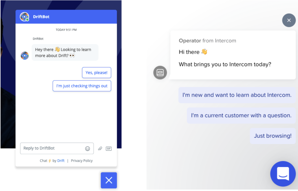
      So like Drift and Intercom and others like them who provide us chatbots. That’s helping. So if you can get [inaudible 00:03:02] one of their bots, you can usually get a nice playbook experience of decision tree experiences. So it’s a good start, but as we all know, the majority of website visitors still want to interact with your website, not a chatbot.

      interactive form experience of the industry

      And we’ve seen some people provide multi-step forms, like Salesforce here with their trials. It’s a good start, but there’s obviously more that can be done. But for B2B, there are some additional hurdles that are typical of most of our clients. So for example, if you’re in the B2B space, typically you’re going to have one of these four vendors.

      form embedded vendors

      And they’re providing your email, your forms, your landing pages, and your workflow. So they make it really easy to by things like let’s copy and paste our embedded form, put it on your website, or we’ll host your landing page, and you’re done. That’s pretty easy. But of course, the default experience is a single, static form.

      A second hurdle we often see is that you do need web developer resources to do this. Most DemandGen teams are resource-constrained. And don’t have access to a developer for the 2-3 days required to implement

      And the third hurdle is, it’s not a priority. Typically the website is not the focus, it’s about getting traffic to the website. So they’re chasing the latest AdTech and Martech to make it easier to target, intent, ABM, and get more people to the site. So I figured this is what people are most interested in hearing about, which is: what are the actual results?

      So these numbers are actually real numbers we’ve had with recent clients in the past year running multi-step interactive forms on their site. So again, these are meaningful lifts on forms like demos and pricing and get started forms. So your core sales forms. So that’s a huge win for many of our clients. And for the most part, for the majority of our clients we tried this on, it’s worked. Typically double-digits or higher. I think, and only one example I can recall, we ran this where it didn’t necessarily win across the board, but it’s still won for the returning segment for around 20 plus percent. So even if we don’t get a clear win across the board, we still see important lifts for key segments. So this is why we want to stress that we think this is probably the most viable tech tactic you can apply to your website to really maximize your revenue and your pipeline for the website.

      multi step form results

      And here’s some just examples of the actual client experiences.

      So as you see here, again, simple, straightforward experiences that make it easier for their visitors to start and complete a form experience.

      And with that said, let’s talk about some of the best practices we’ve seen working with our clients in this area. Now, the first thing you want to consider is, if at all possible, you want to lead this experience, that first question or two, with intent questions. Right? So you want to ask them things that they care about first before you ask them for their name and their email. Right? You want to get them excited and want them to get started and make it easy for them to get started. So intent questions, how large is your organization? What industry are you in? What features do you care about? What’s your role? What are some of your integrations?

      The second learning is you want to create momentum. So we want to ideally provide two or three questions that get that intent ball rolling. So here’s an example from one of our clients. But again, the whole goal here is you want to make it easier for them to get started, you want to create that momentum so that they feel committed to the process. So therefore it’s easier for them to convert and complete that final piece of the form that’s going to be the personal information that we need to collect to run the business.

      Now the third piece I’m going to call out also is it’s good to also set the proper expectations. So when you provide that form, that multi-step experience, call out the number of steps involved. And when possible, call out what you plan to do with that information. So you can help them make a better choice. Is this going to be passed by your sales team to make a more effective quote or a demo or discovery session? But let them know that this information is not going to be dropped to the floor, it’s going to be used to help provide them a better outcome or experience, which is what they want. That guided treatment. Now, those are some simple best practices. And hopefully, they make sense.

      Lessons learned along the way from doing this with our clients.

      • Pick the right form. Ideally, where the outcome could vary based on their inputs:
        -Best working forms -pricing, get started, talk to sales, choosing the right demo or trial, ROI calculators.
      • Don’t be afraid to ask for more information if the question(s) aligns with user intent. like about your team size, about your feature of interest. It will be easier for them to get started.
      • It will work for more than just forms. Now that’s a broader topic, so I’m going to save that for another video, that you can access on our site shortly after this one. But those are some lessons learned

      How to Get Started

      • Identify the right form
      • Figure out the design first
      • Work with a web development resource to build the interactive form (typically a few days to a week effort)
      • If you are adding fields work with your marketing automation team to capture the new fields
      • Run the experience as a test and remember to look at performance by your top segments
      • Run 1-2 iterations over time to fine-tune the question sequence, visuals, or layout
      • Expand to other forms on your site.

      Don’t overlook this, but you want to expand this to other forms on your site in other areas. So again, I’ll have more about this topic in another video about where else can this work for you on your website. But that’s hopefully enough to have you get started. And then with that said, as I mentioned, come back to the website, I’ll be posting a couple of other videos about, one, how this can be used in other places beyond the form.

      Learn More on Multi-Step Experiences

      Here are the two more articles to learn about multi-step interactive forms

      Go to our website, funnelenvy.com/blog, and you’ll be able to check out the content and hopefully enjoy this and other content that’s similar. And with that said, thank you for your time. If you have questions, just drop me an email. And if you want to see our own interactive quiz, you can hit our website. And that quiz will actually help you evaluate whether you’re the right fit for working with us. So check it out and hopefully we can talk soon. With that, take care.

      How Marketing Teams Should Optimize Website for Conversions that Align with B2B Sales

      You might have heard before that marketing and sales can sometimes experience the business version of a sibling rivalry, but it’s not quite what you think.

      Within business-to-business (B2B) organizations, marketing’s focus is on generating leads, while sales focuses on getting those leads to close. A disconnect happens when your marketing team (with good intentions) focuses on volume over quality, therefore resulting in passing over a high volume of leads to sales that just won’t close.

      In this article, we’ll walk through a framework for how to categorize leads that come in through your website, how to build website messaging and landing pages that are consistent and relevant for each type of category, and how to optimize for intent as you go.

      A General Framework for Categorizing Website Leads

      It might seem obvious that your marketing team should focus on quality over quantity, or ideally both at the same time, but in practice the two can get a bit muddled.

      We recommend generally categorizing leads into three different buckets:

      • High volume, high intent. These leads should be sent to sales and prioritized.
      • High quality, Low intent. These leads should be sent to a nurture funnel where they continue to be educated and engaged.
      • Low quality. These should get filtered out altogether, or directed to a different offer.

      Ultimately, we’re talking about being more efficient with  qualification by allowing your website to do a lot of the work for you.

      This includes building consistent messaging for each lead category, building and presenting relevant landing pages for those people, and optimizing for intent as you go.

      Create Messaging that’s Consistent and Relevant

      In order to qualify each website visitor as a member of one of the lead categories above, you’ll need to be able to automatically consider two things before displaying website content:

      • How that person got to your website. The messaging on the page they visit should be consistent with the email, ad, social posts, blog post content, or search result that preceded it.
      • Their business demographic. Use marketing automation, CRM and / or 3rd party data to ensure that messaging is also relevant to their business size or industry. Focus on the industries and business sizes that have an expected value for your sales teams, and send all others into the low quality bucket.

      One effective way to do so is to display case studies from relevant industry competitors, if you have them available. 

      For example, if someone from Wells Fargo visits your fintech website, they’ll likely respond more positively to a landing page with logos or success stories from Chase or Bank of America then from Investopedia or Stripe. If that’s not in the cards for you, focus on business size first. Before showing a Wells Fargo visitor logos from a fintech startup, show a success story from Macy’s, Delta, or another enterprise business.

      This example from Shopify that’s optimized to attract businesses in e-commerce fashion. The logos and success stories listed on the page include e-commerce fashion brands, like AdoreMe, Cee Cee’s Closet and Coco and Breezy, immediately signaling to other fashion e-commerce companies that Shopify’s solution might be a good fit for them.

      This example from Shopify that’s optimized to attract businesses in e-commerce fashion.

      FunnelEnvy offers reverse IP, or account matching, and real time data integration to help marketers surface insights that allow them to display industry-specific webpages like these.

      We also help companies display pages based on other types of data, like funnel stage, company size, and more.

      This example from a large call center showcases how experimenting with personalized offers on their website by buyer segment led to an increase in qualified leads. 

      This example from a large call center showcases how experimenting with personalized offers on their website by buyer segment led to an increase in qualified leads.

      In fact, MQLs increased by 10X between March and June of 2020.

      Graph showing MQLs increased by 10X

      Landing pages that set the right expectations

      Your landing pages essentially start the sales process by presenting your products to people for the first time. For them to be effective, they need to accomplish two things:

      • Mimic your sales people. This should be true for every lead category. Once a person converts through your website and makes it to the stage where they speak to sales, they shouldn’t receive an entirely different message than what led them to convert in the first place.
      • Clearly communicate what each site visitor should expect next. This will change depending on the lead category. If your site visitor is categorized as “high quality, high intent” and on their way to talking to a sales person, tell them that. If they’re getting redirected to a different offer or getting more information sent to their inbox, tell them that instead. 

      One common mistake we see companies make is sending leads to a discovery meeting with a sales development representative (SDR) after they register for a demo. They’re expecting to see the product, when in fact, they end up in a frustrating meeting where they’re asked a lot of questions, afterwards which the real demo is scheduled depending on how they’ve qualified.

      One way to rectify this is to make the discovery process part of the inbound flow, like we do at FunnelEnvy.

      Our quick questionnaire helps us to categorize site visitors that convert so that we can set expectations for what will happen next, once they’ve completed the form.

      Take a moment to fill out this questionnaire

      Here’s another example that qualifies leads using company size and sales strategy:

      Example that qualifies leads using company size and sales strategy

      Optimizing for intent as you go

      You’ve created messaging for each lead category and set up your landing pages so that the right expectations are set. Now it’s time to take it a step further by putting in place a mechanism to filter out low-quality leads or show them a different offer.

      If a website visitor that’s not a highly valuable lead for your sales team comes along, you’ll want to be able to identify them with data that reveals their business size, industry, title, or any other identifying signal that makes a difference for you.

      If someone comes along that doesn’t fall into any of the buckets you’ve identified as high value, consider sending them to your self-service solution (if one exists) or including a message upfront that right now, you’re just not the right fit for one another.

      While it might seem scary to direct some leads away from sales, it can actually improve your sales team’s productivity and have a positive impact on revenue.

      Working with FunnelEnvy, one startup increased their monthly marketing qualified leads (MQLs) by 30%, and grew revenue from closed or won deals by 250% the following quarter. Here’s what that success looks look over time:

      One startup increased their monthly marketing qualified leads (MQLs) by 30%

      This success came from optimizing their website to align with their B2B sales strategy, and by only surfacing high quality leads to their sales teams that were ready to buy.

      Bonus: treat your high quality leads like gold

      Those leads that are high quality and have the appropriate purchase intent should be treated like gold. 

      To ensure that your sales team is successful, make sure there’s an established service-level agreement (SLA) on when and how sales is following up on those leads. For example, Marketo’s sales team commits to a 24-hour SLA.

      If a tight 24-hour turnaround isn’t in the cards for you, automate your follow-up process with marketing automation or your customer resource management (CRM) software.

      End the infamous sibling rivalry

      The infamous sibling rivalry amongst marketing and sales isn’t actually a sibling rivalry at all — in fact, it only exists when these teams try to help one another in the wrong way.

      Your website can do most of the heavy lifting to close this gap and help to qualify leads that are sent to sales automatically. 

      If you’re looking for a custom solution to help personalize your website content for leads of different types, FunnelEnvy can help — contact us.

      Solving the Revenue Funnel Data Challenge


      Transcript:

      Hi, everyone. I’m Arun from FunnelEnvy. Today I want to spend some time talking about how we solve the revenue funnel data challenge.

      Of course, many of you are running multiple campaigns on lots of different channels. You have digital advertising, paid acquisition campaigns that are heavily optimized, and you spent a lot of time getting people into your marketing automation platform and running really personalized email nurture campaigns to them.

      Now, of course, the main problem that we focus on at FunnelEnvy is that the main thing in the middle that glues a lot of that customer journey together is your website. Of course, for many of us, it’s a static experience. Unlike the other channels, prospects and customers keep coming back to that same static website. In many cases, it’s just not keeping up and dragging down your conversion rates and ultimately your pipeline that you’re delivering to the sales team.

      Now, that’s a broad example of some very specific demand gen website problems that we commonly run into. You’re probably looking at website analytics, and if you’ve spent any time in there, it’s not easy to tell which experiences and offers, things like landing pages or other offers, content, are actually contributing to revenue. Maybe you’re running experiments and campaigns on your website, and it’s also hard to measure the pipeline and revenue impact from those website experiments. Of course, a static website that’s showing the same thing to every buyer at every stage isn’t very effective at moving prospects efficiently through the funnel.

      Now, of course, the demand gen revenue journey is long and complex. This is just one example of someone coming to the site, downloading content, getting on an email sequence, attending a webinar, talking to sales who finally opens it up and later on closes the deal. The important thing to understand is that, of course, that revenue journey occurs in multiple different contexts, multiple different channels, and ultimately different platforms in our backend martech stack, from the website and the website analytics to the marketing automation platform and ultimately the sales team and the CRM platform.

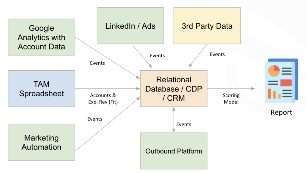
      Now, the net effect of this is we end up creating a lot of data silos in our stack. Website analytics, the CMS or the optimization tools, maybe third-party firmographic data providers, our backend systems like marketing automation and CRM, these are all silos of information that all have individual pieces of that entire customer journey. We can think of those individual pieces as pieces of the puzzle that, if we put together, can actually present a cohesive picture of those individuals and accounts and their opportunities as they move throughout that customer journey.

      Now, the important thing is having that glue that can bring all of those puzzle pieces together and not only receive data from those individual systems, but also feed them and also feed our business intelligence or reporting. For now, we’re going to call that a customer data platform, or CDP. This is similar to a data warehouse, but it has some very specific features that we want to see to be able to solve some of those problems that we were talking about.

      First off, it’s not just sufficient for this CDP to receive data. It needs to have bi-directional integration to a lot of these solutions so it can pass data between these different platforms. Certainly, it unifies all of these puzzle pieces, or that profile data, and because we’re talking about demand gen, it happens both at an individual and an account level. It has that full view of the customer journey, so unlike website analytics that’s only looking at what’s happening on site, it has that perspective tied to that unified customer profile of what happens not only on the website, but also down the funnel as that leads to account progress towards revenue. It allows for rich segmentation because we have those unified customer profiles and full perspective on that buyer journey, and because we’re talking about website optimization, allows for real-time resolution to be able to target those different audiences on the website.

      Let’s get into some of the specific use cases of the customer data platform. First off, we can use it to enhance our existing web analytics. If you spend a lot of time looking at your website performance and in platforms like Google Analytics you know that you’re typically only looking at those vanity metrics, things like bounce rates and visits and exit rates. Unfortunately, a lot of the interesting data that we have lives in our marketing automation, our CRM, the leads, contacts, accounts, and opportunities that we’re really seeking to improve and understand.

      By pumping this data into our CDP and unifying it and then feeding those down-funnel outcomes into our web analytics, as well as our reporting and dashboards, we get a much more complete picture of that revenue journey for that visitor. This lets us answer questions like which experiences and offers on my site are actually contributing to revenue, and how much? You see here a landing page report, but instead of only looking at your typical vanity metrics you see on the right, we actually can visualize the closed one revenue of each of those landing pages. Of course, you can take any of those dimensions that you’re typically looking at in a web analytics and understand the pipeline and revenue impact this way.

      You can also answer ad hoc questions through dashboards, like my website traffic, not just in terms of numbers, but by different buyer stages and the expected revenue of each. This often starts the hypothesis process of how can I actually target those different buyer stages differently to accelerate them through that revenue funnel.

      Once you actually get into running experiments and campaigns, it can be very difficult to understand how much pipeline and revenue those experiments and campaigns are actually generating, especially if you’re using a multi-touch attribution model, which many of you are. We can solve that problem by bringing, again, that lead, contact, account, and opportunity data, as well as the touchpoints in my attribution model and the test and campaigns from the optimization platform, and feeding those into my reporting and business intelligence environment.

      By doing that, we can start looking at the amount of sourced pipeline using that attribution model that my website campaigns and experiments have delivered over time. We can start comparing campaigns, not just on their ability to get people to fill out a form, but based on the actual pipeline and revenue impact that they’ve had. We can look at individual campaigns and the variations in those campaigns and understand which variation is most effective, again, not just in terms of those onsite vanity metrics, but their ability to deliver results down the funnel.

      Finally, when we’re talking about optimizing the revenue funnel, a lot of it is about targeting in real time and targeting the right offers to different personas, different groups of accounts, and my personal favorite, by buyer stage, to move prospects more efficiently through the funnel. Now, to do this, again, we’re bringing over that same marketing automation and CRM data, but potentially also that website behavior from web analytics, and in this case, feeding that into audiences in our content management system or our testing and optimization platform. In this case, this isn’t a reporting use case, so that audience has to be delivered in real time based on an individual visitor as they come into the site. If you can do that though, we can start doing things like personalizing those offers based on that buyer stage and where they are in the journey, or even differentiating offers and changing the experience in real time to present the best offer based on the persona that’s coming to the site.

      With that, I want to leave you with some takeaways. If you’re a demand gen marketer and you’re looking at your website performance and even optimization of it, our recommendation is always not to settle for top-of-the-funnel KPIs. Those vanity metrics, those engagement metrics, even form conversions, they’re not sufficient. Really, you should be trying to align your efforts with the way the rest of the team and organization measure success. For a demand gen team, that’s based on pipeline and revenue impact.

      Of course, demand gen sites, demand gen marketers, typically deal with long customer journeys. What that often means for your site is that you have a lot of return visitors. They’re coming back to the site at different stages in the buying journey with differentiated intent, but the measurement of pipeline and revenue and the ability to understand those different buyer stages and ultimately target them is really related to how efficiently you can bring that data together and activate it in real time.

      Then finally, many of you may have already invested in a data lake or data warehouse to unify that data that you have in these different silos together. Typically, this is done for attribution use cases and other reporting and measurement use cases. It’s a great starting point. Our CDP often compliments existing data lakes or data warehouses, but the reason that we have to compliment it is that typically those are solutions that aren’t built for that real-time use case. If you get into the targeting and activation of that data in the milliseconds that are required by the time a visitor comes to the site and you deliver them that web experience, it requires a real-time source, in our case, the FunnelEnvy customer data platform.

      With that, I want to thank you for listening today. Bye.


      The Secret to Making Your ABM Personalization Campaign a Success

      For all the demand generation leaders out there, I’ll bet you’ve engrossed your partners, sales directors and higher level leadership team on the subject of account based marketing personalization. But be honest, do you really know what a successful outcome looks like?

      visual screenshots of abm personalized accounts

      ABM-based personalized campaigns are the targeted, personalized experiences that either speak one-to-one to an account, or to a group of important accounts. Per a definition found online,

      “Personalized campaigns that are designed to engage each account based on the marketing message on the specific attributes and needs of that account.”

      In following this logic, you’ve decided that certain accounts are more important than others, and therefore are worth the effort of this level of personalization. Great! Typically, demand generation marketers follow these steps:

      1. Identify targeted accounts
      2. Target those accounts in real time with personalized campaigns
      3. Measure the effects of those campaigns

      Steps one and two are pretty straightforward, and certainly there are potential pitfalls, but step number three is critical. The truth is the wrong measurement strategy could doom your ABM personalization efforts to failure.

      pyramid-three-steps-abm-personalization

      Choosing the Right ABM Measurement Strategy

      A common way to evaluate the effect of an onsite experience is through an A/B test. This is the traditional conversion rate optimization (CRO) approach. You might run a randomized A/B test, evaluate the effect of personalizing your homepage against a baseline or control, and measure an on-site goal, like lead conversions. You can carry out this type of testing in a variety of platforms, measure the effect on your goals, and try to determine the overall impact on your personalization efforts. 

      homepage-optimizely-cro-website-optimization

      It’s important to note however, that this approach makes several assumptions. First, it requires a large sample size to establish confidence based on statistical significance. It also assumes that all of these conversions are the same.

      If you’re only looking at the difference between lead conversion for the baseline and lead conversion for the personalized option, then you’re assuming the conversions carry the same weight, measuring impact based on the quantity of those conversions, but not necessarily the qualityWe should ask ourselves, are these assumptions consistent and compatible with our ABM strategy?

      When we think about ABM, the fundamental goal is to capture more revenue from a smaller number of accounts. That’s how you can justify the investment in targeted ads, website personalization, or direct mail.

      graphs-target-image

      Keep in mind that the further up the ABM pyramid you climb, the smaller the number of accounts that can potentially drive value or expected revenue. In many cases, those white glove accounts could be worth a hundred times more value than an SMB account. Since those accounts are likely larger enterprises, they’re also likely to take longer to close.

      What to Include when Measuring your ABM Personalization Campaign

      Your ABM personalization strategy should include a quality metric, which includes pipeline and revenue, considered over a longer period of time.

      Now this can conflict with the CRO approach that we mentioned earlier. This approach, however is very transactional, top-of-funnel, and assumes that each conversion is the same.

      You may consider or are actively engaging in the traditional CRO approach to pass variation information back from your optimization platform to CRM for analysis against pipeline and revenue. Often times, this means embedding those variations that users saw in a hidden field on a lead capture form, and then building a custom report in your CRM data on the backend.

       simple attribution solution

      Will this get you better insight into the down-funnel impact from your personalization experiences, like pipeline and revenue? It may, but you could also wind up with a one-off solution for the website experience that doesn’t align with the way the rest of your demand gen team measures and attributes revenue.

      The Right Attribution Model for ABM Personalization

      You may be running a multi-touch attribution model, either with an off-the-shelf tool like Visible, or a custom solution.

      These work well for longer journeys by allocating revenue back to customer journey touchpoints, like the first touch, lead creation or opportunity created, granting credit to the triggers that influenced the conversion.

      bizible full attribution model path

      Image Source: What is a “Full Path” Marketing Attribution Model? (Bizible | Link)

      B2B attribution solutions are inherently account-based and they’re typically used for channel and campaign analysis, but they can also be used to measure the effect of on-site activities like ABM personalization campaigns.

      Now, the real advantage here is by integrating your website experiences with your multi-touch attribution model. You’re aligning your website activities to the measurement strategy used by the broader demand generation team. So how does this work?

      Let’s say you have touchpoints established, and you’re allocating revenue in some proportion across each one. Here, the actual percentages don’t actually matter as long as you’re are allocating revenue back to new customer touchpoints.

      abm personalization touch points

      Once you know the revenue at a certain touch point over a period of time, with attribution, you’ll be able to assign credit back to the activities that influenced that touchpoint conversion. As I mentioned earlier, it’s typically done at a channel and ad campaign-level, but there’s no reason that an onsite experience can’t be an influence over a touchpoint as well.

      Campaigns and variations are a couple of example of onsite influences, but you could also consider chatbots, content, and anything that influenced a touchpoint. Eventually, you’ll see pipeline and revenue credit associated with the influencing on-site experiences of those touch points. 

      The Better the ABM Attribution, the Better Your Metrics

      Rather than report on percentages like conversion lift on a superficial vanity metric, you can report on campaigns over time with respect to their sourced pipeline. These insights grant you a better understanding of the impact your on-site campaigns have on your business.

      graph of results over time

      Additionally, you’ll see the impact your campaigns have not only in terms of onsite metrics, but based on sourced, influenced pipeline and revenue, and closed deals. 

      personalization by intent chart

      Variations within your experiments will give you the view you need to report on uplift based on whether pipeline or revenue correlated directly with your attribution model.

      testing variation chart funnelenvy

      Let’s talk about other ways you can ensure your ABM personalization efforts are a success. Start your revenue insights journey by measuring your revenue contribution of existing offers. By aligning this with your attribution strategy, you’ll gain deeper insight into your on-site offers and assess their revenue contributions.

      Don’t Forget About Segmentation

      Segmentation is a big part of account-based personalization. The audiences that you create will have differentiated intent. You wouldn’t want to spend time creating audience segments that are effectively the same and trigger the same experiences.

      Think about how your account clusters and account groups are differentiated, and what offers they’re going to want to see that are specific to their interests within their own groups of accounts. 

      Now let’s pivot to the must-avoids. This includes what we call “vanity personalization,” where you add the name of a customer or account coming to the site. Instead, focus on the offers you’re putting in front of your visitor.

      The ideal is to present a more relevant offer throughout the demand generation funnel to your visitor. When segmenting, think about the offers presented to these target accounts, and focus on how to increase their relevancy.

      Remember, this isn’t just a top-of-funnel activity. Obviously we’re talking about demand gen marketing in this post, but consider your full customer journey as a long revenue funnel.

      Once you enable yourself with the capability to personalize your ABM campaigns, think how your business can better align offer and optimize, not only for your top-of-funnel, but for each stage of your buyer journey. 

      Go to Top