No one can sell your product or service better than a happy customer.
Even if you’re one of the best salespeople online, testimonials make your promises more believable and tap into the social proof it takes to turn visitors into buyers.
Most businesses understand how important testimonials are and include them in their websites. But it’s how you choose, frame, and display the testimonials that ultimately determines whether they’ll be helpful for your conversions.
Solid testimonials are becoming even more important in today’s crowded marketplace. 63% of consumers say they’re more likely to buy from a website if it has reviews and testimonials read testimonials. Imagine the impact on your business if you got yours right!
Keep reading to see the key concepts that make your testimonials resonate with the people who matter most: your target customers.
Photo Credit: larskflem via Compfight cc
See Winning Testimonials in Action
It’s one thing to cover vague concepts about what makes testimonials great. You might have heard of many of those already.
But it can be challenging when it comes time apply those concepts in your testimonials. So let’s look under the hood at ten different businesses that are using testimonials effectively. Then we’ll reverse engineer what makes them work and pull the key insights you can use in your testimonials.
Ready to get started?
Here are seven examples of compelling testimonials:
7. Bidsketch

Bidsketch, a software company that helps customers create and submit client proposals, does an excellent job here getting to the essence of what makes testimonials work.
They use several testimonials on their homepage, but this one is featured front and center: right below their headline. Instead of using superlatives or hype like “incredible” or “best proposals ever,” the customer is specific about the results she got from using Bidsketch software. By specifying she “cut down [her] proposal time from 3 hours to 45 mins,” the language becomes more persuasive because specific language is more believable than generic fluff.
This testimonial is also effective because it touches on two key benefits important to Bidsketch customers: 1) saving time, and 2) submitting professionals that look professional.
Finally, the language of the proposal is casual and natural. It sounds like something you’d see in an email. There’s no doubt as to whether someone said it because it hasn’t been doctored up with “corporate speak.” The testimonial also comes from a creative director, someone who fits nicely within the target customers of agencies and freelancers.
6. Hubspot
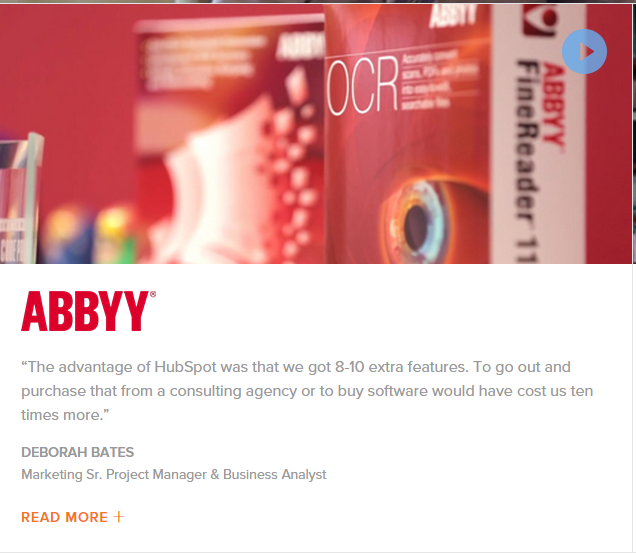
Hubspot, an inbound marketing company, makes good use of multiple testimonials on their homepage. This one stood out for a few important reasons:
First, the customer is particular about what gives Hubspot an advantage over their competitors. Getting “8-10 extra features” is an important distinction, and testimonials are perfect opportunities to highlight what makes your business uniquely valuable.
This testimonial doesn’t just show Hubspot is different than their competitors. It also points out a fundamental reason – going with them is cheaper than hiring a consultant or buying software. Your testimonials don’t have to include a laundry list of benefits to work. That’s counterproductive. Instead, be like Hubspot and focus on what counts to your target customers. Cost savings certainly qualifies.
The language here is also natural. It sounds like something you’d hear in a conversation, which adds more credibility than brands whose testimonials confuse and bore readers. Finally, Hubspot does an excellent job of keeping things brief, but still offering visitors a chance to find out more if they want to. They can click the embedded video above the copy or the “read more” link to find out more if they’re interested.
5. Groove
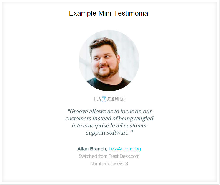
Groove is an online help desk software. Their CEO, Alex Turnbull, included the example above in his excellent blog post about testimonials.
What makes this testimonial work?
It persuades from different angles. The customer describes the pain point that led them to seek out a different solution: “being tangled into enterprise level customer support software.” And it also touches on a key benefit that Groove provides: “allows us to focus on our customers.”
Showing visitors you understand their pain points – where they’re struggling, and other businesses come up short – helps you build a deeper connection and makes people more receptive to hearing you out.
Groove also includes a photo of the customer, which eases doubts about credibility and has shown to be more effective than testimonials without images. Everything is centered and displayed beautifully. And the “switched from FrontDesk.com” is a nice touch because it adds a bit of social proof. It gets people thinking: “If he switched from them, I could switch from them too.”
4. StudioPress
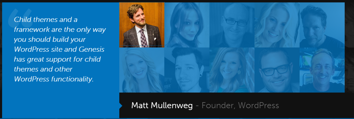
This testimonial from StudioPress, CopyBlogger’s framework for WordPress themes, adds something we haven’t seen yet: a dose of star power.
As the founder of WordPress, Matt Mullenweg’s recommendation carries huge weight in motivating skeptical visitors to give the StudioPress themes a shot. After all, if the creator of the entire WordPress content management system is singing its praises, it must be good enough for the typical customer.
Getting the right person’s recommendation goes a long way, even if they aren’t completely relatable to most of your target audience. As long as your target audience aspires to be like the authority (whether it’s fit, financially successfully, happy, etc.), high-profile endorsements can be extremely effective.
The testimonial itself is kind of vague. “Great support” isn’t exactly a wallet opener. But that’s okay: most people will be so focused on who made the testimonial there’s a bit more leeway with the content itself. If you’re in the position to feature a high-profile testimonial, do it!
3. FreshBooks
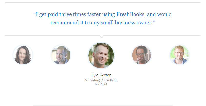
This testimonial from FreshBooks is short and sweet.
It’s also quite effective.
The pictures were the first thing that caught my eye (the text changes when you scroll over different ones). It’s nice to be able to match a face to a name, and it makes whatever the person said much more credible in the eyes of a visitor. Also, the customer himself (a marketing consultant) is relatable to the very type of people – any “small business owner” – his testimonial targets because he falls in that same group.
That raises the importance of precise targeting. A lot of businesses use testimonials to try and target every type of potential customer and serve up all the benefits. But this comprehensive approach waters down the effectiveness of the testimonial. If you cater to different customer profiles, you’re better off designating one testimonial to appeal to each instead of jamming everything all together.
Finally, the content itself is solid because the customer touches on a significant concern for any small business owner: getting paid quickly. It also works well because it’s specific. Instead of saying “I get paid much faster,” it specifies just how much faster. Those words can only come from someone who’s used (and loved) the product.
2. Podio
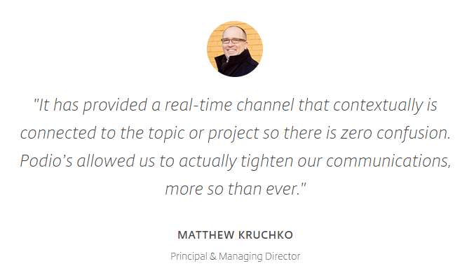
Podio helps companies coordinate projects and customer support without getting bogged down in endless email threads.
This testimonial works well because it addresses both the benefits of using Podio and the frustrations new customers can avoid. Not knowing which team member handles a customer support issue is a big problem for many businesses. But “zero confusion” and the ability to “tighten up communications” will appeal to any efficiency-minded executive.
The display is also good because it features a picture of the happy customer and extremely readable text. One of the most important reasons to try Podio – eliminating internal confusion – is brought up in a concise way to keep readers from getting bored. And the customer who gave the testimonial’s occupation is also is in line with Podio’s target audience.
A minor critique here: the language of the testimonial comes off a bit stilted. Words like “real-time channel” and “contextually” could be confusing to the average visitor. But if that’s how Podio’s target customers speak, it’s a calculated move. Speak in simple terms; unless you’re using specific terminology your target customers use as well.
1. Prezi

Prezi is an app that helps customers create and deliver engaging presentations.
Their testimonial works well for a few reasons. First, it does an excellent job distilling the essence of why businesses want to give better presentations in the first place: to increase their customer satisfaction. It goes a layer deeper than “give a better presentation” until it touches on the key benefit.
It’s also effective because it’s specific. Increasing customer satisfaction by 28% is a lot more persuasive (and believable) than “increased customer satisfaction a ton.” Here is a happy customer who’s measured the effects of Prezi on his business. Interested visitors can start imagining the possibilities for their businesses.
There’s also a play to authority here. Salesforce is one of the most successful and well-known CRM suites around. Their endorsement is powerful because most of Prezi’s target customers will probably have at least heard of, if not use, Salesforce themselves. I would’ve liked to see a picture of the guy’s face, but leaving it off seems like a calculated decision to get people to hone in on the text.
Your Turn
The right testimonials can persuade an “on-the-fence” visitor to become your newest customer.
They don’t have to be difficult either. The easiest way to figure out how to improve your testimonials is to study what’s already working well for others.
No matter your industry, the principles from the examples above can help you reach visitors in the most effective way: through the voice of happy customers.
Which of the 7 examples of testimonials did you like the most? Why? Leave a comment below and let us know!

