One of the most important areas for your prospective customers is the About Page. By optimizing this space on your website, you can generate engagement and establish a relationship with potential customers. You’re giving visitors a taste of your skills and credentials while telling potential customers what you can do for them.
As easy as it sounds, there is a right and wrong way to go about optimizing an About Page to increase sales and build customer support. This page can be one of the most important driving forces in building a reputation and converting your visitors into customers.
Effective About Page Attributes
An effective About Page is both visually appealing and substantive. This page gives companies the opportunity to engage, inform and inspire visitors with their goals, core values and how they can address their potential customers’ needs.
Harness these five principles to create a stronger About Page, and help your company sell more and build a solid, loyal customer base.
1. Shift the Focus from “We” to “You”
Frequently About Pages tend to focus on the company’s skills, awards won, and all the bells and whistles that make them special. This glowing praise is great in small doses, but it actually doesn’t necessarily read well for potential clients. This may lead to customers questioning, “Where do I fit into this picture?” There’s the company’s first mistake: they’ve put themselves before their customer’s needs.
Instead of continuing to showcase your company’s attributes, use framing to alter the way you phrase your statements and questions. From a psychological standpoint, the way you frame your solution strongly impacts the way it is perceived.
Citing Kahneman and Tversky’s framing effects study in 1981, Professor George Lakoff at UC Berkeley, discusses the advantages framing can have on a person’s perception.
“… Framing effects are perceptual. They are analogous to optical illusions in terms of whether the glass is half full or whether the glass is half-empty. The framing effects occur when a subject makes a different choice depending on whether the same outcomes are phrased as though they were gains versus as though they were losses.”
Include statements and statistics that praise your company’s skills and assets, but put a different spin on them. Shift the focus from what you do to what you can do for them.
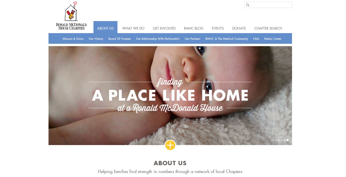
Take a look at The Ronald McDonald House’s “About Us” section. They use a photo slide to showcase different ways their company can help family and loved ones. While they address their services of networking through chapters, the focus is always on making the family and people come together. Instead of a talking about everything that they do, they focus on their families and how they meet their needs.
2. Showcase Your Expertise Through Value Propositions
Often times About Pages are ambiguous when it comes to presenting their core values and beliefs. Consequently they come across as blatant advertising, only concerned about making a profit.
Do not become a company that does not explicitly state their core values and beliefs. Doing so provides a great opportunity to showcase the goals and services of your company, while demonstrating to your visitors that you have a solid foundation and precedence set and in motion.
Ultimately a lot of weight is placed on this simple gesture. One statement can advertise to visitors that you are a company that is committed, focused, driven and always striving to become better.
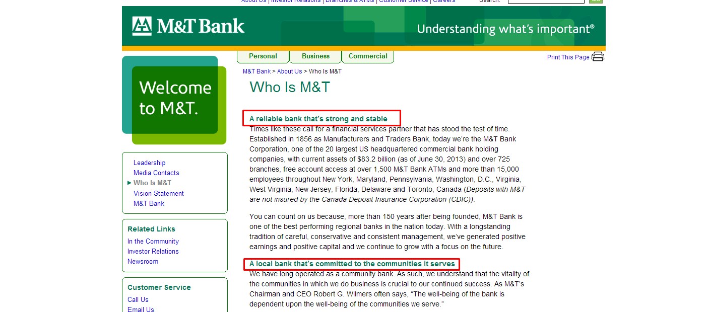
M&T Bank does an excellent job with simple statements of value. They are clear, concise and are set in bold and a vibrant color. While their morals and values are admirable qualities, they become lost amid the wall of text that follows each value. This can cloud the potential client’s vision and focus on what the company will strive to do for them.
That’s why your value proposition should be the headline of your About Page. It should engage and inspire your potential clients all while enticing them to read on and plant the seeds to establishing themselves with your company.
3. Incorporate Emotional Storytelling to Engage Visitors
Have an About Page that has something to say. Research shows that people are more likely to make a decision based on their emotions. A University of Toronto study suggested that “People who are emotionally intelligent don’t remove all emotions from their decision-making. They remove emotions that have nothing to do with the decision.”
Incorporate emotional storytelling to create a strong bond with you and your clients. If you have a unique company name or a great story that lead to your company’s success, don’t be afraid to share it.
Generate copy that engages your visitors to read on. Avoid sounding pretentious and use a conversational tone that allows your potential clients to relate to your company. Be careful not to reiterate the same ideas over and over again. Know your audience and how you can use copy to successful engage your visitors.
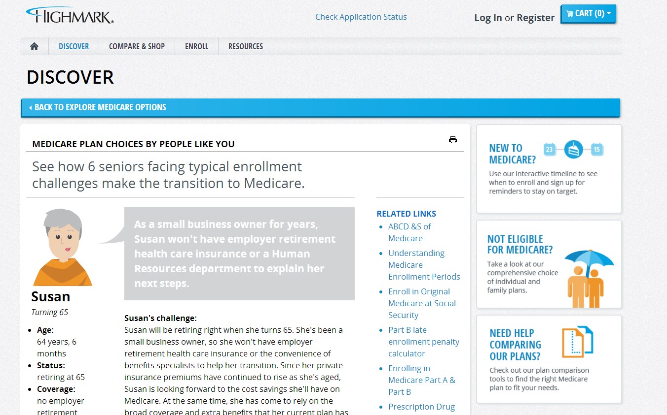
Highmark Blue Shield’s About Page entitled “Discover” talks about the benefits of Medicare within their company. Through six unique stories they can paint a picture of how their company can attend to the individual needs of their clients. Using these anecdotes can help create an emotional connection and make the copy relatable to visitors.
4. Help Your Visitors Take the Next Step
Don’t create an About Page that ignores the visitors interest. They’ve invested enough time in learning about your company and how it can benefit them. They’ve demonstrated some interest, so use the opportunity to engage them.
Guide your visitors towards the next logical acton. By utilizing a strong Call to Action (CTA), you have the opportunity to take their hand and lead them to their next step. This will help your visitors follow through with their interest in your company and your services.
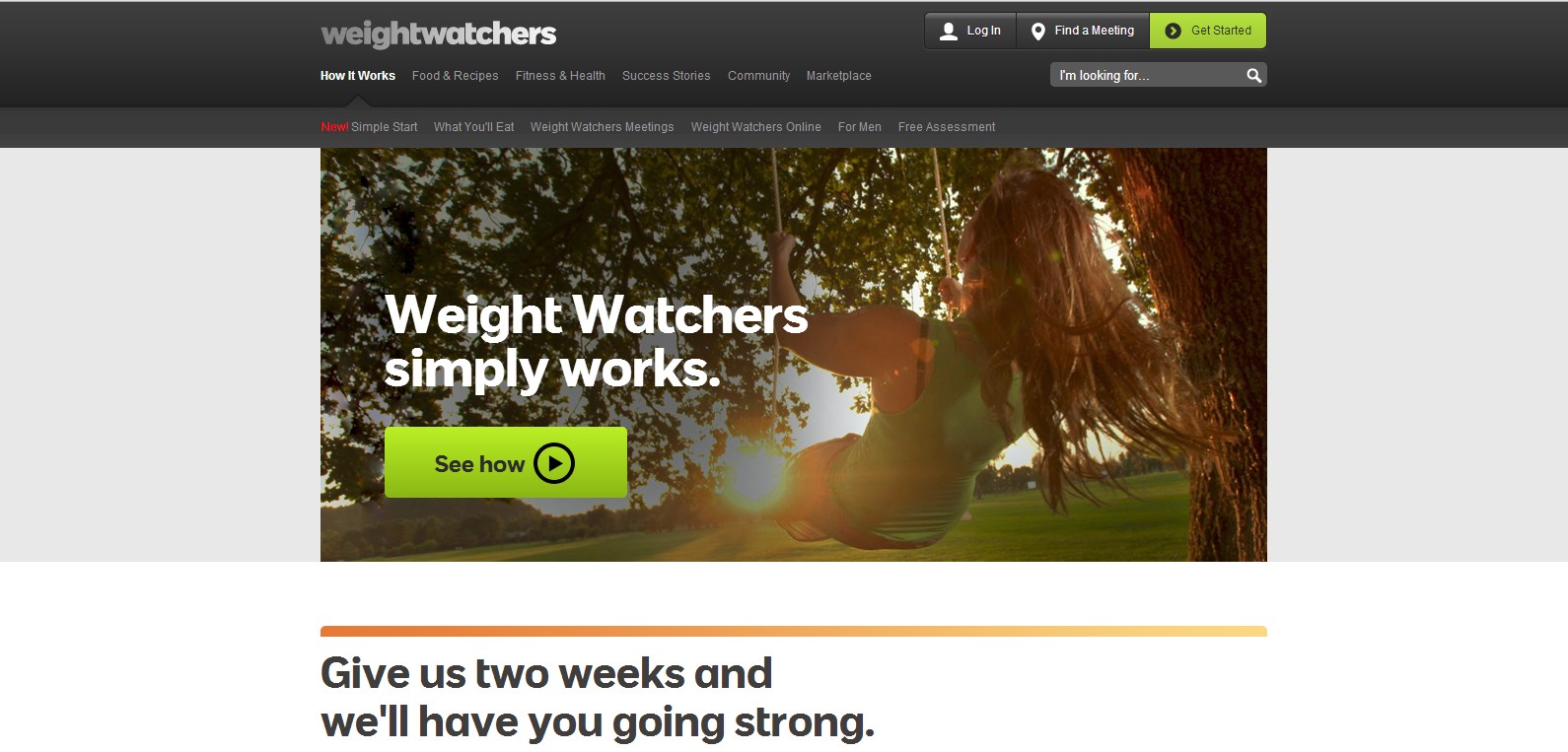
Take a look at Weight Watchers About Page. Not only do they include bold, simple value propositions, but they also create CTA’s that follow at the bottom of page that are colorful, and blatantly obvious. They’ve engaged and enticed their audience to join, so the next step would be options to sign up.
This way you won’t lose your potential clients because they were bored or overwhelmed. When in doubt, make it bold, but keep it simple and compelling.
5. Keep Your About Page Simple and Easy to Navigate
It may be obvious, but keep your About Page simple. Overwhelming your visitors with images, excessive content and trivial nonsense will stuff the page and deter potential clients from weeding through your information.
In marketing, more is more, and sometimes, more is just too much. Having countless links, awards, testimonies and a complicated design adds nothing to enhance an About Page. It just clutters the visitors view.
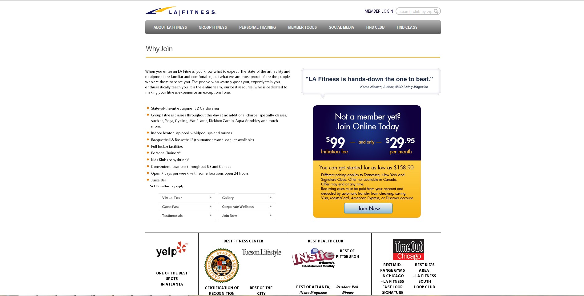
While LA Fitness has a great CTA to join their club, it is masked by a wall of text and awards from different cities. From the overall aesthetics, the page looks cluttered, especially because each award is associated with their respective dates. This can be daunting for a visitor.
Make your About Page easier to digest. Less is often more when it comes to making a point, so don’t be afraid of “white space.” Tastefully decorate your page with a company logo or a few fancy words to highlight your company’s contributions. Piece the copy into small, manageable chunks so readers can absorb more.
Crafting An Effective About Page
Consider these five principles when creating an effective About Page. When in doubt, put yourself in your customers’ shoes and speak to them in their language. This approach can help you build trust and ultimately drive more conversions.
Do you have any suggestions for an effective About Page? Let us know in the comments!

