A business philosophy that embraces incremental improvements and continuous testing pays off for months and years down the line.
The conversion rate optimization process is essential to making the most of limited resources and creating a long-term edge over your competitors. Yet those subtle improvements won’t have the effect you want if people don’t stick around to read your content.
Paying a little attention to how you present your content buys you invaluable time and attention to engage visitors and encourage them to become buyers.
Keep reading to discover practical ways how to do it using typography.

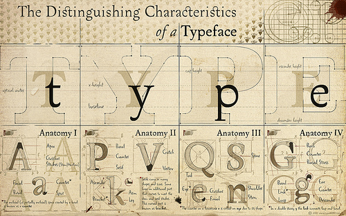
Image Source: arnoKath
Most Businesses Don’t Think about Typography
There’s no shortage of information out there discussing different ways you can optimize your conversion rate.
Do a quick search on Google, and it won’t take you long to come across articles telling you how to use headlines, tweak your calls to actions, and leverage strategic testimonials to turn a higher percentage of visitors into leads and customers.
Improving all of these elements – and getting them all to work together – are crucial to creating a website that converts. Unfortunately, a lot of businesses latch onto just one or two things. They get wrapped up in a series of never-ending tests and lose sight of the big picture.
With so many options to tweak and improve, there’s something subtle, but important, that’s often overlooked: typography.
Why You Can’t Afford to Overlook It
Typography, the art of arranging and presenting text to make it easy to read, goes far beyond aesthetics or personal taste.
You can’t afford to neglect typography in your conversion rate optimization process. The way you present your content has a significant impact on the readability and credibility of your messaging. Visitors won’t convert if they don’t read your content or believe it.
In a 2012 study with over 45,000 participants, The New York Times website found that certain typefaces were more believable than others. Phil Renaud, a college student, tracked his grades on 52 essays he completed in three different typefaces and found that assignments in the “Georgia” typeface averaged over an entire letter grade higher than assignments in “Trebuchet MS.”
Solid typography won’t turn an inferior product into a remarkable one, but it will help you hold visitors’ attention and give you time to showcase what you’re selling.
Sloppy typography can ruin an otherwise sound conversion strategy. People won’t stick around long enough to become leads and buyers if the way you present your content puts them off.
Giving Typography the Attention It Deserves
Now that you know a little more about what typography is and the impact it can have on your conversions, it’s time to give it the attention it deserves.
Making subtle changes and paying attention to the details will attract more customers and separate you from your competitors…
But how do you do it?
What are some practical steps you can take right now to use typography as a tool to boost conversions instead of an obstacle that turns people away?
Here are 5 simple steps to get you started:
1. Choose a Large Font Size
In most cases, using a larger font for website content is more effective.
How large should your font be? B. Nonn argues no less than 16 pixels, and makes a compelling case in an article over at Smashing Magazine. The article makes a good point in that users typically sit farther away from computer screens than when reading printed material. Here’s a picture showing identical text on a computer monitor (16 pixels) next to a printed copy (12 pixels):
Image Source: Smashing Magazine
A 2005 Nielsen Group article found that “small font sizes” was far and away the most common user complaint. You don’t have to overhaul your entire website right now, but you could change the font on a single page to 16 pixels and track your conversions.
Then, if you find the larger font size performs better by a statistically significant margin, you could change the font sizes on the rest of your website.
2. Stick to a Basic Typeface Scheme
In the principles of effective typography, simplicity rules the roost.
Typography should draw attention to your content, not the way it’s packaged.
Google Fonts has made it simple to try all kinds of crazy new fonts on your website copy. Resist the temptation; sticking to a basic scheme of 2 to 3 different typefaces is the best way to encourage visitors to read your content.
Choose one typeface for your body text and another for titles and headings. This establishes a clear hierarchy and helps convince all the “scanners” who jump around your content to dive in and explore it further.
Want to create a basic typeface scheme but don’t know where to get started? Check out this excellent article from Creative Bloq for a list of 20 different pairings that work well together.
3. Create Enough Contrast Between Text and Background Color
Effective typography makes it effortless for people to read your content. Anything that makes them work adds friction and decreases the likelihood of them engaging with it.
Although “readability” is a highly controversial topic, the majority position is that using light text on a dark background is a mistake. A lot of businesses do this. It strains visitors’ eyes and probably costs them conversions.

Image Source: UX Movement
Your website is the perfect platform to express your business’ personality, but you can do that with your website design, header, and logo.
You don’t have to do it on all of your content, but sticking to dark text on a light background for most of your content is the safest bet. This creates enough contrast to make your content easy to read. When content is readable, relevant, and does a good job of holding people’s interest, they keep reading and become leads and customers.
4. Increase Your Line Height
Most of your visitors (unless you’re selling to fighter pilots) wear either glasses or contact lenses. It’s hard enough for them to read on computer screens as it is, and you don’t want to make it any more difficult.
That’s why it’s important to have an adequate line height. This gives your text room to “breathe” and makes it easy for people to follow along.

Image Source: Rank Executives
Consider increasing your line height. It sounds like a simple change, but it can create significant results. Rank Executives lowered their bounce rate and increased their average time on site and social shares simply by changing their line height from 1 to 1.5.
Chris Pearson, the creator of the popular Thesis WordPress framework and founder of DIYThemes, created an awesome free tool to help you figure out your ideal line height for the best readability. Just enter your font size and content width, and the tool will calculate a line height for you based on the golden ratio.
5. Remember Web Readability Fundamentals
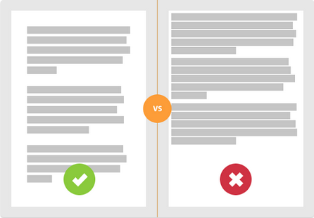
It doesn’t matter how beautiful your typography is if you surround it in a wall of text. Visitors won’t engage with it because the content looks intimidating and it’s too hard to read.
You can avoid this issue by applying solid content fundamentals:
- Use short paragraphs
- Use short words (write like you speak)
- Scrap filler words and get to the point
- Break up your content with subheadings, lists, and bullet-points
Jason Fried has it right:
Rule of thumb: Short paragraphs get read, long paragraphs get skimmed, really long paragraphs get skipped.
— Jason Fried (@jasonfried) July 9, 2012
Use all the tools at your disposal to make reading your content easy. Doing that will boost engagement and conversions.
Embracing Typography in Your Optimization Process
Applying these 5 typography tips will help you present your content in a way that encourages visitors to read it and builds your credibility.
After you’ve made the changes suggested above, don’t be afraid to experiment and track your results. What works best for your business and customers might surprise you.
The key is to embrace typography as an important part of the conversion rate optimization process. By all means, keeping testing headlines, calls to action, and other vital conversion elements. But remember the presentation of your content too!
Have you ever tested different typography options on your website? What were your results? Leave a comment below and let us know.


