Landing pages can be like well-engineered bridges that help people cross the chasm between “first-time visitor” and “buyer.”
Or they can be colossal wastes of time and money.
Ineffective landing pages are a dime a dozen. They strain budgets by eating up limited marketing funds. And they squander opportunities to make memorable impressions on users.
Businesses that use them well separate themselves from competitors and fill their lead pipelines. The competition for your prospects’ attention is intense, and that’s exactly what’s at stake here.
Putting landing pages together doesn’t seem complicated at first glance, but there are a lot of moving pieces required to make them work properly.
And if your landing pages fizzle, how can you turn things around?

Photo credit: HikingArtist.com via Compfight cc
“Fixing” Low-Converting Landing Pages Can Seem Overwhelming
If your landing pages aren’t converting well, the thought of “fixing” them can seem overwhelming.
There are so many things to keep in mind. Are your headlines optimized to grab attention and get readers wanting more? Does your layout draw people in or put them off? Should you just scrap the whole thing and start over with a new format?
Figuring out how to do all these well—write compelling copy, pair it with an engaging design, and implement your landing pages within a broader marketing strategy—could take years of study and firsthand experience.
But your landing pages aren’t working as well as they could be now. What can you do to rack up some quick wins and boost your conversions?
Focusing Your Efforts on High-Leverage Best Practices
There are hundreds (maybe thousands) of things you could try to improve your landing pages. But your time and energy are limited. You can make the most of it by focusing on “high leverage” changes that can create a massive impact on your conversions.
What will work best for you depends on your niche, what you’re selling, and your target customers. But some strategies have an almost universal positive impact on conversions. They’re been tested for years—and across a variety of niches.
Here are 10 landing page best practices that will boost conversions on practically every landing page:
10. Align User Expectations to Reality
Ever clicked on an ad… only to end up on a page that had nothing to do with what you thought it would?
You probably clicked away from the page, didn’t you?
The ad that gets your attention creates an expectation in your mind. But the landing page associated with it doesn’t meet those expectations.
It’s essential to fulfill expectations you create in the content that gets visitors to your landing page in the first place. No one will engage your copy if it isn’t instantly relatable to the initial advertisement.
Take a look at this ad and landing page that came up after I Googled “tax software:”

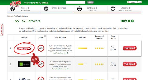
See how the content on the landing page “matches” the content from the ad? I clicked because I wanted to find out more about tax software. And that’s exactly what I find on the corresponding landing page. This creates a solid foundation marketers can build on.
9. An Obvious (and Prominently-Placed) Call-to-Action
A landing page’s primary purpose is to drive action—whether you’re trying to get visitors to sign up to your email list, try your product, or anything else.
Poor landing pages leave the action visitors should take vague. Even if someone finds the copy engaging, there isn’t a clear “next step” to take the relationship further.
But effective landing pages make it obvious what they want you to do next by including a noticeable, prominently placed call to action. Check out this example from Dropbox:
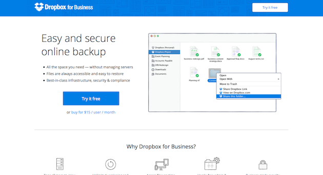
The next step is clear: try Dropbox for free. The call to action is “above the fold” so readers don’t have to scroll to find it, and the dark blue button stands out. And Dropbox makes the call to action enticing by reassuring users what they will get out of taking action: a free trial.
8. Trust Elements
Many visitors who find your landing pages haven’t been exposed to you before. They’re “cold traffic,” and you only have a few seconds to warm them up and show them that you’re credible.
That’s why trust signals—things like testimonials, social proof, and seals and certifications—are essential components of high-converting landing pages. Without them, your visitors end up lumping you in with the other scammers and fly by night operations they encounter online.
Take a look how The John Maxwell team, who teaches people how to become business coaches, incorporates testimonials within their landing page:

7. Personalization
You can’t make a new landing page for every single person who visits them, but personalizing your landing pages as much as possible is a great way to connect with users and convince them to take action.
More data is emerging every day shedding light into who your visitors are at a deep level. You can use things like their geographic location, prior activity on your website, and their traffic source to tailor landing pages and give them a personal touch.
James Agate from Skyrocket SEO created a new landing page specifically designed to welcome Raven Tools readers after submitting a guest post there. That gave him the perfect place to refer those blogs’ readers who make their way to his website. Here’s the page:
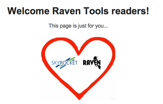
Image credit: Unbounce
6. Directional Cues
Your landing page has only a few seconds to get someone’s attention and make it clear what he or she should do next. Directional cues are great ways to point people in the right direction and create a “flow” in your landing pages that ends in conversions.
Using arrows is simple and effective. Another option is to include an image of someone looking in a specific direction: where you want your visitors to look! Humans are curious when they see a picture of someone; we want to know what they’re looking at.
Take a look how Geico does this in their landing page for car insurance:
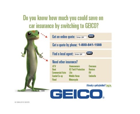
Image credit: WordStream
5. Pick One Conversion Goal
Landing pages that try to get users to do multiple things—all within the context of a single page—usually aren’t as effective as those that stick to a single conversion goal.
Instead of trying to get visitors to join your email list, check out your blog, and schedule a free demo all at once (a recipe for confusion), limit yourself to one “next step” for the visitor to take.
Shopify does a nice job of this in their landing page:

They don’t try to get visitors to several things at once. The only goal: persuading them to sign up for a free trial.
4. Remove Link and Navigation Clutter
Cutting down on “link clutter” is a great way to keep visitors engaged. You might want people to eventually visit your blog and find out more about your business, but that’s beyond the scope of a landing page. Each extra link you include gives people something to do besides what you want them to do after engaging your landing page.
It’s possible to design landing pages so there are very few (or no) other links besides the single conversion action. Take a look how QuickBooks does it in their landing page:
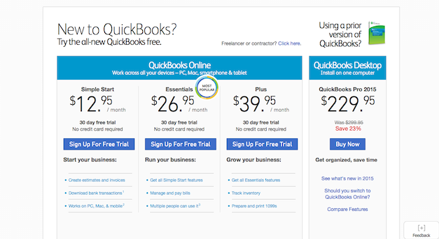
See how that works? Besides clicking the “back” button on their web browsers, there isn’t much for visitors to do besides select a free trial of the software—the exact action QuickBooks wants them to take.
3. Clarity Beats Everything Else
You want to make your landing pages as persuasive as possible, but making things clear is the highest priority.
Landing pages aren’t the time to try to get clever. Remember: a lot of your visitors don’t have previous contact with you. You only get one chance to make a good impression, and a few seconds to show them you could help them.
Someone should be able to find out what your business does (and the benefits) immediately. That’s why clear headlines and benefit-oriented copy are so effective.
Take a look how Greenpal does this.
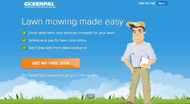
There isn’t any doubt about what they do or the problems they solve. All a reader has to do is read the headline and scan the bullet points.
2. There’s No “One-Size-Fits-All” Length or Layout
Debates about the ideal length and format (text-based, video-based, etc.) of landing pages are endless.
The only way to win those arguments is to not play. Bottom line: a lot of factors are involved. Everything from what you’re selling, to your market and audience demographics play a part.
In general, shorter landing pages work well for inexpensive offers and small commitments. Long-form landing pages, on the other hand, are well suited if you’re selling expensive, complicated products.
Conversion Rate Experts made the copy on Moz’s landing page six times longer than the control, which helped to increase Moz’s revenue by $1 million a year:
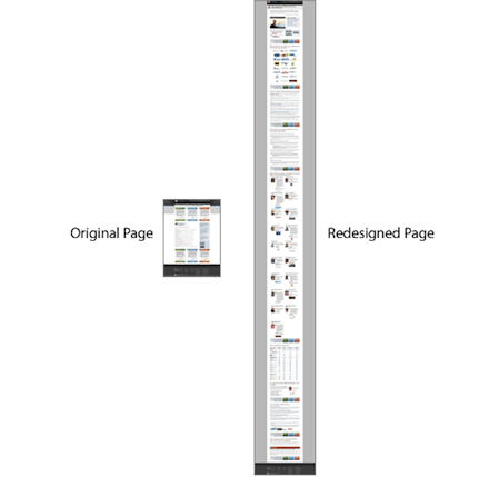
Image credit: Conversion Rate Experts
As for format, what others are doing in your industry can create expectations among your target customers. Older prospects might prefer text-based landing pages while young, hip demographics are likely to embrace video.
The only way to find out for sure: start somewhere and test along the way. Which brings us to…
1. Continuously Test and Tweak Design, Layout, and Creative
Once you have the other nine best practices in place, the best way to take your landing page conversions to the next level is continuous testing.
There are so many potential elements to test. Unbounce put together a comprehensive list of 101 landing page optimization tips here. The key is to start somewhere and to always be running tests. This isn’t a process that ends; it’s a consistent element of winning CRO strategies.
The result: your landing pages consistently get more persuasive (and cost-effective).
Optimizing Your Landing Pages Doesn’t Have to be Scary
Optimizing your landing pages can seem scary, but it doesn’t have to be.
Start with these 10 best practices. Then, once you have a solid foundation in place, you can continue to tweak your pages to make them even more profitable.
But start today. Even slight conversion improvements can add up to a lot of money saved (and new customers won) over time.
Do you have a strategy in place to optimize your landing pages? What do you focus on first? Leave a comment below and let us know.


