A landing page is the critical element of a funnel upon which its broader results hinge. You could have slick visuals and top-notch marketing automation software – if an error or obstacle on your landing page prevents visitors from converting, it will constrain your results and limit the effectiveness of your digital marketing.
Even if your landing page has been working well and capturing a healthy number of people, it can always be optimized so that you can convert even more visitors. The bigger question is, how do you take steps to optimize your landing page?
There’s no one-size-fits-all answer. Everyone’s offering and their funnel will be slightly different. However, even in the dynamic world of B2B, where there is a strong focus on customization, our team has seen certain trends emerge across several industries.
Just remember, trends in landing page design operate the same way as trends in any other industry – fashion, art, music, etc. That means you don’t need to take this blog post as a comprehensive guide to all the elements you must include on a landing page. Think of it the way you might think about trends in clothing: you wouldn’t rush out and replace your entire wardrobe with only the items trending at this year’s top fashion shows.
Instead, you would look at what kind of clothes are trending, think about your signature style, and decide how you might incorporate a few popular pieces into what you already wear. The same goes for your landing page – instead of completely overhauling a page to keep up with the latest trends, decide which of them make sense and edit your pages accordingly.
Live Messaging and Chatbots
If you’ve been on any recently-updated landing page in the last year or two, you probably noticed a recurring pattern: a chat window pops up, often on the bottom-right side of your screen, prompting you to ask a question about a product or service, or perhaps giving you details of the company’s latest sale or launch.
The rise of support via messenger and chatbot platforms on company websites has been meteoric. According to Fortune, the global chatbot industry expects to grow at a rapid clip of 22.5% between 2020 and 2027. That significant growth rate didn’t happen by accident. It’s the result of customers in many industries preferring to get their questions answered immediately via chat instead of sitting on hold or waiting around for an email inquiry to get answered. Over 40% of customers prefer getting answers from chat immediately, compared to 32% who prefer the phone and 23% who prefer email.
You don’t need to build a sophisticated AI-based chat platform from scratch. Plenty of simple chat platforms allow you to use either a real person or a basic bot to message people who have questions about your offering. Check out tools like HubSpot, Drift, Intercom, and Twilio as a starting point in your search for live messenger and chatbot solutions.
Inclusive Design
According to Adobe, inclusive design is a style that “considers the full range of human diversity with respect to ability, language, culture, gender, age, and other forms of human difference.” In other words, it’s a design that allows the broadest range of people to view and use your landing page content, even if they use adaptive technology or have some type of disability.
A great place to start regarding inclusive design is the web content accessibility guidelines (WCAG), created by the World Wide Web Consortium (W3C). Government bodies, universities, and other organizations leading the way in accessible digital content use these guidelines.
A few simple elements that you can incorporate right away to improve accessibility:
- Add captions to all video content, whether live or pre-recorded
- Allow users to pause and play audio and video content
- Allow users to resize text by at least 200% without assistive technology
- Don’t include any images or visual elements that flash more than three times
Progress Indicators and Icons
Another common element on today’s landing pages is some type of indicator to let users know how they are progressing on a form. Percentage bars or icons representing the number of form pages completed and remaining are a great addition to almost any landing page. By some metrics, you can increase your website’s conversion rate by 30% just by adding a progress bar to your landing page.
Ideally, you want to keep your landing page to no more than four separate pages or sub-forms. If you need to collect more information than this, think about adjusting your funnel or trying to gather extra data after the conversion event has taken place. For example, if your landing page is to book appointments, there may be some kinds of information that you can collect on your first sales call instead of on the page form. Keeping your form as short as possible and letting people know how many more sub-forms they have to complete is a great way to improve landing page conversion.
Minimalist Design
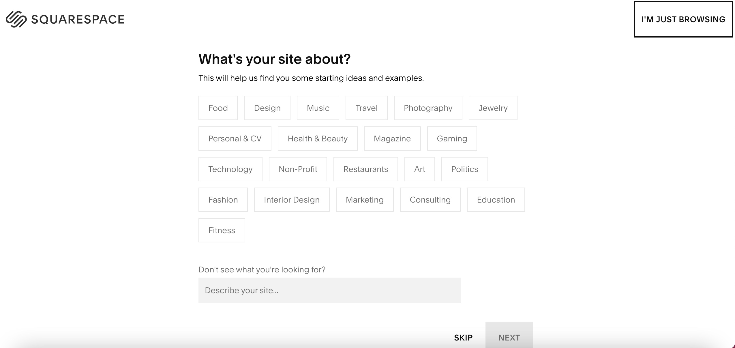
Check out this landing page from Squarespace:

Notice the simplicity: it has the company’s logo, the main form, and an option that allows visitors who aren’t ready to buy to return to the home page. This type of minimalist design is everywhere on modern landing pages, from those related to the most complex B2B software to those offering the most basic B2C commodity.
If you’re going for the minimalist approach, strike a good balance between design and functionality. Don’t sacrifice important information that prospects need to know simply to include as much space as possible. However, it can be helpful to re-evaluate your landing pages with a close eye to determine if there are elements that you may be able to remove.
A final tip for the minimalist or “blank space” approach: use colors that make the main elements of your page stand out. A white background typically means using brighter colors on elements like links, buttons, and headers. Be sure to pick a color scheme that works well together and doesn’t clash or cause any readability issues for visitors.
Final Thoughts On Landing Page Trends
Remember: you don’t need to adopt any of these trends on your existing landing pages, particularly if your funnel already works well at converting visitors. However, when looking to improve your landing page’s conversion rate, it can be helpful to look at current trends in landing page design as a starting point to determine what positive changes you could make.
Our expert team at FunnelEnvy can help by evaluating your landing page and identifying a few key areas you can improve. With only minor tweaks to your page, it’s possible to increase your conversion rate by a significant percentage that expands your marketing funnel and provides real gains to your organization’s bottom line.
Click here to complete a short quiz and find out more about how FunnelEnvy may be able to assist with optimizing your funnel’s landing page to incorporate some of the latest trends and designs for better results.


