Transcript
Hey everyone. My name is James Niehaus. And today in this video, I’m going to walk you through what are multi-step interactive forms. So at FunnelEnvy, we use this all the time with our clients, and we’ve seen some great wins. And we thought today we would actually share with you what we’ve learned from those efforts, and hopefully encourage you to do the same on your side.
- What are multi-step interactive forms?
- Results we’ve been seeing with our clients.
- Some best practices we’ve learned from doing this with our clients.
- Some techniques and lessons learned that you can use and adapt to make it easier for you to get started.
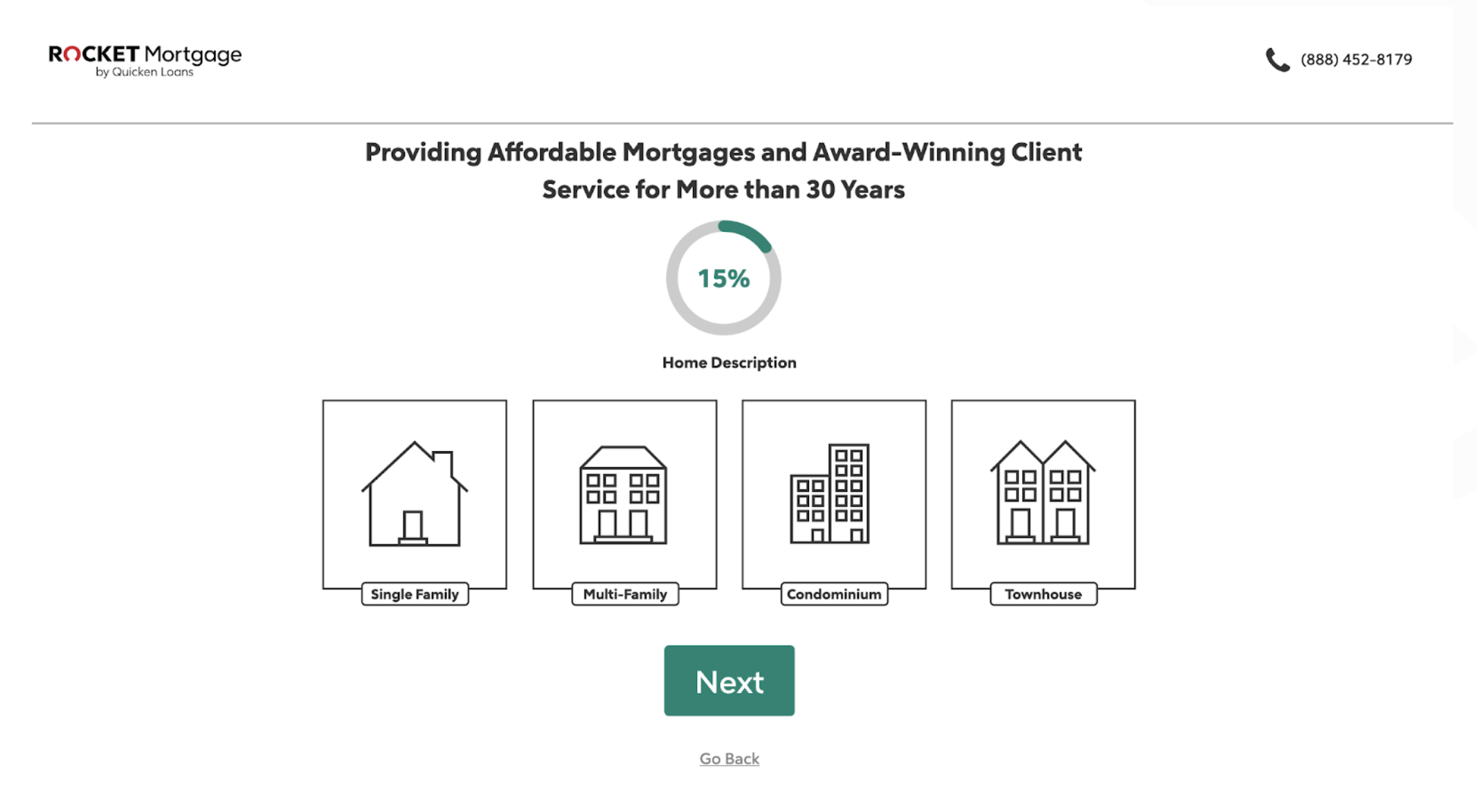
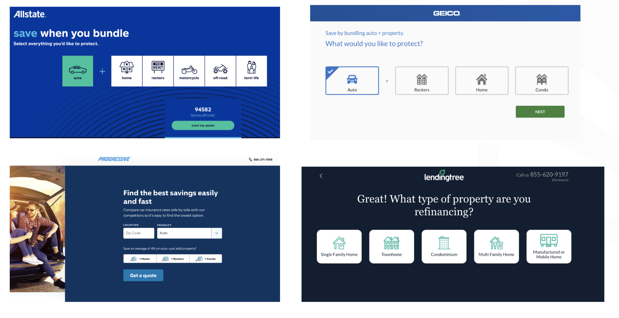
We all hate forms. Right? So whether it’s a mortgage application or whether it’s a tax form, it’s something we prefer not to do. And the providers know this, and that’s why it’s very hard for you today to complete a mortgage application online without going through a multi-step experience as we see here. Or as we all know with taxes, TurboTax and others have made that the standard experience, step-by-step guided questions.
That is Why We All Prefer This…
Why? It’s common sense.
- It’s less intimidating, easier to get started. Even though we know there are more fields,
- it’s an easier way to start and get the process going.
- We feel less perceived commitment.
- And lastly and most importantly, ideally we do it right, as an end-user we think we’re being guided down a better path, which will, as we know, save us time and give us better results.
So there are all positives and why we’ve seen this kind of being the prominent way, at least in B2C, where complex forms are being presented. So they’ve been doing this for like 15, 20 years. LendingTree is one of the pioneers of this. They found out early on that, in a competitive space, this gave them an advantage. Can provide you a better user experience, make it easier for you to fill out a form, and become a lead. And now, fast forward to today, you really can’t complete a mortgage lead or auto insurance quote without going through some similar experience. So it is now the standard for B2C.
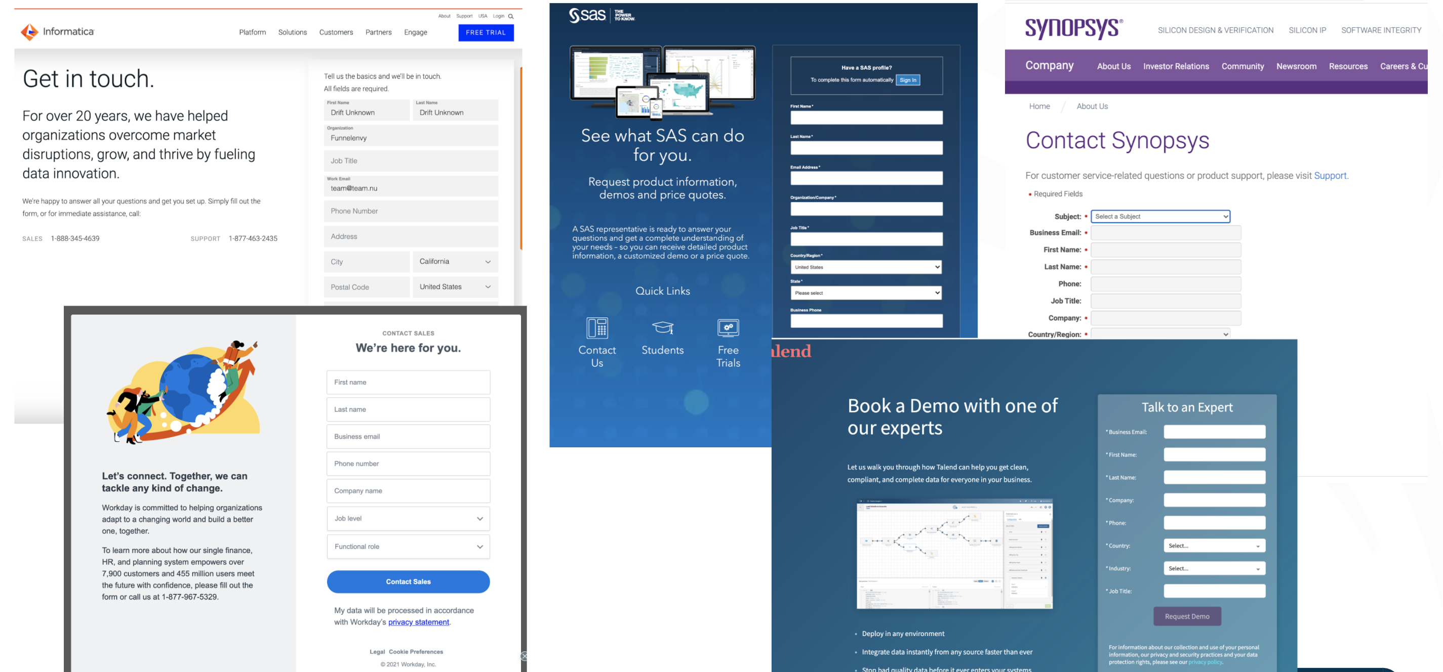
But for B2B, unfortunately, it still seems to be the 1990s, where it’s still no static forms, no interactivity, and it’s pretty much the standard for most of the industry. This is unfortunate, but it’s slowly changing. So if you see here, there are some examples out there.
So like Drift and Intercom and others like them who provide us chatbots. That’s helping. So if you can get [inaudible 00:03:02] one of their bots, you can usually get a nice playbook experience of decision tree experiences. So it’s a good start, but as we all know, the majority of website visitors still want to interact with your website, not a chatbot.
And we’ve seen some people provide multi-step forms, like Salesforce here with their trials. It’s a good start, but there’s obviously more that can be done. But for B2B, there are some additional hurdles that are typical of most of our clients. So for example, if you’re in the B2B space, typically you’re going to have one of these four vendors.

And they’re providing your email, your forms, your landing pages, and your workflow. So they make it really easy to by things like let’s copy and paste our embedded form, put it on your website, or we’ll host your landing page, and you’re done. That’s pretty easy. But of course, the default experience is a single, static form.
A second hurdle we often see is that you do need web developer resources to do this. Most DemandGen teams are resource-constrained. And don’t have access to a developer for the 2-3 days required to implement
And the third hurdle is, it’s not a priority. Typically the website is not the focus, it’s about getting traffic to the website. So they’re chasing the latest AdTech and Martech to make it easier to target, intent, ABM, and get more people to the site. So I figured this is what people are most interested in hearing about, which is: what are the actual results?
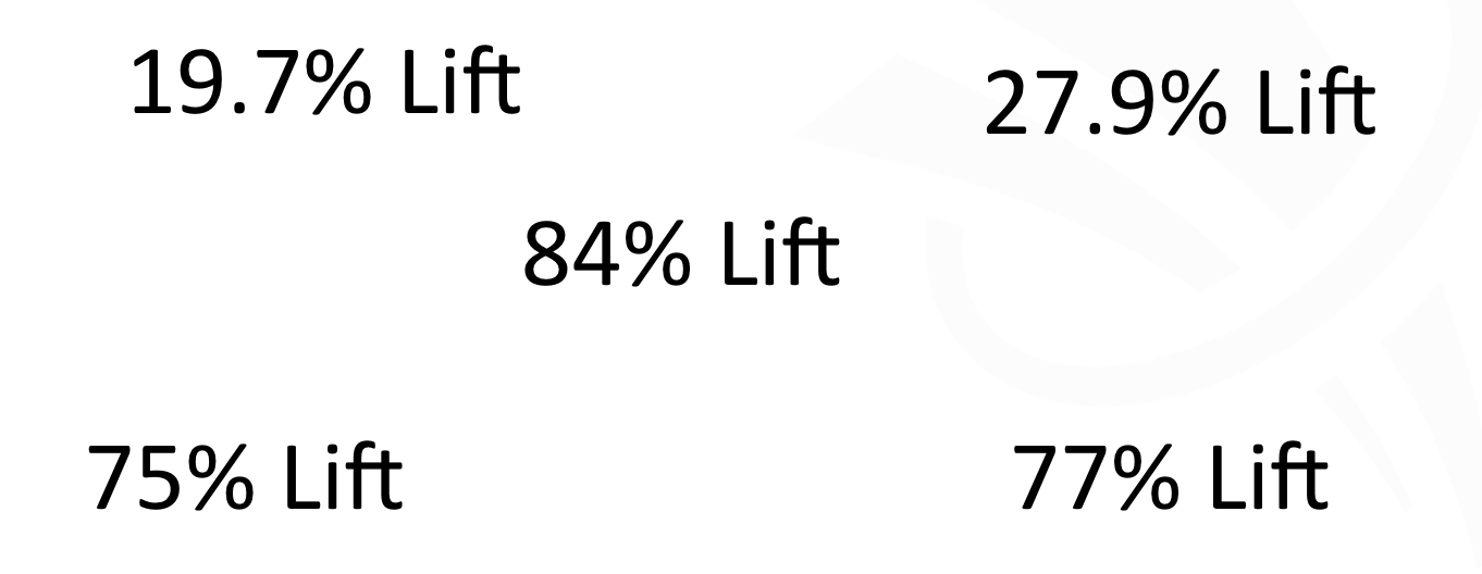
So these numbers are actually real numbers we’ve had with recent clients in the past year running multi-step interactive forms on their site. So again, these are meaningful lifts on forms like demos and pricing and get started forms. So your core sales forms. So that’s a huge win for many of our clients. And for the most part, for the majority of our clients we tried this on, it’s worked. Typically double-digits or higher. I think, and only one example I can recall, we ran this where it didn’t necessarily win across the board, but it’s still won for the returning segment for around 20 plus percent. So even if we don’t get a clear win across the board, we still see important lifts for key segments. So this is why we want to stress that we think this is probably the most viable tech tactic you can apply to your website to really maximize your revenue and your pipeline for the website.
And here’s some just examples of the actual client experiences.
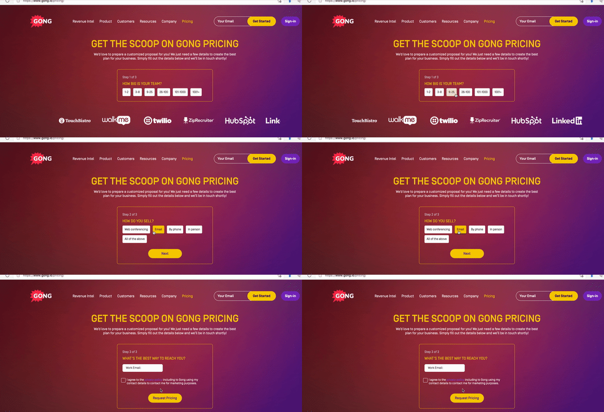
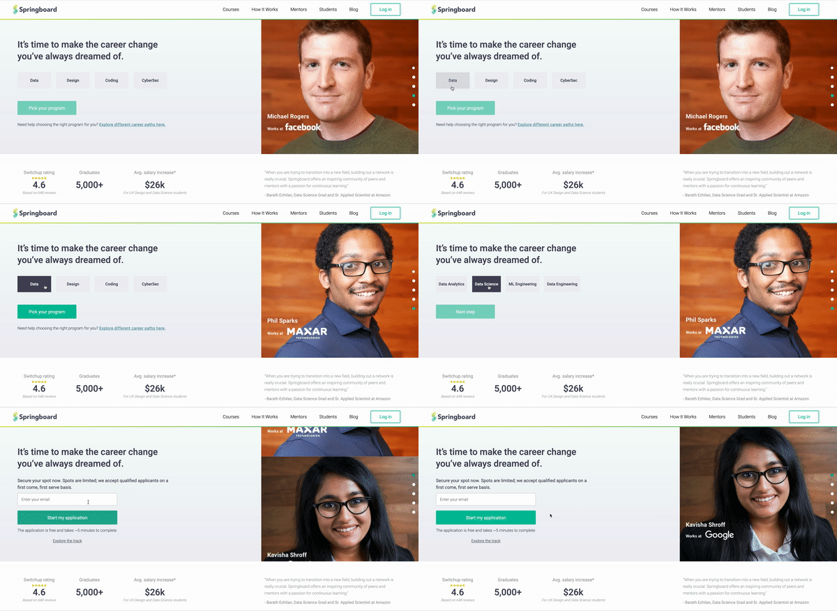
So as you see here, again, simple, straightforward experiences that make it easier for their visitors to start and complete a form experience.
And with that said, let’s talk about some of the best practices we’ve seen working with our clients in this area. Now, the first thing you want to consider is, if at all possible, you want to lead this experience, that first question or two, with intent questions. Right? So you want to ask them things that they care about first before you ask them for their name and their email. Right? You want to get them excited and want them to get started and make it easy for them to get started. So intent questions, how large is your organization? What industry are you in? What features do you care about? What’s your role? What are some of your integrations?
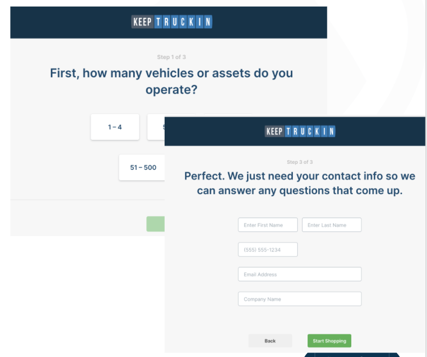
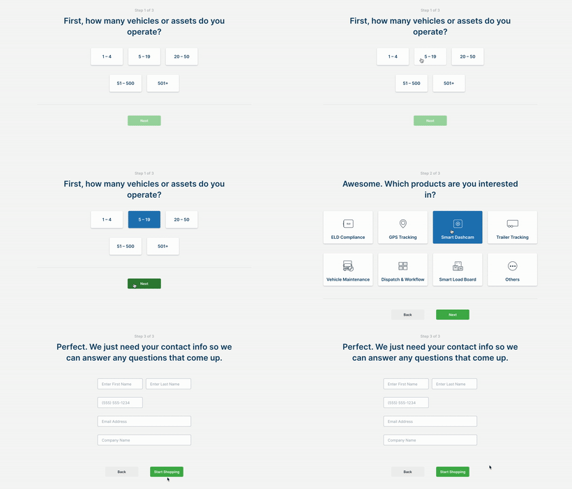
The second learning is you want to create momentum. So we want to ideally provide two or three questions that get that intent ball rolling. So here’s an example from one of our clients. But again, the whole goal here is you want to make it easier for them to get started, you want to create that momentum so that they feel committed to the process. So therefore it’s easier for them to convert and complete that final piece of the form that’s going to be the personal information that we need to collect to run the business.
Now the third piece I’m going to call out also is it’s good to also set the proper expectations. So when you provide that form, that multi-step experience, call out the number of steps involved. And when possible, call out what you plan to do with that information. So you can help them make a better choice. Is this going to be passed by your sales team to make a more effective quote or a demo or discovery session? But let them know that this information is not going to be dropped to the floor, it’s going to be used to help provide them a better outcome or experience, which is what they want. That guided treatment. Now, those are some simple best practices. And hopefully, they make sense.
Lessons learned along the way from doing this with our clients.
- Pick the right form. Ideally, where the outcome could vary based on their inputs:
-Best working forms -pricing, get started, talk to sales, choosing the right demo or trial, ROI calculators. - Don’t be afraid to ask for more information if the question(s) aligns with user intent. like about your team size, about your feature of interest. It will be easier for them to get started.
- It will work for more than just forms. Now that’s a broader topic, so I’m going to save that for another video, that you can access on our site shortly after this one. But those are some lessons learned
How to Get Started
- Identify the right form
- Figure out the design first
- Work with a web development resource to build the interactive form (typically a few days to a week effort)
- If you are adding fields work with your marketing automation team to capture the new fields
- Run the experience as a test and remember to look at performance by your top segments
- Run 1-2 iterations over time to fine-tune the question sequence, visuals, or layout
- Expand to other forms on your site.
Don’t overlook this, but you want to expand this to other forms on your site in other areas. So again, I’ll have more about this topic in another video about where else can this work for you on your website. But that’s hopefully enough to have you get started. And then with that said, as I mentioned, come back to the website, I’ll be posting a couple of other videos about, one, how this can be used in other places beyond the form.
Learn More on Multi-Step Experiences
Here are the two more articles to learn about multi-step interactive forms
- Advanced use cases for ABM and Personalization
- Multi-step Interactive Experiences (going past the form)
Go to our website, funnelenvy.com/blog, and you’ll be able to check out the content and hopefully enjoy this and other content that’s similar. And with that said, thank you for your time. If you have questions, just drop me an email. And if you want to see our own interactive quiz, you can hit our website. And that quiz will actually help you evaluate whether you’re the right fit for working with us. So check it out and hopefully we can talk soon. With that, take care.


