Your website receives visitors in different stages of the buying process, who have varying needs and priorities. You recognize this, so you’ve installed a personalization platform. Where to begin?
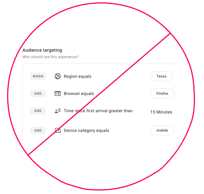
First, a word on what not to do. Do not get click-and-drag happy with your platform’s audience tool, and end up creating a monstrosity like “Returning visitors from Texas using Firefox on Mobile.”

These audiences are easy to target, but hard to reason about, painful to maintain, and impossible to extract value from.
Instead, start with leads.
Why leads? (And what’s a lead?)
The exact definition will depend on your customer journey, but broadly speaking a lead is any visitor who has identified themself on your website.
This might include:
- Free trial users
- Whitepaper downloaders
- Webinar attendees
Put another way, leads are visitors who are neither paying customers nor anonymous.
As for why you should provide a personalized experience for them, there are three main reasons:
- You can. They’ve signed up, so you know something about them.
- They’re your second-most-valuable visitor segment. (Customers are #1, but that’s a topic for another day.)
- Your current website is probably dominated by top of funnel content that they’ve already seen, and no longer find valuable.
Given how important this group is, it makes sense to provide an experience that’s relevant to them. But how do you do that without rewriting your whole website?
Where to personalize
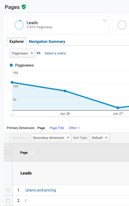
Meet your leads where they’re already spending time. Finding out the answer to this question is as simple as segmenting your analytics data by leads, then looking at top pages.
The answer is probably “the Homepage and the Pricing page” but don’t take my word for it. Let the data tell you where to focus, and what kind of reach you can achieve.

Once you’ve identified the top pages visited by leads, you can further prioritize by focusing on the elements they see and interact with.
For example, Hotjar allows you to trigger heat and scroll maps with custom code. That means you can create a “Leads only” heat map of your home page. (If that’s too hard, just keep your focus above the fold.)
How to personalize
This step is where the magic happens. What unique questions do leads on your website have? What tasks do they prioritize? What does activation look like?
To help structure your ideas, look for chances to do three things: Educate, remove friction, and nudge.
Educate
Does your homepage hero heading tout your product’s core value proposition? That’s great, but your leads probably know it by now. Can you change it to outline an important differentiator?
Does the homepage hero CTA still say “Free Trial”? You definitely don’t need that. Does it make sense to link to your knowledge base, or a quick start guide?
Remove friction
A simple improvement you can make is to show your free trial leads a more prominent “Log in” or “Visit My Dashboard” button. There’s a good chance that’s what they came to click.
You can also disable widgets and popups focused on lead generation. Those elements, by definition, can’t provide you with a new lead in this context. All they can do is annoy an existing lead.
Nudge forward
What steps does a visitor have to take before obtaining value from your product? Configure an integration, view a dashboard, import contacts?
When they were new to the site, pushing them toward this would’ve been overwhelming. Now that they’re more familiar with your product, though, they need this guidance.
Does your chat widget still ask “New here? Got any questions?” Why not start an onboarding-related conversation instead? A simple script along the lines of “Have you imported your contacts yet?” can transform this chatbot from a nuisance to a touch point for upgrades.
Stuck for ideas? Here are a couple of suggestions for websites we at FunnelEnvy know and love.
What you can do today
The first step toward obtaining value from a personalization strategy is convincing yourself that it’s worth the effort. So, start there.
What is the single highest-traffic page for existing leads? How many visitors does it get each month?
What’s the single most impactful element on that page? If you’re not sure, start with the hero heading copy and CTA.
What’s the current experience for leads? Is it relevant at all? Can you think of a message that would easily be 10 times more helpful?
If so, you’re onto something.
The good news is that the technical hurdles involved in making this change are solvable in any number of ways.
Your personalization tool might support targeting based on past visits to the /dashboard page. You might convince a friendly dev to set a cookie for new signups. If you use Marketo, FunnelEnvy lets you target by Smart List.
So take your newly acquired vision for a better lead experience, share it with the team. You’ll be hard pressed to find someone willing to fight to keep redundant CTAs on the page. I doubt anyone will argue that converting leads to sales is a wasted effort.
Starting personalization with a well-defined, high value, high reach, and observably different audience segment will make the difference between real ROI and a cringe-inducing vanity metrics report. So let’s go nurture some leads!


