If you are a B2B SAAS business you should be spending a lot of time on your pricing page focused on iterative testing.
Pricing pages are vital for your bottom line. Those who end up there are late in the conversion funnel, and likely gathering the information to make a purchase decision, or at least consider that purchase.
Given its importance, you should be constantly A/B testing pricing pages, taking every incremental improvement as a win for your marketing department.
At a high level, pricing pages should be clear in terms of quickly getting users information to make a purchase decision and also not introduce additional points of friction. While simple in theory to follow, we see many of these fundamental rules not being followed here at FunnelEnvy.
As such, we have created a simple list of best practices you should follow to maximize conversions with your pricing pages.
Clear and Simple Pricing Tier Design
The specific pricing tiers on a pricing page is often an acute area of focus for testing, and somewhere that you might want to spend lots of time on.
Here are 3 helpful steps to follow with your pricing page design.
- Focus on clarity and simplicity.
- Ensure the design conveys the most critical information about those pricing tiers in order for the user to make a purchase decision.
- Keep the calls to action clear and differentiated enough to stand out.
I’m going to use two of the classic B2B examples for reference points here. The first one is from HubSpot, the second one is from Salesforce. They do a great job at high converting pricing tiers.
Hubspot Pricing Page
SalesForce pricing page
In both of the examples above, it’s very clear as to what you are getting with the different pricing tiers. The CTA’s are contrasting in color versus the rest of the page, and the prices are clearly stated.
If you’re looking for test ideas and you don’t think your design hits the mark there, you might want to test alternative designs.
Align your pricing with buyer personas.
The idea here is to articulate your pricing tiers in a way that resonates with the customer’s perception of their own business. For example, ‘professional’ and ‘enterprise’ are both terms that both HubSpot and Salesforce use, and it’s very infrequently that people arrive on either of these pricing pages and get confused between which one they have to pick.
The pricing tiers are articulated and match how the user perceives their business. This helps the user not get stuck trying to choose between options.
Use a single core value metric
I recommend scaling your pricing tiers to a ‘single core value metric’. This is a single metric the user understands and reflects the value they get from the platform as they scale.
To take a HubSpot example, the pricing is based on a number of contacts, and the user intuitively understands that as they have more contacts in HubSpot, the pricing increases because the value to them increases as well.
So if you’re looking at your pricing pages and want to improve conversion there and find that your pricing tiers aren’t necessarily consistent with the buyer persona or you’re not clearly articulating a single core value metric, you may want to test reframing some of that pricing, rearticulating it, and comparing that to your current baseline.
Eliminate multiple audiences for a single page
Let’s take a look at the example above. Can you spot the problem?
Right here we’re looking at actually two different audiences being targeted, and two completely different buyer journeys being crammed into a single pricing page; a single web experience.
The basic and premium options are targeted towards small or medium-sized businesses and organizations, and the signup flow is self-registration; it occurs completely through the website.
But as you can see, they’re also trying to target enterprise customers through ‘request a demo’, and speaking to someone on the inside sales team that has a completely different experience and audience.
That should set off some alarms. If you’re in the business of driving conversions, competing calls to action, audiences, and buyer journeys on a single page does have a really negative impact on your conversion rate.
Solution: Optimize through personalization
How can we improve the experience of a pricing page with multiple buyer personas?
If you are able to identify the nature of that account or traffic coming into the site, you can show a unique experience for that specific audience.
 For example, target SMBs based on previous browsing behavior and highlight the self-signup flow. Alternatively, through firmographic third party integrations, identify if a visitor is coming from an Apple or Microsoft, and really highlight the enterprise plan and the benefits for that customer.
Through personalizing the experience, the decision-making process is simplified for the visitor, and you’ll see an increase in conversions.
Clear Calls to Action
It’s really important on pricing pages to set clear expectations on the call to action as to what happens when the user clicks a button. In the HubSpot example, somewhat non-traditionally, they use two calls to action.
But in this case, they are differentiated both in design as well as the expectations. One is about trying it, engaging in the free trial. One is about signing up.
Salesforce is very clear that when you click on that button, you start the free trial process.
So if the expectation isn’t clear in your call to action language, that might be something that you want to test.
Offer human help
Now even if you get all of this right, you’re going to run into times where the user is still stuck staring at the pricing page and can’t make a decision. If you do have that happening, again, that’s really high-value traffic that you don’t necessarily want to lose.
If it’s worth it to you, you might want to test intervening with human help.
Offer to intervene, give them whatever information they need to potentially get that conversion, get them across the line!
There are a couple of ways you can go about this. Salesforce, after a couple seconds, pops up a modal window offering to put you in front of a live agent.
Alternatively, if you have chat already on the site, certainly you could pop that chat window when the user’s stuck.
Try a chat window by Olark.
Keep things simple
The reality is that people don’t read content, at best they skim. Furthurmore, no one wants to read a complicated piece of content.
The same concept goes for your pricing page. Keep it as simple and easy to understand as possible. You should be always asking your self ‘what can we do to simplify this page’.
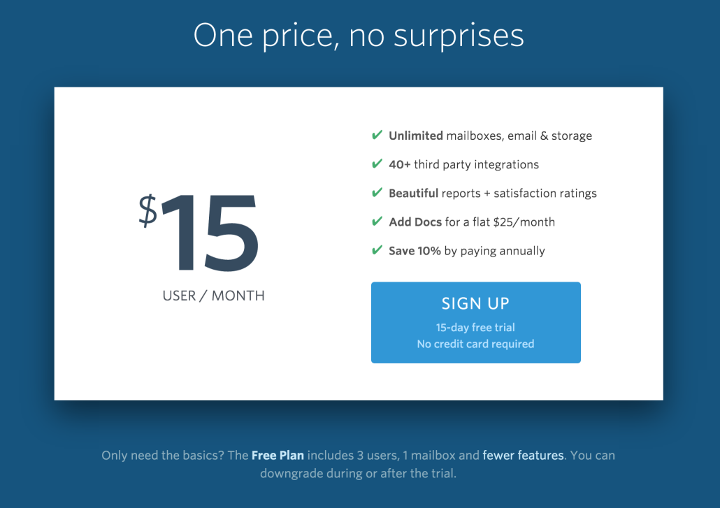
Look at the HelpScout pricing page above. It’s a simple price and sign up box. There is no confusion for the customer, the action for them to take is right in front of them.
Some companies need tiered pricing given the complexity of their offerings. Yet, if some A/B tests support increased conversions and your bottom line is not affected, consider dropping the multiple price points.
Highlight your unique values
Many times users are comparing various vendors for a specific product across some specific criteria. Once you know that specific criteria for your product, make it very obvious. If you know
If you know price is a big factor, you should it as the first thing people see on the page. If you are a storage company like Box, make the storage limits one of the first things people see.
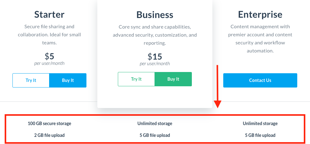
Box pricing page
In many instances people don’t even know what they want. In the classic marketing book ‘Predictably Irrational’ by Dan Ariely he states, “Most people don’t know what they want unless they see it in context”. For example, people don’t know what basketball shoe they should buy until they see it on a professional.
Same goes for marketing a pricing page. Many people won’t know what are the important factors to consider. It’s up to you spell it out for your customers and make the most important features front and center.
Suggest Plans to Users
It can often times be beneficial to push users towards a certain plan. By doing so you are reducing purchase friction and making it easy for users to make a decision.
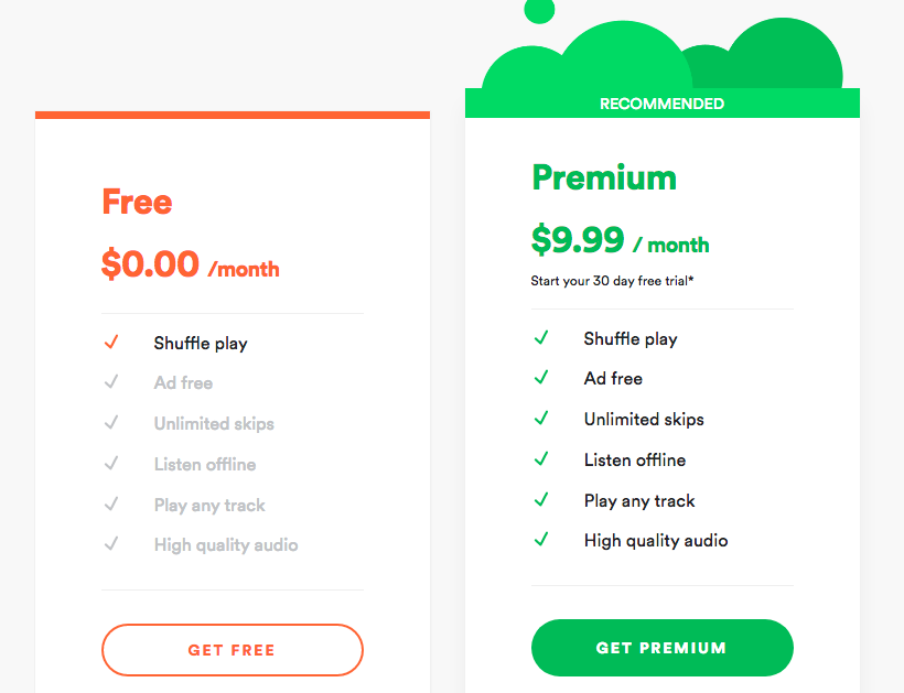
Spotify pricing page
Now the question becomes which plan to recommend. There is no clear cut answer to this question, but here are a few things to consider.
- Consider data known data about a user. Using the FunnelEnvy platform, you can bring in Marketo or Salesforce data into your pricing page tests. This gives you the ability to personalize the pricing page depending on the user/accounts. As a basic test, try changing the recommendation based on company size!
- Recommend the most expensive option. While it is unrealistic that the majority of people chose that option, you can expect people to choose the second most expensive. This is advantageous if people are often opting for your least expensive option, and you want to incentivise them to upgrade.
- Free Trial. While the free trial isn’t going to bring you the most money up front, it does have the least amount of friction. If you can work out the numbers, pushing people to a free trial might be your best option.
Address Fears
In the world of sales there is the concept of FUD. This stands for fear, uncertainties, and doubts. These FUDs come out when a customer is making a purchase, the bigger the purchase the greater opportunity for it to arise.
The best way to address FUD is to address it up front on the pricing page. To get started, write down all the possible fears, uncertainties, and doubts that people might have. Then write down your response to how to handle the FUD.
Here are some examples.
- Customer: I won’t get the ROI from this software. Response: “Average customers increase revenue by 34% with the software.”
- Customer: The software will be difficult to implement. Response: “We offer free implementation support to guarentee you get up and running”.
See how the customer will feel much more at ease after their fears are addressed.

SumoLogic Pricing Table
See how SumoLogic offers a free trial to reduce fears that users won’t get any value back from signing up.
Show Validation
It’s important that customers know other companies use and have success with your software. This validation helps to reduce fear for the customer about spending their money.
The easiest way to show validation is through quotes. See below how SumoLogic reduces fear that users won’t be able to get the software into production by showing a quote.

Customer Quote from SumoLogic
If you want to have the most relevant quote for a particular visitor, we recommend using personalization to show a quote based on a user industry. For example, if you know a visitor works in the travel industry, you could show a quote from someone at AirBnB.
Incentives Longer Commitments
It’s always beneficial to have customers pay for year-long commitments up front. This keeps them locked in for longer, and make it impossible to stop after only a month. While there might be some conversion drop-off for those who don’t want to pay at once, the overall benefit to your business will be tremendous.
Let’s take a look at some examples.
In this example from Dropbox, you can see that the pricing defaults to annual billing.

Dropbox Annual Billing
However, you can also switch to monthly billing, although it costs more per month.

Dropbox Monthly Billing
The goal here is to push people into the yearly billing and longer commitment.
Below is a similar example from Sumo. In this pricing page, they subtly say “paid annually” under the monthly price. While it can be construed as a ‘dirty trick’ to make someone think they are paying a monthly rate, this practice is quite common with pricing pages.
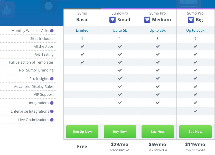
AppSumo Pricing Page
Conclusion
I hope you can use some of these tips in your own pricing pages. If you have any questions about how to best optimize your pricing page, please let us know in the comments, and we’ll be sure to give you some tailored suggestions.

