Want to know the secret of great conversions? It’s giving your visitors what they want when they come to your site. If you don’t, they leave.
But how do you know exactly what they want – and how do you deliver? Here’s a shortcut for you – check out some research Hubspot did earlier this year that shows that most of the people who visit your site want it to be easy to find the information they want and accomplish the actions they have set out to achieve. In a nutshell, that’s web usability, so when you improve web usability, you improve the chances that your site will convert well.
Things to Avoid
Let’s start by eliminating some of the features that most users DON’T want from the bad web design archives. These include things like:
- Automatically playing audio or video – they will probably try to figure out how to disable it. Users want to be in the driving seat when it comes to deciding if to play media – taking that decision out of their hands will drive them away.
- Content that requires a special plugin (as many game sites do)
- Flash-based designs (they won’t help SEO either)
- Other poor design trends.
Here’s an example of a poor Flash-based site. When it loaded, there was a black screen with a colorful circle. There was no indication of what the site was about and the navigation that appeared when you hovered is virtually illegible.
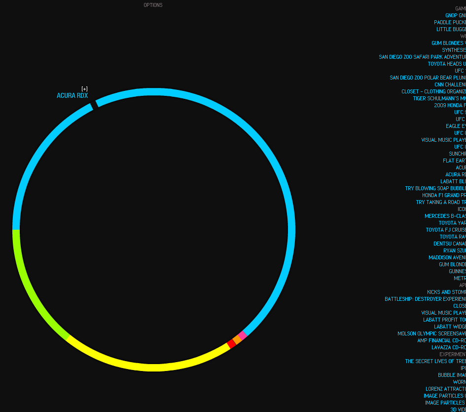
Flash has been plagued by problems from the start. It’s no wonder that some mobile software providersdon’t provide it at all. That’s an important signal, especially with the growing prominence of mobile users.
5 Features Users Want From Your Website
So if that’s what users don’t want – what is that they do want? Usability is all about making the website easy to use. That means taking care of things like:
- Using a consistent navigation system that makes it easy for users to find information. This is no place to get cute. Navigation bars tend to be in a couple of standard places – if it ain’t broke, don’t fix it!
- Including a search box in an easy to see location – above the fold is good – so that people can search for what they want easily,
- Using a standard structure for your site with the regular pages people expect to see (home, about, services, products, contact and so on)
- Including a sitemap for additional, which will also help with SEO.
- Having a design that marries attractiveness with utility, with buttons, links and text that are easy to read and as little clutter as possible. There’s no harm in having white space.
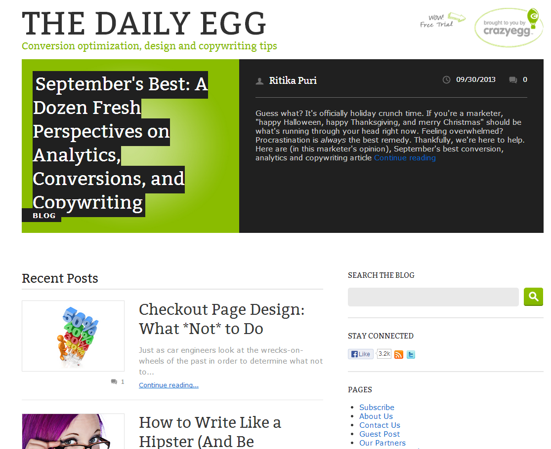
Here’s an example of use of whitespace, consistent navigation and good search box placement on the Crazy Egg blog.
Readability and Accessibility
If people actually get to the point of reading your content, then this has to be clear too. That means writing enticing headlines, including subheads to make the text scannable, and breaking it into short paragraphs with a single key idea in each. Check our post on online business for an example. Bullets and numbered lists are also helpful to chunk up the text.
In preparing your web content, it’s also a good idea to give thought to accessibility. Just to give a few examples:
- Visually impaired users who are using screen readers rely on alt text for images so the reader can tell them what they should be seeing.
- Hearing impaired users will welcome transcripts for any audio or video content so they can get your point without difficulty.
- Describing links so people know what to expect when they click.
Moveable Online has a great guide to the main points of W3C’s Web Content Accessibility Guidelines Level 1.
Mobile Web Design
Don’t forget about mobile when thinking about giving users what they want from your site. With themobile audience growing, it’s a segment you can’t ignore.
Here’s an example of when it goes wrong.
The other day I was browsing a site on my smartphone. Nothing unusual there, but I was trying to get to the full version of an article and then follow a link to another article on the same site. I couldn’t do it. Everything I did led me in a a circular path and I never found the information I wanted. So I went to another site with better navigation and ordered the product from there.
In catering for mobile users, you have to think about the limitations of a smaller screen and a touch based interface. Mobile users still want to be able to find information and accomplish actions easily, but they expect to do it via:
- swiping and gestures to navigate content
- tapping to make a selection
- navigation that’s there when you need it and out of the way when you don’t
- minimal numbers of forms to fill out or hoops to jump through to complete an action.
- the ability to move to the full site if they want to – and have it look good.
This last point is important. With users increasingly switching among screens to navigate your site, what they are looking for is a consistent experience. That means that you need to think about responsive design, adaptive design or a combination of the two. One example of this in action is The Next Web’s site which adapts to the screen size being used so you can always see the most important content.

Putting It Together
To tie all this together, there’s one more thing you have to do to make sites work both for users and for you. Always make it clear what the payoff is for users – they want to know what they get from being on your site whether that’s the latest news in your niche, free downloads or access to your products. Clear consistent branding, statements of purpose and calls to action will deliver that for the final piece of the usability puzzle.
Finally, you can assess how users are actually experiencing your site and what usability issues you need to address by comparing your site against usability guidelines (there’s a huge checklist on Useit.com) and online usability testing and analytics tools.


