It takes time, effort, and money to drive traffic to your website, and it’s all wasted unless you can turn that traffic into paying customers.
Are you converting as many customers as you hope? If you’re having trouble but can’t figure out why, take a look at these 7 common conversion-killing mistakes.
1. You Don’t Take Advantage Of “Above-The-Fold” Header Space.
Newspapers put their most compelling stories at the top of the front page. They have only seconds to pique people’s interest enough to pick them up. And they only get half a page to do it.
The same concept applies online. It’s amazing how many businesses fail to grasp it.
The most valuable part of your website is the part people can see without scrolling. If you aren’t using that space to give people a clear idea of who you are and how you can help them, it’s costing you conversions.
Here’s how Square uses their above-the-fold space:

You only get a few seconds to reel someone in, so you can’t afford to distract or confuse people. Fancy banners and image sliders might look great, but they take up a lot of space and are probably hurting your conversions.
2. You Don’t Have One Clear Goal For Each Web Page.
Your website isn’t meant to entertain people; it’s meant to bring in business.
A lot of businesses just throw random pages together without guiding their visitors closer to a transaction. Their pages either don’t have any goals or ten different ones. This leads to confused visitors and lower conversions.
For each page on your website, ask yourself:
- What does this page ask the visitor to do after they read it?
- If the visitor does that thing, does it increase the chances of them eventually buying from me?
If you can’t get a clear answer to both of these questions, it’s time to reconsider the purpose of that page.
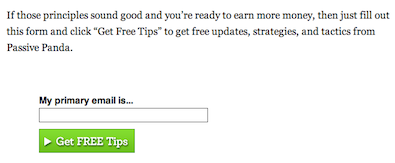
Here’s a page from Passive Panda with one clear purpose: capturing email addresses.
3. You Don’t Have A Clear Value Proposition.
No one cares how long you’ve been in business or if you call yourself an expert.
People want to know exactly what you can do for them and why they should pay attention to you instead of someone else. What can you do for your customers that no one else can? What sets you apart? That’s your value proposition.
Domino’s Pizza’s claim to fame was “fresh, hot pizza delivered to your door in 30 minutes or less – or it’s free.” They showed people exactly what they offered in a way that set them apart from their competitors.
Find your value proposition, and share it with your prospects as soon as they’re on your site. The above-the-fold header space is a perfect place to do this.
Here’s how 37signals conveys their value proposition:

4. You Have A Cluttered Design That Gives People Too Many Choices.
“People love options.”
It’s only half-true. Giving people too many things to choose from actually creates friction and keeps them from making buying decisions.
If a visitor sees a chance to sign up to your email list, contact you for a free consultation, and read through your blog archives all on the same page, chances are they won’t do any of those things. They’ll hit the “back” button on their browser instead.
You can remedy this by considering each design element and asking yourself what purpose it serves.
Instead of going with dozens of social media sharing buttons, Forbes cut it down to the essentials:
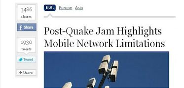
Do you really need social media share buttons on a landing page? Does someone need to see blog post tags in your sidebar, or would an email opt-in form serve you better? Make it easy for people to choose, and you’ll increase your conversions.
5. You Aren’t Following Your Prospects’ Thought Patterns.
Put yourself in the mind of someone who lands on your website.
What do they want to know first? What if they read something and like it, but aren’t sure what to do next?
Turning traffic into customers isn’t a linear process. You have to create a structure where people can build their interest gradually and ease their doubts before deciding to commit. It’s two steps forward, one step back… until you close the sale.
Consider how you can make it easier for people to stay on your site than go elsewhere. There are plenty of different ways to do this. You could:
- Link to related posts at the bottom of your content
- Display your most popular content in an easy to find location
- Show people where they can get free resources, eBooks, etc.
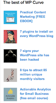
Here’s how WP Curve keeps visitors on their site using their most popular posts:
6. You Don’t Have A Sales Funnel.
There are plenty of people who are interested in what you’re offering, but aren’t ready to do business with you yet. You can’t trust them to come back and find you when they are.
Depending on the price and complexity of what you’re selling, it can take some time to convince people to buy from you. If you just have a sales page, you might get a few impulse buys, but you’ll lose the vast majority of your potential customers.
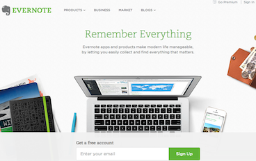
A sales funnel is a process that captures people who are interested, but not yet ready to buy, and moves them towards a transaction at their own pace. Evernote offers a free account to get people into theirs:
Email marketing is a great way to do this. It gives you a personal way to send prospects your latest content, newsletters, and other information they’ll find valuable. This helps you nurture their interest, overcome objections, and establish your authority in your niche.
7. You Don’t Track Your Conversions Or Optimize Your Website Continuously.
As Peter Drucker said, “You can’t manage what you don’t measure.”
Too many businesses make assumptions about their visitors. They’re confident they know their target market and what works, so they don’t ever test it.
Unexpected things happen all the time. Even if you know copywriting and follow all the “best practices,” the only way to know what will work for you is to measure and test. So much depends on your offer and target market.
Tweaking your website for more conversions is a never-ending process. When you keep the lifetime value of a customer in mind, you can’t afford not to do it.
These small adjustments compound into a massive competitive edge. They pay off in the form of customers, sales, and long-term growth.
Your Turn
If aren’t getting as customers as you’d like, hopefully you have some new ideas to improve your conversions.
Which of these mistakes do you struggle with the most? Do you have any new ideas to increase your conversions going forward? Leave a comment below and let us know!


